## Bar Chart: Accuracy Comparison of Raw vs. Processed Metrics
### Overview
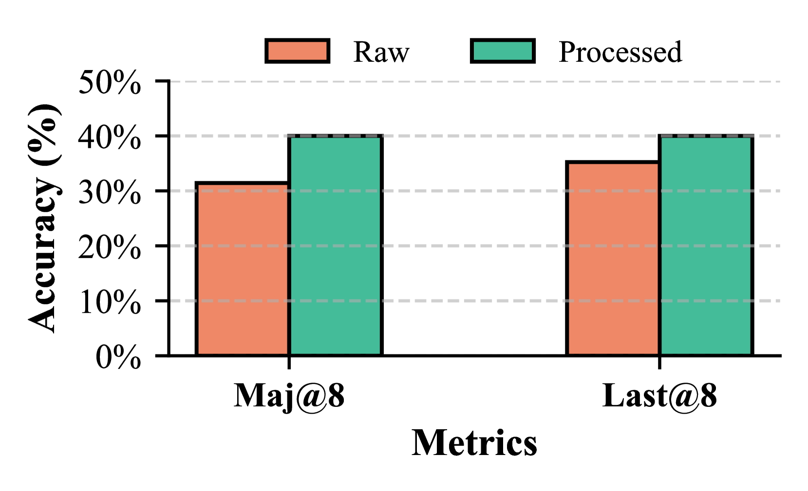
This image is a bar chart comparing the accuracy of "Raw" and "Processed" metrics across two different categories: "Maj@8" and "Last@8". The chart displays accuracy percentages on the y-axis and the metrics categories on the x-axis.
### Components/Axes
* **Title:** Implicitly, the chart compares accuracy.
* **Y-axis Label:** "Accuracy (%)"
* **Scale:** Ranges from 0% to 50%, with major tick marks at 0%, 10%, 20%, 30%, 40%, and 50%.
* **Grid Lines:** Dashed horizontal lines are present at each major tick mark, aiding in reading values.
* **X-axis Label:** "Metrics"
* **Categories:** "Maj@8" and "Last@8".
* **Legend:** Located at the top-center of the chart.
* **"Raw"**: Represented by an orange rectangle.
* **"Processed"**: Represented by a teal rectangle.
### Detailed Analysis
The chart presents two sets of paired bars, one for each metric category.
**1. Maj@8 Category:**
* **Raw (Orange Bar):** This bar's top aligns with the 30% mark on the y-axis.
* **Value:** Approximately 31% (with an uncertainty of +/- 1%).
* **Processed (Teal Bar):** This bar's top aligns with the 40% mark on the y-axis.
* **Value:** Approximately 40% (with an uncertainty of +/- 1%).
**2. Last@8 Category:**
* **Raw (Orange Bar):** This bar's top aligns slightly above the 30% mark, approximately at the 35% mark.
* **Value:** Approximately 35% (with an uncertainty of +/- 1%).
* **Processed (Teal Bar):** This bar's top aligns with the 40% mark on the y-axis.
* **Value:** Approximately 40% (with an uncertainty of +/- 1%).
### Key Observations
* For both "Maj@8" and "Last@8" metrics, the "Processed" accuracy is higher than the "Raw" accuracy.
* The "Processed" accuracy for "Maj@8" is approximately 40%.
* The "Processed" accuracy for "Last@8" is also approximately 40%.
* The "Raw" accuracy for "Maj@8" is approximately 31%.
* The "Raw" accuracy for "Last@8" is approximately 35%.
* The difference in accuracy between "Processed" and "Raw" is more pronounced for the "Maj@8" metric (approximately 9%) compared to the "Last@8" metric (approximately 5%).
### Interpretation
This bar chart demonstrates the impact of processing on the accuracy of two different metrics, "Maj@8" and "Last@8". The data strongly suggests that processing the metrics leads to a significant improvement in accuracy across both categories.
Specifically, the "Processed" bars consistently reach a higher accuracy level than their "Raw" counterparts. The "Processed" accuracy appears to plateau around 40% for both "Maj@8" and "Last@8", indicating a potential ceiling or consistent performance after processing.
The "Raw" accuracy, however, shows some variation between the two metrics, with "Last@8" performing better than "Maj@8". The improvement gained by processing is more substantial for "Maj@8", suggesting that this metric might benefit more from the applied processing techniques. This could imply that the "Raw" "Maj@8" data contains more noise or irrelevant information that the processing effectively filters out, leading to a greater relative gain in accuracy. Conversely, "Raw" "Last@8" might already be closer to optimal performance, thus showing a smaller, though still positive, improvement after processing.
In essence, the chart visually supports the hypothesis that data processing is a beneficial step for improving the performance of these metrics.