## Bar Chart: Accuracy Comparison of Raw vs. Processed Data
### Overview
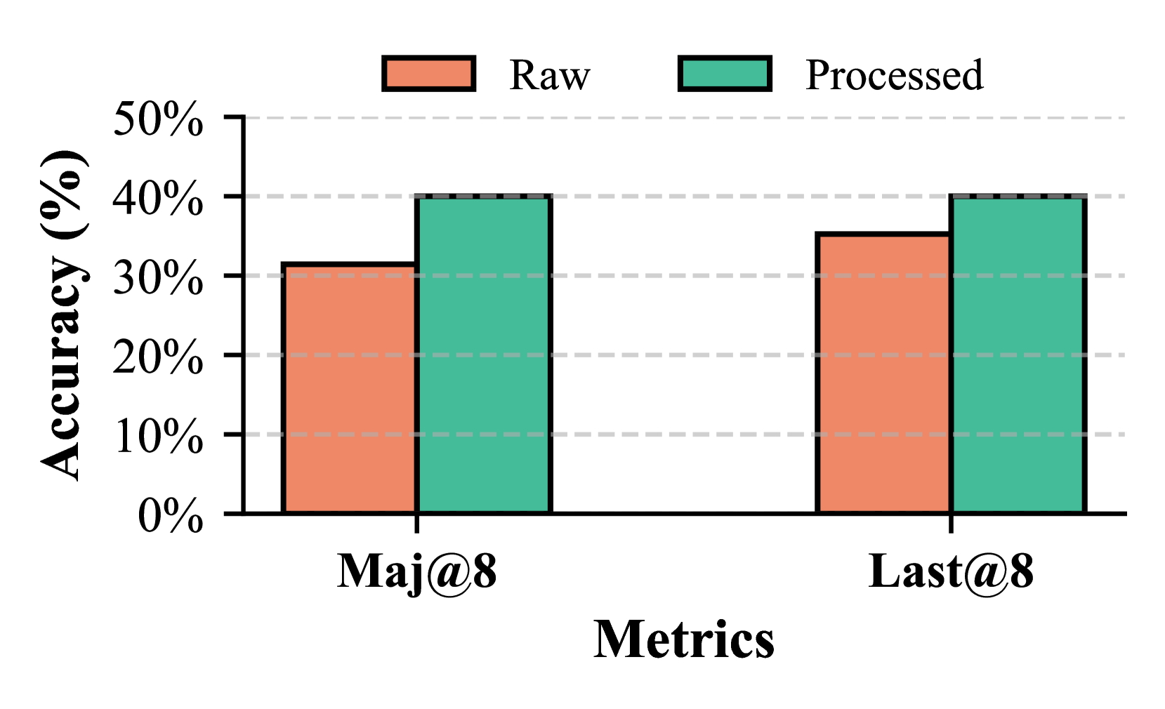
The image is a bar chart comparing the accuracy (in percentage) of "Raw" and "Processed" data across two metrics: "Maj@8" and "Last@8". The chart displays the accuracy values for each category using vertical bars, with "Raw" data represented by coral-colored bars and "Processed" data by teal-colored bars.
### Components/Axes
* **Y-axis:** "Accuracy (%)" with a scale from 0% to 50%, incrementing by 10%.
* **X-axis:** "Metrics" with two categories: "Maj@8" and "Last@8".
* **Legend:** Located at the top of the chart, indicating "Raw" (coral) and "Processed" (teal).
* Horizontal grid lines are present at each 10% increment on the y-axis.
### Detailed Analysis
* **Maj@8:**
* Raw: The coral bar reaches approximately 32%.
* Processed: The teal bar reaches approximately 40%.
* **Last@8:**
* Raw: The coral bar reaches approximately 36%.
* Processed: The teal bar reaches approximately 40%.
### Key Observations
* For both metrics (Maj@8 and Last@8), the "Processed" data shows higher accuracy than the "Raw" data.
* The accuracy of "Processed" data is the same (approximately 40%) for both metrics.
* The "Last@8" metric has a higher "Raw" accuracy (approximately 36%) compared to the "Maj@8" metric (approximately 32%).
### Interpretation
The chart demonstrates that processing the data leads to an improvement in accuracy compared to using the raw data. The "Processed" data achieves a consistent accuracy of around 40% across both "Maj@8" and "Last@8" metrics. The "Last@8" metric appears to be inherently more accurate than "Maj@8" even before processing, as indicated by the higher "Raw" accuracy value. This suggests that the "Last@8" metric might be a better indicator or more robust to noise in the raw data. The consistent accuracy of the processed data suggests that the processing method is effective in mitigating the differences between the two metrics.