## Bar Chart: Accuracy Comparison for Maj@8 and Last@8 Metrics
### Overview
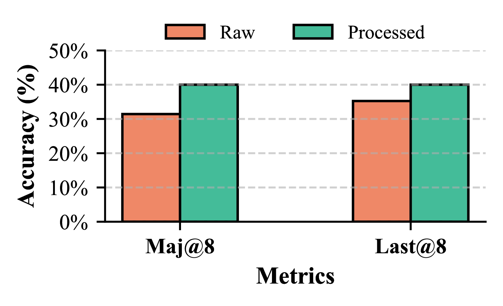
The chart compares the accuracy of two metrics, **Maj@8** and **Last@8**, across two data states: **Raw** (orange) and **Processed** (teal). Accuracy is measured on a y-axis from 0% to 50%, with two grouped bars per metric.
### Components/Axes
- **X-axis (Metrics)**: Labeled "Maj@8" and "Last@8".
- **Y-axis (Accuracy)**: Labeled "Accuracy (%)" with increments at 10%, 20%, ..., 50%.
- **Legend**: Located at the top-right corner, with:
- **Orange**: "Raw" data.
- **Teal**: "Processed" data.
- **Bars**: Two bars per metric (Raw and Processed), grouped side-by-side.
### Detailed Analysis
- **Maj@8**:
- **Raw**: Approximately 30% accuracy.
- **Processed**: Approximately 40% accuracy.
- **Last@8**:
- **Raw**: Approximately 35% accuracy.
- **Processed**: Approximately 40% accuracy.
### Key Observations
1. **Processed data consistently outperforms Raw** for both metrics.
2. **Maj@8** shows a larger improvement (10% increase) compared to **Last@8** (5% increase).
3. **Last@8 Raw** has higher baseline accuracy than **Maj@8 Raw** (35% vs. 30%).
### Interpretation
The data suggests that processing improves accuracy across both metrics, with **Maj@8** benefiting more significantly. The **Last@8** metric starts with higher raw accuracy but plateaus at 40% after processing, indicating potential saturation or diminishing returns. The uniformity of **Processed** values (both at ~40%) may reflect a standardization effect or shared upper limit in the processing pipeline. The disparity in raw accuracy between metrics could imply differing inherent complexities or data quality issues.