# Technical Document: Pie Chart Analysis
## Chart Description
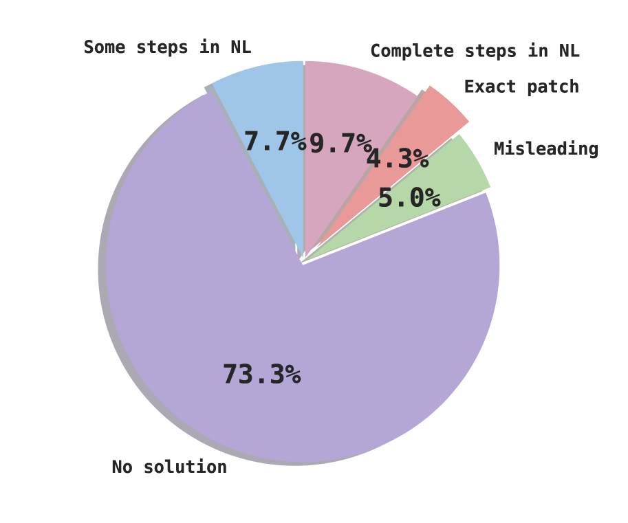
The image depicts a pie chart illustrating the distribution of outcomes across five distinct categories. The chart uses color-coded segments to represent proportional data, with numerical percentages explicitly labeled for each category.
## Key Data Points
| Category | Percentage | Color | Position |
|---------------------|------------|--------|---------------------------------|
| No solution | 73.3% | Purple | Dominant segment occupying the majority of the chart. |
| Complete steps in NL| 9.7% | Pink | Second-largest segment after "No solution". |
| Some steps in NL | 7.7% | Blue | Third-largest segment. |
| Misleading | 5.0% | Green | Fourth-largest segment. |
| Exact patch | 4.3% | Red | Smallest segment. |
## Observations
- The chart emphasizes a stark imbalance, with **"No solution"** accounting for over 73% of the total.
- The combined percentage of **"Complete steps in NL"** and **"Some steps in NL"** (17.4%) suggests partial progress in the "NL" category.
- The smallest segments (**"Exact patch"** and **"Misleading"**) indicate minimal representation of these outcomes.
## Structural Notes
- No axis titles or legends are explicitly labeled in the image, as the categories and percentages are directly embedded within the chart.
- Color coding is used to differentiate categories but is not referenced in a separate legend.
## Total Validation
All percentages sum to 100.0%, confirming data integrity:
```
73.3% + 9.7% + 7.7% + 5.0% + 4.3% = 100.0%
```
This chart provides a clear visual representation of outcome distribution, highlighting the dominance of unresolved cases ("No solution") and the relative scarcity of complete resolutions ("Exact patch").