## Line Chart: MER Average vs. N for Different Methods
### Overview
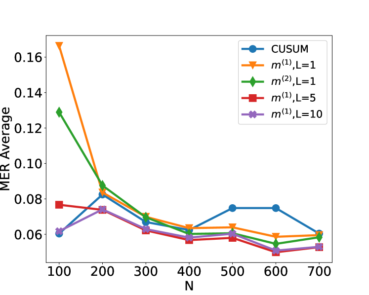
This image displays a line chart illustrating the "MER Average" on the y-axis against "N" on the x-axis. Five different data series, representing various methods, are plotted, each with distinct markers and colors. The chart shows how the MER Average changes with increasing values of N for each method.
### Components/Axes
* **X-axis Title:** N
* **X-axis Markers:** 100, 200, 300, 400, 500, 600, 700
* **Y-axis Title:** MER Average
* **Y-axis Markers:** 0.06, 0.08, 0.10, 0.12, 0.14, 0.16
* **Legend:** Located in the top-right quadrant of the chart.
* **CUSUM:** Blue circles (•)
* **m⁽¹⁾, L=1:** Orange inverted triangles (▼)
* **m⁽²⁾, L=1:** Green diamonds (◆)
* **m⁽¹⁾, L=5:** Red squares (■)
* **m⁽¹⁾, L=10:** Purple crosses (×)
### Detailed Analysis
**Data Series Trends and Points:**
1. **CUSUM (Blue circles •):**
* **Trend:** Initially slopes upward from N=100 to N=500, then plateaus between N=500 and N=600, and finally slopes downward to N=700.
* **Data Points (approximate):**
* N=100: 0.060
* N=200: 0.082
* N=300: 0.070
* N=400: 0.065
* N=500: 0.077
* N=600: 0.077
* N=700: 0.062
2. **m⁽¹⁾, L=1 (Orange inverted triangles ▼):**
* **Trend:** Starts at its highest value at N=100 and then consistently slopes downward as N increases.
* **Data Points (approximate):**
* N=100: 0.165
* N=200: 0.085
* N=300: 0.073
* N=400: 0.065
* N=500: 0.060
* N=600: 0.058
* N=700: 0.059
3. **m⁽²⁾, L=1 (Green diamonds ◆):**
* **Trend:** Starts at a high value at N=100 and then consistently slopes downward as N increases, generally following a similar pattern to m⁽¹⁾, L=1 but with lower initial values.
* **Data Points (approximate):**
* N=100: 0.128
* N=200: 0.085
* N=300: 0.072
* N=400: 0.065
* N=500: 0.062
* N=600: 0.057
* N=700: 0.058
4. **m⁽¹⁾, L=5 (Red squares ■):**
* **Trend:** Starts at a moderate value at N=100, dips slightly at N=200, then generally slopes downward as N increases, reaching its lowest point at N=600 before a slight increase at N=700.
* **Data Points (approximate):**
* N=100: 0.078
* N=200: 0.074
* N=300: 0.065
* N=400: 0.059
* N=500: 0.063
* N=600: 0.055
* N=700: 0.057
5. **m⁽¹⁾, L=10 (Purple crosses ×):**
* **Trend:** Starts at a moderate value at N=100, rises slightly at N=200, then generally slopes downward as N increases, reaching its lowest point at N=600 before a slight increase at N=700. This trend is very similar to m⁽¹⁾, L=5.
* **Data Points (approximate):**
* N=100: 0.062
* N=200: 0.075
* N=300: 0.067
* N=400: 0.062
* N=500: 0.060
* N=600: 0.055
* N=700: 0.056
### Key Observations
* The **m⁽¹⁾, L=1** method exhibits the highest MER Average at N=100 (approximately 0.165) and shows a significant decrease as N increases.
* All methods generally show a decreasing trend in MER Average as N increases, particularly after N=200.
* The **CUSUM** method shows a different pattern, with an initial increase and then a plateau before a decrease, unlike the other methods which mostly decrease monotonically.
* The **m⁽¹⁾, L=5** and **m⁽¹⁾, L=10** methods have very similar trends and values, especially for N >= 300, with both reaching their minimum MER Average around N=600.
* At N=100, the MER Average values range from approximately 0.060 (CUSUM) to 0.165 (m⁽¹⁾, L=1).
* At N=700, the MER Average values are much closer, ranging from approximately 0.056 (m⁽¹⁾, L=10) to 0.062 (CUSUM).
### Interpretation
The chart suggests that for most of the methods presented (m⁽¹⁾, L=1, m⁽²⁾, L=1, m⁽¹⁾, L=5, and m⁽¹⁾, L=10), the MER Average tends to decrease as the sample size (N) increases. This is a common observation in statistical analysis, where larger sample sizes often lead to more stable and potentially lower error metrics.
The **m⁽¹⁾, L=1** method starts with a very high MER Average at N=100, indicating a significant amount of error or variability at smaller sample sizes. However, it rapidly improves as N grows.
The **CUSUM** method's behavior is distinct. Its initial rise and subsequent plateau suggest a different mechanism of error accumulation or detection compared to the other methods. The plateau between N=500 and N=600 might indicate a point where the CUSUM statistic stabilizes or reaches a steady state before potentially detecting changes at larger N.
The similarity between **m⁽¹⁾, L=5** and **m⁽¹⁾, L=10** suggests that for these specific methods, the parameter L (which likely represents a look-ahead or window size) might have a diminishing impact on the MER Average beyond L=5, or that the optimal L is around 5 or 10 for the tested range of N.
Overall, the data demonstrates a trade-off between sample size and MER Average for most methods. The choice of method and its parameters (like L) significantly influences the MER Average, especially at smaller sample sizes. The CUSUM method's unique trend warrants further investigation into its specific application and behavior.