\n
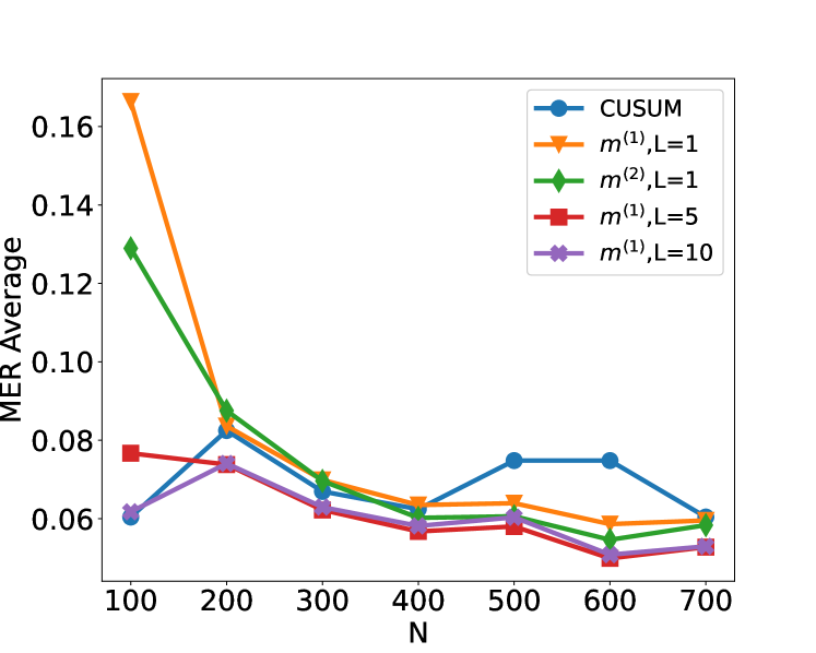
## Line Chart: MER Average vs. N for Different Methods
### Overview
This image presents a line chart comparing the Mean Error Rate (MER) Average for different methods as a function of 'N'. The chart displays five distinct data series, each representing a different method or parameter setting. The x-axis represents 'N', and the y-axis represents the MER Average.
### Components/Axes
* **X-axis:** Labeled "N", ranging from approximately 100 to 700, with markers at 100, 200, 300, 400, 500, 600, and 700.
* **Y-axis:** Labeled "MER Average", ranging from approximately 0.04 to 0.16, with markers at 0.06, 0.08, 0.10, 0.12, 0.14, and 0.16.
* **Legend:** Located in the top-right corner of the chart. It identifies the following data series:
* CUSUM (Blue)
* m<sup>(1)</sup>, L=1 (Orange)
* m<sup>(2)</sup>, L=1 (Green)
* m<sup>(1)</sup>, L=5 (Red)
* m<sup>(1)</sup>, L=10 (Purple)
### Detailed Analysis
Here's a breakdown of each data series and their trends:
* **CUSUM (Blue):** This line starts at approximately 0.062 at N=100, decreases to a minimum of around 0.058 at N=400, then increases to approximately 0.072 at N=700. The trend is generally flat with a slight dip around N=400.
* N=100: MER Average ≈ 0.062
* N=200: MER Average ≈ 0.060
* N=300: MER Average ≈ 0.059
* N=400: MER Average ≈ 0.058
* N=500: MER Average ≈ 0.060
* N=600: MER Average ≈ 0.066
* N=700: MER Average ≈ 0.072
* **m<sup>(1)</sup>, L=1 (Orange):** This line exhibits a steep decline from approximately 0.16 at N=100 to around 0.062 at N=700. The trend is consistently downward.
* N=100: MER Average ≈ 0.16
* N=200: MER Average ≈ 0.12
* N=300: MER Average ≈ 0.09
* N=400: MER Average ≈ 0.075
* N=500: MER Average ≈ 0.066
* N=600: MER Average ≈ 0.063
* N=700: MER Average ≈ 0.062
* **m<sup>(2)</sup>, L=1 (Green):** This line starts at approximately 0.13 at N=100 and decreases to around 0.06 at N=700. The trend is downward, but less steep than the orange line.
* N=100: MER Average ≈ 0.13
* N=200: MER Average ≈ 0.10
* N=300: MER Average ≈ 0.08
* N=400: MER Average ≈ 0.07
* N=500: MER Average ≈ 0.065
* N=600: MER Average ≈ 0.062
* N=700: MER Average ≈ 0.060
* **m<sup>(1)</sup>, L=5 (Red):** This line begins at approximately 0.078 at N=100, decreases to a minimum of around 0.055 at N=500, and then increases slightly to approximately 0.058 at N=700. The trend is relatively flat with a slight dip.
* N=100: MER Average ≈ 0.078
* N=200: MER Average ≈ 0.072
* N=300: MER Average ≈ 0.065
* N=400: MER Average ≈ 0.060
* N=500: MER Average ≈ 0.055
* N=600: MER Average ≈ 0.057
* N=700: MER Average ≈ 0.058
* **m<sup>(1)</sup>, L=10 (Purple):** This line starts at approximately 0.065 at N=100, decreases to around 0.056 at N=400, and remains relatively stable around 0.056-0.058 until N=700.
* N=100: MER Average ≈ 0.065
* N=200: MER Average ≈ 0.062
* N=300: MER Average ≈ 0.060
* N=400: MER Average ≈ 0.056
* N=500: MER Average ≈ 0.057
* N=600: MER Average ≈ 0.057
* N=700: MER Average ≈ 0.058
### Key Observations
* The method m<sup>(1)</sup>, L=1 (orange) shows the most significant decrease in MER Average as N increases.
* The CUSUM method (blue) exhibits the most stable performance, with relatively small fluctuations in MER Average across the range of N values.
* The methods m<sup>(1)</sup>, L=5 (red) and m<sup>(1)</sup>, L=10 (purple) show similar trends, with a slight decrease in MER Average followed by stabilization.
* The initial MER Average values are significantly higher for methods m<sup>(1)</sup>, L=1 (orange) and m<sup>(2)</sup>, L=1 (green) compared to the other methods.
### Interpretation
The chart demonstrates the performance of different methods for estimating or predicting something, as measured by the Mean Error Rate (MER). The parameter 'N' likely represents the sample size or the amount of data used. The results suggest that increasing the sample size ('N') generally improves the accuracy of the methods, as indicated by the decreasing MER Average.
The method m<sup>(1)</sup>, L=1 (orange) appears to benefit the most from larger sample sizes, showing a substantial reduction in error rate. This could indicate that this method is particularly sensitive to the amount of data available. The CUSUM method (blue) is relatively robust to changes in sample size, maintaining a consistently low error rate.
The parameter 'L' in the method names (e.g., m<sup>(1)</sup>, L=1) likely controls some aspect of the method's behavior, such as a smoothing factor or a window size. The comparison of different 'L' values (L=1, L=5, L=10) suggests that the optimal value of 'L' may depend on the sample size and the specific application. The differences between m<sup>(1)</sup> and m<sup>(2)</sup> are not immediately clear without further context.
The chart provides valuable insights into the trade-offs between different methods and the importance of sample size in achieving accurate results.