# Technical Document Extraction: Line Chart Analysis
## Chart Overview
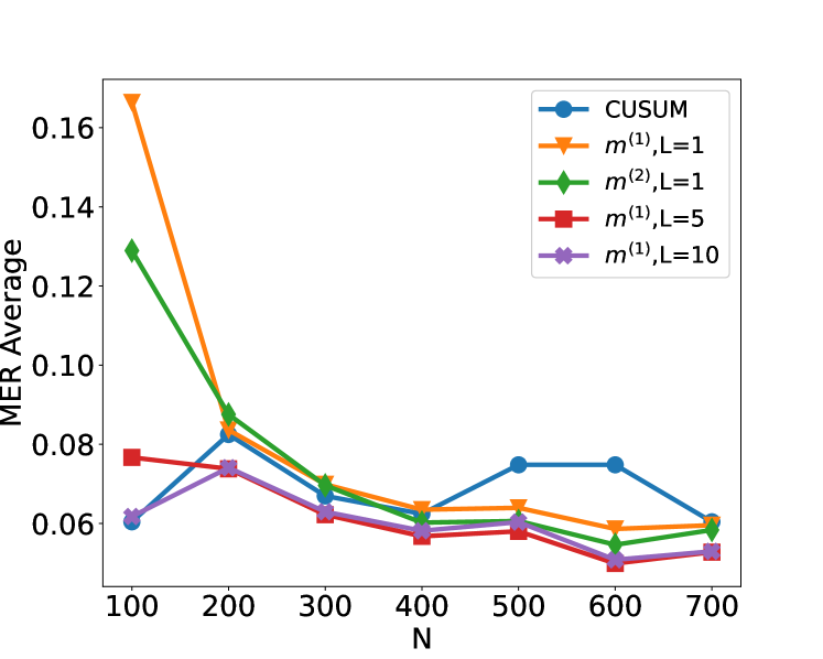
The image depicts a line chart comparing the **MER Average** (Mean Error Rate) across different sample sizes (**N**) for multiple statistical methods. The chart includes five data series, each represented by distinct line styles, markers, and colors.
---
### **Axes and Labels**
- **X-axis (Horizontal):**
- Label: **N** (sample size)
- Range: 100 to 700 (in increments of 100)
- Ticks: 100, 200, 300, 400, 500, 600, 700
- **Y-axis (Vertical):**
- Label: **MER Average** (Mean Error Rate)
- Range: 0.06 to 0.16
- Ticks: 0.06, 0.08, 0.10, 0.12, 0.14, 0.16
---
### **Legend**
- **Location:** Right side of the chart
- **Entries:**
1. **CUSUM** (blue line with circle markers)
2. **m^(1),L=1** (orange line with downward-pointing triangle markers)
3. **m^(2),L=1** (green line with diamond markers)
4. **m^(1),L=5** (red line with square markers)
5. **m^(1),L=10** (purple line with asterisk markers)
---
### **Data Series Analysis**
#### 1. **CUSUM (Blue Line)**
- **Trend:**
- Starts at **0.06** (N=100)
- Rises sharply to **0.08** at N=200
- Dips to **0.06** at N=300
- Rises again to **0.075** at N=500
- Stabilizes at **0.075** for N=600 and N=700
#### 2. **m^(1),L=1 (Orange Line)**
- **Trend:**
- Starts at **0.165** (N=100)
- Drops sharply to **0.085** at N=200
- Declines further to **0.065** at N=300
- Stabilizes at **0.06** for N=400, 500, 600, and 700
#### 3. **m^(2),L=1 (Green Line)**
- **Trend:**
- Starts at **0.13** (N=100)
- Declines to **0.09** at N=200
- Dips to **0.065** at N=300
- Fluctuates slightly between **0.06** and **0.065** for N=400–700
#### 4. **m^(1),L=5 (Red Line)**
- **Trend:**
- Starts at **0.078** (N=100)
- Declines to **0.065** at N=200
- Stabilizes at **0.06** for N=300–700
#### 5. **m^(1),L=10 (Purple Line)**
- **Trend:**
- Starts at **0.06** (N=100)
- Dips to **0.055** at N=200
- Rises slightly to **0.06** at N=300
- Stabilizes at **0.055** for N=400–700
---
### **Key Observations**
1. **m^(1),L=1** exhibits the highest initial MER Average (0.165 at N=100) but converges to the lowest values by N=700.
2. **CUSUM** shows the most volatility, with peaks at N=200 and N=500.
3. **m^(2),L=1** and **m^(1),L=5** demonstrate similar stabilization patterns, with MER Averages converging to ~0.06 by N=700.
4. **m^(1),L=10** maintains the lowest MER Average across all N values.
---
### **Spatial Grounding**
- **Legend Position:** Right-aligned, outside the plot area.
- **Data Point Verification:**
- All line colors and markers match the legend entries (e.g., orange line = m^(1),L=1).
- No discrepancies observed between legend labels and visual data.
---
### **Conclusion**
The chart illustrates how MER Average varies with sample size (N) for different statistical methods. **m^(1),L=1** and **CUSUM** show significant initial variability, while **m^(1),L=10** consistently performs best. All methods converge to similar MER Averages (~0.06) at larger N values (N ≥ 400).