# Technical Document Extraction: PCA Visualization Analysis
## Image Description
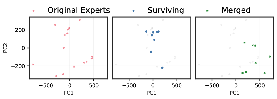
The image contains three scatter plots arranged horizontally, each representing a distinct dataset or transformation stage. All plots share the same axis labels (**PC1** and **PC2**), indicating principal component analysis (PCA) dimensionality reduction. Points are color-coded to denote categories, with a legend provided for reference.
---
## Key Components & Labels
### Axis Titles
- **X-axis**: PC1 (Principal Component 1)
- **Y-axis**: PC2 (Principal Component 2)
### Legends
- **Red dots**: Original Experts
- **Blue dots**: Surviving
- **Green crosses**: Merged
### Plot Titles
1. **Original Experts**: Red points distributed across the PC1-PC2 space.
2. **Surviving**: Blue points clustered near the origin (0,0).
3. **Merged**: Green crosses distributed across the PC1-PC2 space, with some overlap with the "Surviving" cluster.
---
## Data Trends & Observations
### 1. Original Experts (Red Dots)
- **Distribution**: Scattered across the entire PC1-PC2 range.
- **Key Points**:
- PC1 range: Approximately -500 to +500.
- PC2 range: Approximately -200 to +200.
- No clear clustering; points are dispersed.
### 2. Surviving (Blue Dots)
- **Distribution**: Concentrated near the origin (0,0).
- **Key Points**:
- PC1 range: Approximately -100 to +100.
- PC2 range: Approximately -50 to +150.
- Tight clustering suggests a filtering or selection process (e.g., retaining only high-quality or relevant data points).
### 3. Merged (Green Crosses)
- **Distribution**: Overlaps with both "Original Experts" and "Surviving" clusters.
- **Key Points**:
- PC1 range: Approximately -100 to +500.
- PC2 range: Approximately -100 to +200.
- Crosses indicate a hybrid dataset, potentially combining "Original Experts" and "Surviving" after transformation.
---
## Cross-Referenced Legend Accuracy
- **Red (Original Experts)**: Matches all red dots in the first plot.
- **Blue (Surviving)**: Matches all blue dots in the second plot.
- **Green (Merged)**: Matches all green crosses in the third plot.
---
## Summary
The visualization illustrates a three-stage PCA analysis:
1. **Original Experts**: Full dataset with high variability.
2. **Surviving**: Subset of data points after filtering (clustered near origin).
3. **Merged**: Combined dataset showing transformed relationships between the original and surviving points.
All plots use the same PCA axes (PC1 and PC2), enabling direct comparison of data distributions across stages.