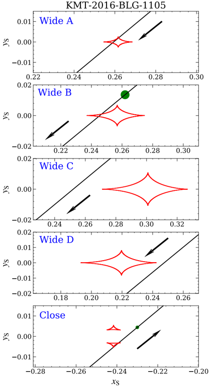
## Chart/Diagram Type: Scatter Plots with Trend Lines
### Overview
The image displays five scatter plots arranged vertically, each labeled "Wide A," "Wide B," "Wide C," "Wide D," and "Close." Each plot features a red diamond-shaped distribution, a black arrow, and a diagonal dashed line. The axes are labeled **x_s** (horizontal) and **y_s** (vertical), with values ranging from -0.28 to 0.30 for x_s and -0.02 to 0.01 for y_s. A legend identifies red as "Wide" and green as "Close."
### Components/Axes
- **Axes**:
- **x_s**: Ranges from -0.28 (left) to 0.30 (right).
- **y_s**: Ranges from -0.02 (bottom) to 0.01 (top).
- **Legend**:
- **Red**: "Wide" (diamond-shaped distributions).
- **Green**: "Close" (single data points).
- **Diagonal Line**: A dashed line with a positive slope (≈0.35) spans all panels, suggesting a reference or trend line.
### Detailed Analysis
1. **Wide A**:
- Red diamond centered at **x_s ≈ 0.26**, **y_s ≈ 0.00**.
- Black arrow points **rightward and slightly upward** (toward higher x_s and y_s).
- Diamond spans **x_s ≈ 0.24–0.28**, **y_s ≈ -0.01–0.01**.
2. **Wide B**:
- Red diamond centered at **x_s ≈ 0.24**, **y_s ≈ -0.01**.
- Green dot at **x_s ≈ 0.26**, **y_s ≈ 0.00** (on the diagonal line).
- Black arrow points **leftward and downward** (toward lower x_s and y_s).
3. **Wide C**:
- Red diamond centered at **x_s ≈ 0.26**, **y_s ≈ 0.00**.
- Diamond spans **x_s ≈ 0.24–0.28**, **y_s ≈ -0.01–0.01**.
- Black arrow points **leftward and downward** (toward lower x_s and y_s).
4. **Wide D**:
- Red diamond centered at **x_s ≈ 0.22**, **y_s ≈ 0.00**.
- Diamond spans **x_s ≈ 0.18–0.24**, **y_s ≈ -0.01–0.01**.
- Black arrow points **rightward and upward** (toward higher x_s and y_s).
5. **Close**:
- Two small red triangles at **x_s ≈ -0.24**, **y_s ≈ -0.01** and **y_s ≈ 0.00**.
- Green dot at **x_s ≈ -0.24**, **y_s ≈ 0.00** (on the diagonal line).
- Black arrow points **rightward and upward** (toward higher x_s and y_s).
### Key Observations
- **Trend Line**: The diagonal line (slope ≈0.35) acts as a reference. Data points in "Close" panels (green) align closely with it, while "Wide" panels (red) show deviations.
- **Arrow Directions**: Arrows in "Wide" panels point toward or away from the trend line, suggesting directional trends or shifts.
- **Distribution Spread**: "Wide" panels show broader x_s ranges (e.g., Wide D spans 0.18–0.24) compared to "Close" panels (narrower, focused at -0.24).
- **Outliers**: The green "Close" points in Wide B and Close panels lie exactly on the trend line, contrasting with the dispersed red "Wide" points.
### Interpretation
- **State Differentiation**: The "Wide" vs. "Close" labels likely represent distinct states or conditions. "Close" points align with the trend line, implying adherence to a baseline, while "Wide" points deviate, suggesting variability or instability.
- **Directional Trends**: Arrows in "Wide" panels may indicate movement toward or away from equilibrium (the trend line). For example, Wide A’s arrow points away from the line, while Wide D’s arrow moves toward it.
- **Anomalies**: The green "Close" point in Wide B (x_s ≈ 0.26) is an outlier, as it lies on the trend line despite the panel’s "Wide" label. This could indicate a transitional state or measurement error.
- **Spatial Relationships**: The positioning of red diamonds and green dots relative to the trend line and arrows suggests a dynamic system where "Wide" states are more dispersed, and "Close" states are stabilized.
This visualization likely models a physical or mathematical system (e.g., particle positions, economic indicators) where "Wide" and "Close" represent spatial or operational states, with the trend line serving as a critical threshold or reference.