## Line Chart: Exact Match vs. Data Percentage for k=2 and k=3
### Overview
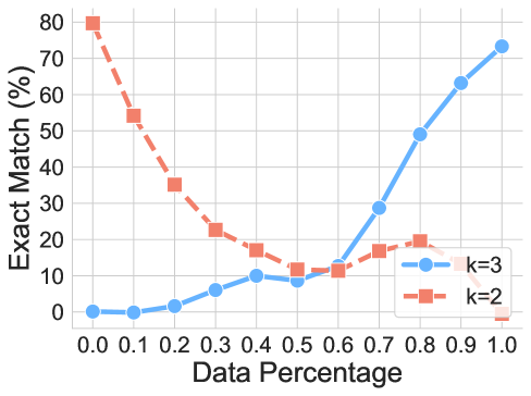
The image is a line chart illustrating the performance of two different parameters, labeled "k=2" and "k=3," across varying "Data Percentage" levels. The chart tracks the "Exact Match (%)" metric, showing how the accuracy of these two parameters evolves as the data percentage increases from 0.0 to 1.0.
### Components/Axes
* **X-Axis:** Labeled "Data Percentage." The scale ranges from 0.0 to 1.0, with major tick marks at intervals of 0.1.
* **Y-Axis:** Labeled "Exact Match (%)." The scale ranges from 0 to 80, with major tick marks at intervals of 10.
* **Legend:** Located in the bottom-right quadrant of the chart area.
* **Blue line with circle markers:** Labeled "k=3"
* **Red/Orange dashed line with square markers:** Labeled "k=2"
* **Grid:** A light gray grid is overlaid on the chart, corresponding to the axis tick marks.
### Detailed Analysis
#### Trend Verification
* **k=3 (Blue, Solid Line):** This series exhibits a generally upward trend. It starts near zero, remains relatively flat until 0.3, experiences a minor dip at 0.5, and then accelerates sharply upward from 0.6 to 1.0.
* **k=2 (Red/Orange, Dashed Line):** This series exhibits a generally downward trend. It starts at the maximum value, drops sharply until 0.5, stabilizes/plateaus between 0.5 and 0.8, and then drops to zero at 1.0.
#### Data Extraction (Approximate Values)
| Data Percentage | k=3 (Blue, Circle) | k=2 (Red/Orange, Square) |
| :--- | :--- | :--- |
| 0.0 | ~0% | ~80% |
| 0.1 | ~0% | ~54% |
| 0.2 | ~2% | ~35% |
| 0.3 | ~6% | ~23% |
| 0.4 | ~10% | ~17% |
| 0.5 | ~9% | ~12% |
| 0.6 | ~13% | ~12% |
| 0.7 | ~29% | ~17% |
| 0.8 | ~49% | ~20% |
| 0.9 | ~63% | ~12% |
| 1.0 | ~74% | ~0% |
### Key Observations
* **Crossover Point:** The two lines intersect between 0.5 and 0.6 on the x-axis. Before this point, $k=2$ outperforms $k=3$. After this point, $k=3$ significantly outperforms $k=2$.
* **Inverse Relationship:** Between 0.0 and 0.5, the two series show a strong inverse relationship, where $k=2$ is declining while $k=3$ is slowly increasing.
* **Anomaly at 1.0:** The $k=2$ series drops abruptly to 0% at the 1.0 Data Percentage mark, which is a sharp deviation from its previous trend.
### Interpretation
This chart likely represents the performance of a machine learning model or a classification algorithm (such as K-Nearest Neighbors) where $k$ represents the number of neighbors or a similar hyperparameter.
* **Performance Characteristics:** The data suggests that $k=2$ is highly effective when the dataset is sparse (low Data Percentage) but fails to generalize or becomes unstable as the dataset grows. Conversely, $k=3$ is ineffective with sparse data but becomes increasingly accurate as more data is introduced, suggesting it is a more robust parameter for larger datasets.
* **The 1.0 Anomaly:** The sudden drop of $k=2$ to 0% at 1.0 suggests a potential edge-case failure, such as an overfitting issue, a specific boundary condition in the test set, or a computational error when the full dataset is utilized.
* **Strategic Insight:** If this were a model selection task, one would choose $k=2$ for low-data environments and $k=3$ for high-data environments. The crossover point (approx. 0.55) serves as the decision threshold for switching between these two configurations.