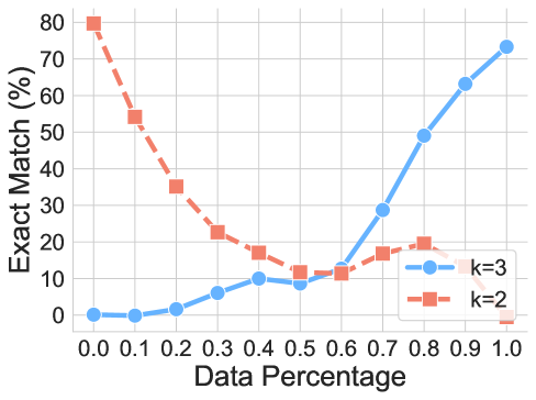
## Line Chart: Exact Match Percentage vs. Data Percentage for k=2 and k=3
### Overview
The image is a line chart comparing the performance of two models or configurations, labeled "k=2" and "k=3", across varying amounts of data. The chart plots the "Exact Match (%)" on the vertical axis against the "Data Percentage" on the horizontal axis. The blue line (k=3) shows a positive correlation, while the orange line (k=2) shows a strong negative correlation.
### Components/Axes
* **Chart Type:** Line chart with markers.
* **X-Axis (Horizontal):**
* **Label:** "Data Percentage"
* **Scale:** Linear, ranging from 0.0 to 1.0.
* **Tick Marks:** Labeled at every 0.1 increment (0.0, 0.1, 0.2, 0.3, 0.4, 0.5, 0.6, 0.7, 0.8, 0.9, 1.0).
* **Y-Axis (Vertical):**
* **Label:** "Exact Match (%)"
* **Scale:** Linear, ranging from 0 to 80.
* **Tick Marks:** Labeled at every 10% increment (0, 10, 20, 30, 40, 50, 60, 70, 80).
* **Legend:**
* **Position:** Bottom-right corner of the chart area.
* **Series 1:** Blue line with circular markers, labeled "k=3".
* **Series 2:** Orange line with square markers, labeled "k=2".
* **Grid:** Light gray gridlines are present for both major x and y ticks.
### Detailed Analysis
**Data Series: k=3 (Blue Line, Circle Markers)**
* **Trend:** The line starts near 0% and exhibits a slow, gradual increase until approximately 0.5 Data Percentage. After this point, the slope increases dramatically, showing a steep, near-linear rise to its peak.
* **Approximate Data Points:**
* Data % 0.0: ~0%
* Data % 0.1: ~0%
* Data % 0.2: ~2%
* Data % 0.3: ~6%
* Data % 0.4: ~10%
* Data % 0.5: ~9% (slight dip)
* Data % 0.6: ~12%
* Data % 0.7: ~29%
* Data % 0.8: ~49%
* Data % 0.9: ~63%
* Data % 1.0: ~73%
**Data Series: k=2 (Orange Line, Square Markers)**
* **Trend:** The line starts at its maximum value and exhibits a steep, consistent decline until approximately 0.5 Data Percentage. After this point, the decline halts, and the line fluctuates at a low level before dropping to near zero at the end.
* **Approximate Data Points:**
* Data % 0.0: ~80%
* Data % 0.1: ~54%
* Data % 0.2: ~35%
* Data % 0.3: ~23%
* Data % 0.4: ~17%
* Data % 0.5: ~12%
* Data % 0.6: ~12%
* Data % 0.7: ~16%
* Data % 0.8: ~19%
* Data % 0.9: ~16%
* Data % 1.0: ~0%
### Key Observations
1. **Inverse Relationship:** The two series demonstrate a clear inverse relationship. As the data percentage increases, the performance of k=3 improves significantly, while the performance of k=2 degrades severely.
2. **Crossover Point:** The lines intersect between Data Percentage 0.5 and 0.6, at an Exact Match value of approximately 12%. This is the point where both configurations perform equally.
3. **Performance Extremes:** k=2 achieves its best performance (~80%) with minimal data (0.0), while k=3 achieves its best performance (~73%) with the full dataset (1.0).
4. **Mid-Range Behavior:** Between 0.5 and 0.9 Data Percentage, k=2 shows a minor recovery and plateau (hovering between ~12% and ~19%) before its final drop, while k=3 enters its phase of rapid improvement.
### Interpretation
This chart likely illustrates a fundamental trade-off in a machine learning or information retrieval context, possibly related to the "k" in a k-nearest neighbors algorithm or a similar parameter.
* **k=2 (Low k):** This configuration appears to be highly specialized or "overfitted" to very small amounts of data. It performs exceptionally well when data is scarce but fails to generalize or improve—and in fact deteriorates—as more data is introduced. The steep initial drop suggests it is highly sensitive to noise or irrelevant information present in larger datasets.
* **k=3 (Higher k):** This configuration shows the classic behavior of a model that benefits from more data. It starts poorly but leverages additional data to build a more robust and accurate representation, leading to strong performance at high data percentages. The slight dip at 0.5 could indicate a transitional phase or a point where the added data introduces temporary complexity before being effectively utilized.
* **The Crossover:** The intersection point is critical. It defines the data regime where one should switch from using k=2 to k=3 to maximize performance. For projects with less than ~55% of the available data, k=2 is superior. For projects with more than ~55% of the data, k=3 is the clear choice.
* **Underlying Principle:** The data suggests that the optimal value of the parameter `k` is not static but is dependent on the volume of available training data. A smaller `k` may be preferable in low-data scenarios, while a larger `k` is necessary to harness the power of large datasets.