```markdown
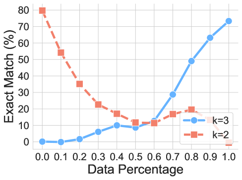
## Line Graph: Exact Match Percentage vs Data Percentage
### Overview
The image depicts a line graph comparing the performance of two models (k=2 and k=3) across varying data percentages. The y-axis represents "Exact Match (%)" (0-80%), and the x-axis represents "Data Percentage" (0.0-1.0). Two data series are plotted: a blue line with circular markers (k=3) and a red dashed line with square markers (k=2).
### Components/Axes
- **X-axis (Data Percentage)**: Labeled "Data Percentage" with tick marks at 0.0, 0.1, 0.2, ..., 1.0.
- **Y-axis (Exact Match %)**: Labeled "Exact Match (%)" with increments of 10 (0-80).
- **Legend**: Located in the top-right corner, with:
- Blue line (solid circles): "k=3"
- Red dashed line (squares): "k=2"
### Detailed Analysis
#### k=3 (Blue Line)
- **Trend**: Starts at 0% (0.0 data), rises gradually to 2% (0.2), dips slightly to 9% (0.5), then surges to 72% (1.0).
- **Key Points**:
- 0.0: 0%
- 0.1: 0%
- 0.2: 2%
- 0.3: 5%
- 0.4: 10%
- 0.5: 9%
- 0.6: 12%
- 0.7: 28%
- 0.8: 48%
- 0.9: 62%
- 1.0: 72%
#### k=2 (Red Dashed Line)
- **Trend**: Starts at 80% (0.0 data), declines steadily to 0% (1.0).
- **Key Points**:
- 0.0: 80%
- 0.1: 55%
- 0.2: 35%
- 0.3: 22%
- 0.4: 18%
- 0.5: 12%
- 0.6: 10%
- 0.7: 16%
- 0.8: 20%
- 0.9: 14%
- 1.0: 0%
### Key Observations
1. **Crossover Point**: At 0.5 data percentage, both models show ~10% exact match, but k=3 overtakes k=2 beyond this point.
2. **k=3 Performance**: Shows a U-shaped curve