\n
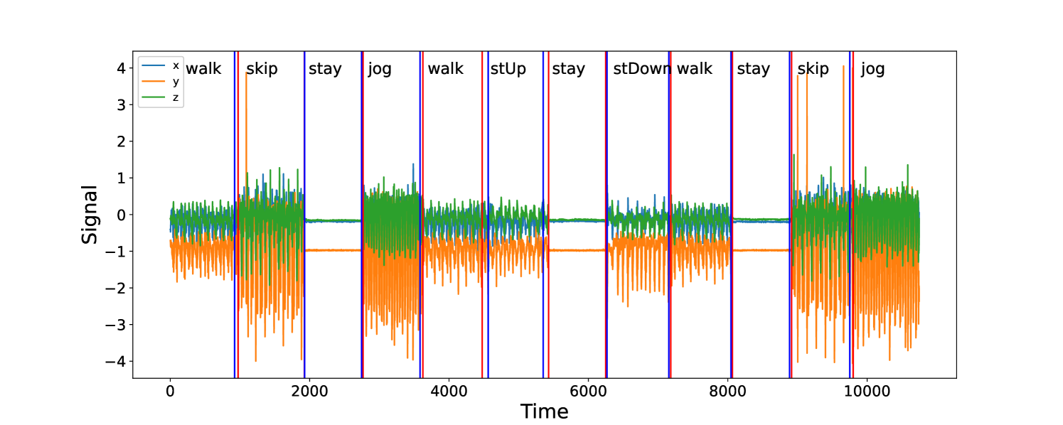
## Line Chart: Sensor Signal Over Time with Activity Labels
### Overview
The image presents a line chart displaying sensor signals (x, y, and z axes) over time. The chart is segmented into sections, each labeled with a different activity: "walk", "skip", "jog", "stay", "stUp" (step up), "stDown" (step down). The chart appears to represent data collected from an accelerometer or similar sensor, showing signal variations corresponding to different human movements.
### Components/Axes
* **X-axis:** "Time" - ranging from approximately 0 to 11000 units.
* **Y-axis:** "Signal" - ranging from approximately -4 to 4 units.
* **Legend:** Located in the top-left corner, defining the color-coding for each axis:
* Orange: "x"
* Blue: "y"
* Green: "z"
* **Activity Labels:** Placed horizontally above the chart, dividing it into segments corresponding to different activities. The labels are: "walk", "skip", "jog", "walk", "stUp", "stay", "stDown", "walk", "stay", "skip", "jog".
* **Vertical Lines:** Purple vertical lines are used to demarcate the boundaries between the activity segments.
### Detailed Analysis
The chart displays three distinct lines representing the x, y, and z signals. Each activity segment exhibits a unique signal pattern.
* **Walk:** The orange "x" signal shows a consistent oscillating pattern with a relatively high amplitude (between -3 and 3). The blue "y" signal is relatively flat, fluctuating around 0. The green "z" signal shows small oscillations around 0.
* **Skip:** The orange "x" signal exhibits a higher frequency oscillation with a larger amplitude (between -3 and 3). The blue "y" signal shows a more pronounced oscillation, and the green "z" signal also shows increased activity.
* **Jog:** Similar to "walk", but with a slightly higher frequency and potentially larger amplitude in the orange "x" signal.
* **Stay:** All three signals (x, y, and z) are relatively flat and close to 0, indicating minimal movement.
* **stUp (Step Up):** The orange "x" signal shows a sharp positive peak, followed by oscillations. The blue "y" signal shows a smaller peak, and the green "z" signal shows a slight increase.
* **stDown (Step Down):** The orange "x" signal shows a sharp negative peak, followed by oscillations. The blue "y" signal shows a smaller peak, and the green "z" signal shows a slight increase.
**Approximate Data Points (sampled at key points within each activity):**
| Activity | Time (approx.) | x Signal | y Signal | z Signal |
|---|---|---|---|---|
| walk | 500 | 2.5 | 0.2 | 0.1 |
| walk | 1500 | -2.0 | -0.1 | 0.0 |
| skip | 2500 | 3.0 | 1.0 | 0.5 |
| skip | 3000 | -2.5 | -0.8 | -0.3 |
| jog | 3500 | 2.0 | 0.3 | 0.2 |
| jog | 4000 | -1.5 | -0.2 | 0.1 |
| walk | 4500 | 2.2 | 0.1 | 0.0 |
| stUp | 5500 | 3.5 | 0.5 | 0.3 |
| stay | 6500 | 0.1 | 0.0 | 0.0 |
| stDown | 7500 | -3.0 | -0.4 | -0.2 |
| walk | 8500 | 2.3 | 0.2 | 0.1 |
| stay | 9500 | 0.0 | 0.0 | 0.0 |
| skip | 10500 | 2.8 | 0.9 | 0.4 |
| jog | 11000 | 1.8 | 0.3 | 0.2 |
### Key Observations
* The "stay" activity consistently shows minimal signal variation across all axes.
* "Skip" exhibits the most dynamic signal patterns, with the highest amplitude and frequency oscillations.
* "stUp" and "stDown" show distinct, sharp peaks in the x-signal, indicating a sudden change in acceleration.
* The "walk" and "jog" activities show similar patterns, but "jog" appears to have slightly higher signal amplitudes.
### Interpretation
The data suggests that the sensor is effectively capturing the different acceleration patterns associated with various human activities. The distinct signal characteristics for each activity could be used to train a machine learning model for activity recognition. The consistent patterns within each activity indicate the reliability of the sensor data. The sharp peaks observed during "stUp" and "stDown" likely correspond to the initial acceleration and deceleration phases of stepping. The relatively flat signals during "stay" confirm the sensor's ability to detect periods of inactivity. The differences in signal amplitude and frequency between "walk" and "jog" likely reflect the increased intensity and speed of jogging. The data provides a clear demonstration of how accelerometer data can be used to characterize and differentiate human movements.