## Time-Series Activity Recognition Plot
### Overview
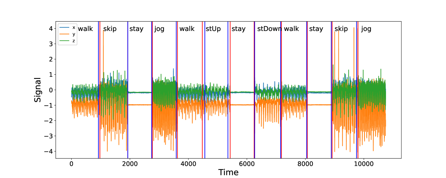
The image displays a time-series plot of three-axis signal data (likely from an accelerometer or similar sensor) recorded over a period of approximately 10,500 time units. The plot is segmented into distinct periods, each labeled with a specific physical activity. The data shows clear, repeating patterns of signal amplitude and variability that correspond to the different activities.
### Components/Axes
* **Y-Axis:** Labeled "Signal". The scale ranges from -4 to +4, with major tick marks at intervals of 1 unit.
* **X-Axis:** Labeled "Time". The scale ranges from 0 to over 10,000, with major tick marks at 0, 2000, 4000, 6000, 8000, and 10000.
* **Legend:** Located in the top-left corner. It defines three data series:
* `x` (blue line)
* `y` (orange line)
* `z` (green line)
* **Activity Segments:** The plot is divided by vertical lines (alternating blue and red) into 13 distinct segments. Each segment is labeled at the top with an activity name. The labels, in order from left to right, are:
1. `walk`
2. `skip`
3. `stay`
4. `jog`
5. `walk`
6. `stUp`
7. `stay`
8. `stDown`
9. `walk`
10. `stay`
11. `skip`
12. `jog`
(Note: The final segment after the last vertical line is unlabeled but appears to be a continuation of `jog`).
### Detailed Analysis
The signal patterns are highly characteristic for each labeled activity:
* **`walk` (Segments 1, 5, 9):** The `x` (blue) and `z` (green) signals show moderate, rhythmic oscillations centered near 0. The `y` (orange) signal is consistently negative, oscillating roughly between -0.5 and -1.5. The overall amplitude is moderate.
* **`skip` (Segments 2, 11):** This activity shows the highest signal variability and amplitude. The `y` (orange) signal exhibits large, sharp negative spikes reaching down to approximately -4. The `z` (green) signal also shows high-amplitude oscillations, frequently exceeding +1. The `x` (blue) signal is more variable than during `walk`.
* **`stay` (Segments 3, 7, 10):** All three signals (`x`, `y`, `z`) are nearly flat lines with minimal noise. The `y` (orange) signal holds a steady value near -1. This indicates a stationary, static posture.
* **`jog` (Segments 4, 12, and final unlabeled segment):** Similar to `walk` but with noticeably higher amplitude and frequency of oscillation in all three axes. The `y` (orange) signal remains negative but fluctuates more widely, between approximately -0.5 and -2.5.
* **`stUp` (Segment 6):** This short segment shows a distinct transition. The signals, particularly `y` (orange), move from the flat "stay" pattern to a more active state, resembling the beginning of a `walk` pattern.
* **`stDown` (Segment 8):** This is the inverse of `stUp`. The active, oscillating signals transition back to the flat, static pattern characteristic of `stay`.
### Key Observations
1. **Activity Signatures:** Each activity has a unique and repeatable "signature" across the three signal axes. `skip` is the most energetic, `stay` is the least.
2. **Consistency:** The patterns for repeated activities (e.g., the first and second `walk`) are visually consistent, suggesting reliable sensor data and distinct movement profiles.
3. **`y`-Axis Bias:** The `y` (orange) signal is predominantly negative across all active movements (`walk`, `skip`, `jog`). This likely reflects the sensor's orientation relative to gravity during these activities.
4. **Transition Clarity:** The `stUp` and `stDown` segments clearly capture the dynamic transition between static (`stay`) and dynamic (`walk`) states.
### Interpretation
This plot is almost certainly data from a wearable inertial measurement unit (IMU) used for **Human Activity Recognition (HAR)**. The three axes (`x`, `y`, `z`) correspond to accelerometer readings.
* **What the data demonstrates:** The plot successfully demonstrates that basic physical activities can be classified based on the temporal patterns of accelerometer data. The clear segmentation shows that a model or algorithm could reliably distinguish between stationary (`stay`), low-intensity (`walk`), and high-intensity (`skip`, `jog`) activities, as well as detect postural transitions (`stUp`, `stDown`).
* **Relationship between elements:** The vertical lines and labels represent the "ground truth" activity annotations. The underlying signal data is the raw input feature for a HAR system. The strong correlation between the label and the signal pattern validates the use of this data for training or testing a classifier.
* **Notable patterns/anomalies:** The most notable pattern is the distinct negative bias and high-amplitude spikes in the `y`-axis during dynamic activities. This is not an anomaly but a critical feature, likely indicating the vertical axis (aligned with gravity) on a body-worn sensor (e.g., on the waist or chest). The consistency of this pattern across different `walk` and `jog` segments is a key finding for feature engineering in an activity recognition pipeline.