\n
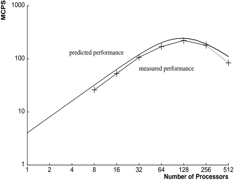
## Chart: Performance vs. Number of Processors
### Overview
The image presents a line chart comparing predicted and measured performance (in MCPS - Millions of Calculations Per Second) as a function of the number of processors. The chart illustrates the scaling behavior of a system as more processors are added.
### Components/Axes
* **X-axis:** Number of Processors. Scale is logarithmic, ranging from 1 to 512. Markers are present at 1, 2, 4, 8, 16, 32, 64, 128, 256, and 512.
* **Y-axis:** MCPS (Millions of Calculations Per Second). Scale is logarithmic, ranging from 1 to 1000. Markers are present at 1, 2, 4, 8, 10, 20, 40, 80, 100, 200, 400, 800, and 1000.
* **Data Series 1:** "predicted performance" - Represented by a solid line.
* **Data Series 2:** "measured performance" - Represented by a line with '+' markers.
* **Legend:** Located in the top-center of the chart, identifying the two data series.
### Detailed Analysis
**Predicted Performance (Solid Line):**
The predicted performance line starts at approximately 5 MCPS with 1 processor. It slopes upward, increasing rapidly until approximately 64 processors, where it reaches a peak of around 250 MCPS. After 64 processors, the line begins to curve downwards, indicating diminishing returns. At 128 processors, the predicted performance is approximately 240 MCPS. At 256 processors, it drops to around 180 MCPS, and at 512 processors, it is approximately 100 MCPS.
**Measured Performance (Line with '+' Markers):**
The measured performance starts at approximately 2 MCPS with 1 processor. It increases steadily, with a steeper slope than the predicted performance initially. At 8 processors, the measured performance is around 15 MCPS. At 16 processors, it reaches approximately 30 MCPS. At 32 processors, it is around 60 MCPS. At 64 processors, the measured performance peaks at approximately 250 MCPS. After 64 processors, the measured performance declines. At 128 processors, it is approximately 220 MCPS. At 256 processors, it drops to around 100 MCPS, and at 512 processors, it is approximately 80 MCPS.
### Key Observations
* The predicted performance and measured performance initially align closely, but diverge after 64 processors.
* Both predicted and measured performance exhibit diminishing returns as the number of processors increases beyond 64.
* The measured performance peaks at 64 processors, while the predicted performance continues to increase, albeit at a slower rate, before eventually declining.
* The measured performance declines more rapidly than the predicted performance after the peak.
### Interpretation
The chart demonstrates the concept of scaling in parallel computing. Initially, adding more processors leads to a significant increase in performance (linear scaling). However, as the number of processors increases, communication overhead and other factors limit the scalability, resulting in diminishing returns. The divergence between predicted and measured performance suggests that the prediction model does not accurately account for these limiting factors. The peak in measured performance indicates the optimal number of processors for this particular system and workload. Beyond this point, adding more processors actually *decreases* overall performance, likely due to increased overhead outweighing the benefits of additional processing power. The difference between the predicted and measured performance after the peak suggests that the model underestimates the impact of these overheads. This data is valuable for optimizing resource allocation and understanding the limitations of parallel processing in this specific context.