\n
## Line Graph: Performance Scaling vs. Processor Count
### Overview
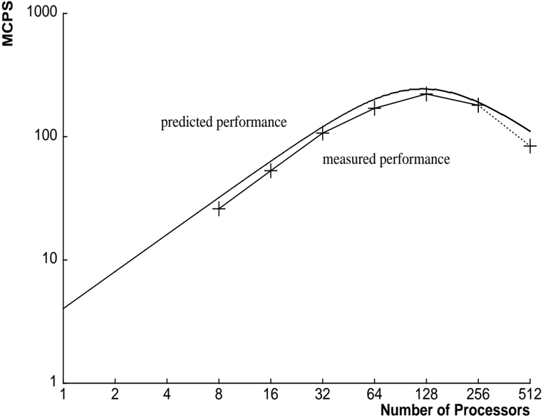
The image is a line graph comparing predicted and measured computational performance (in MCPS) as a function of the number of processors. The graph uses logarithmic scales on both axes to display data spanning several orders of magnitude. The overall trend shows performance increasing with processor count up to a peak, after which it begins to decline.
### Components/Axes
* **Y-Axis (Vertical):**
* **Label:** `MCPS` (Likely stands for Million Connections Per Second or a similar performance metric).
* **Scale:** Logarithmic.
* **Major Tick Marks:** 1, 10, 100, 1000.
* **X-Axis (Horizontal):**
* **Label:** `Number of Processors`.
* **Scale:** Logarithmic.
* **Major Tick Marks:** 1, 2, 4, 8, 16, 32, 64, 128, 256, 512.
* **Data Series & Legend:**
* A legend is positioned in the **center-left** area of the plot.
* **Series 1:** `predicted performance` - Represented by a **solid black line**.
* **Series 2:** `measured performance` - Represented by a **dashed black line** with **plus sign (+) markers** at each data point.
### Detailed Analysis
**Data Series: Predicted Performance (Solid Line)**
* **Trend:** The line shows a smooth, continuous curve. It slopes upward steeply from 1 to ~128 processors, peaks, and then slopes downward.
* **Approximate Data Points:**
* 1 Processor: ~4 MCPS
* 8 Processors: ~20 MCPS
* 16 Processors: ~40 MCPS
* 32 Processors: ~80 MCPS
* 64 Processors: ~150 MCPS
* 128 Processors: ~200 MCPS (Peak)
* 256 Processors: ~180 MCPS
* 512 Processors: ~110 MCPS
**Data Series: Measured Performance (Dashed Line with '+' Markers)**
* **Trend:** The line follows a similar shape to the predicted performance but is consistently lower. It also peaks around 128 processors before declining.
* **Approximate Data Points (from '+' markers):**
* 8 Processors: ~18 MCPS
* 16 Processors: ~35 MCPS
* 32 Processors: ~70 MCPS
* 64 Processors: ~130 MCPS
* 128 Processors: ~180 MCPS (Peak)
* 256 Processors: ~160 MCPS
* 512 Processors: ~80 MCPS
### Key Observations
1. **Performance Peak:** Both predicted and measured performance peak at **128 processors**.
2. **Diminishing Returns & Decline:** After 128 processors, performance begins to degrade for both series. The decline is more pronounced in the measured data.
3. **Prediction Gap:** The predicted performance line is consistently above the measured performance line across all data points, indicating the model overestimates actual system performance.
4. **Scaling Efficiency:** The graph shows near-linear scaling (a straight line on a log-log plot) up to about 32-64 processors, after which the curve flattens, indicating diminishing returns from adding more processors.
### Interpretation
This graph illustrates a classic scalability analysis in parallel computing. The data suggests that the system under test scales efficiently up to a point (around 64-128 processors), where communication overhead, resource contention, or algorithmic limitations begin to dominate, causing performance to plateau and then decrease.
The consistent gap between the `predicted performance` model and the `measured performance` reality highlights the challenge of accurately modeling complex parallel systems. The model captures the general trend but fails to account for all real-world overheads, leading to an optimistic bias.
The critical takeaway is the identification of an **optimal processor count (128)** for this specific workload and system configuration. Deploying more than 128 processors is not only wasteful of resources but actively harmful to performance, a crucial insight for capacity planning and cost optimization. The graph serves as a diagnostic tool, prompting investigation into the specific bottlenecks (e.g., network latency, synchronization costs) that cause the performance drop-off beyond the peak.