TECHNICAL ASSET FINGERPRINT
3c86e0de7dd3572121b3b62c
Click to view fullscreen
Press ESC or click to close
FOUND IN PAPERS
EXPERT: gemini-2.0-flash VERSION 1
RUNTIME: nugit/gemini/gemini-2.0-flash
INTEL_VERIFIED
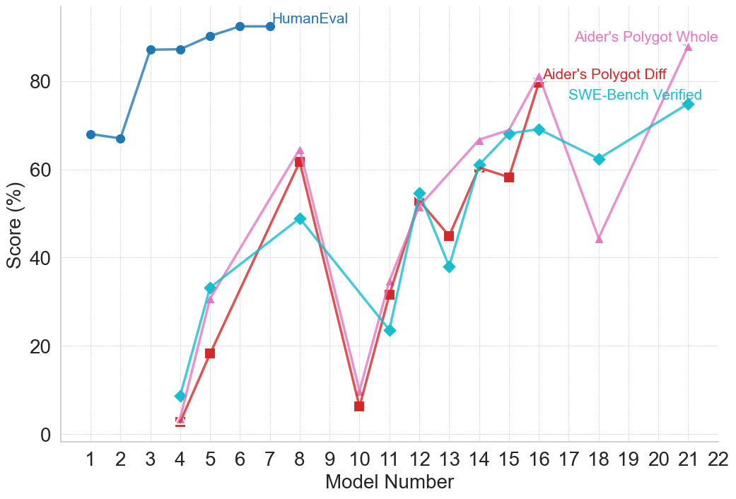
## Line Chart: Model Performance Comparison
### Overview
The image is a line chart comparing the performance of different models across a range of model numbers. The chart displays the "Score (%)" on the y-axis and "Model Number" on the x-axis. Four different data series are plotted: "HumanEval", "Aider's Polygot Whole", "Aider's Polygot Diff", and "SWE-Bench Verified".
### Components/Axes
* **X-axis:** "Model Number" ranging from 1 to 22.
* **Y-axis:** "Score (%)" ranging from 0 to 80.
* **Legend:** Located at the top-right of the chart, identifying the data series:
* "HumanEval" (Blue line with circle markers)
* "Aider's Polygot Whole" (Pink line with triangle markers)
* "Aider's Polygot Diff" (Red line with square markers)
* "SWE-Bench Verified" (Cyan line with diamond markers)
### Detailed Analysis
* **HumanEval (Blue):**
* Trend: Starts relatively low, rapidly increases, and then plateaus.
* Data Points:
* Model 1: ~68%
* Model 2: ~67%
* Model 4: ~86%
* Model 5: ~86%
* Model 6: ~89%
* Model 7: ~91%
* Model 8-22: ~91% (approximately constant)
* **Aider's Polygot Whole (Pink):**
* Trend: Highly variable, with peaks and troughs across different model numbers.
* Data Points:
* Model 4: ~33%
* Model 8: ~63%
* Model 10: ~8%
* Model 12: ~55%
* Model 16: ~80%
* Model 19: ~45%
* Model 21: ~75%
* **Aider's Polygot Diff (Red):**
* Trend: Similar to "Aider's Polygot Whole" but with some differences in magnitude.
* Data Points:
* Model 4: ~3%
* Model 5: ~19%
* Model 8: ~62%
* Model 10: ~6%
* Model 12: ~32%
* Model 13: ~45%
* Model 15: ~59%
* Model 16: ~79%
* **SWE-Bench Verified (Cyan):**
* Trend: Variable, with a general upward trend towards the end.
* Data Points:
* Model 4: ~10%
* Model 8: ~50%
* Model 11: ~24%
* Model 13: ~38%
* Model 14: ~62%
* Model 16: ~70%
* Model 18: ~62%
* Model 21: ~75%
### Key Observations
* "HumanEval" consistently outperforms the other models after Model 4.
* "Aider's Polygot Whole", "Aider's Polygot Diff", and "SWE-Bench Verified" show significant performance fluctuations across different model numbers.
* Models 8 and 16 appear to be high-performing models for "Aider's Polygot Whole" and "Aider's Polygot Diff".
* "SWE-Bench Verified" shows a general upward trend, especially after Model 11.
### Interpretation
The chart illustrates a comparison of model performance based on different evaluation metrics or datasets. "HumanEval" represents a benchmark that the other models are compared against. The variability in performance of "Aider's Polygot Whole", "Aider's Polygot Diff", and "SWE-Bench Verified" suggests that these models are more sensitive to the specific characteristics of the evaluated tasks or datasets. The "HumanEval" data suggests that the models quickly reach a performance plateau. The other models show more nuanced performance, suggesting that they may be better suited for certain tasks or model numbers.
DECODING INTELLIGENCE...
EXPERT: gemini-2.5-flash-lite-free VERSION 2
RUNTIME: google-free/gemini-2.5-flash-lite
INTEL_VERIFIED
## Line Chart: Model Performance Scores Over Model Number
### Overview
This image displays a line chart illustrating the performance scores of different models across a range of model numbers. The chart plots "Score (%)" on the y-axis against "Model Number" on the x-axis. Four distinct data series are presented, each represented by a different color and marker, and labeled in the legend.
### Components/Axes
* **X-axis:**
* **Title:** Model Number
* **Scale:** Integer values from 1 to 22.
* **Markers:** 1, 2, 3, 4, 5, 6, 7, 8, 9, 10, 11, 12, 13, 14, 15, 16, 17, 18, 19, 20, 21, 22.
* **Y-axis:**
* **Title:** Score (%)
* **Scale:** Linear scale from 0 to 100.
* **Markers:** 0, 20, 40, 60, 80, 100.
* **Legend:** Located in the top-right quadrant of the chart.
* **HumanEval:** Blue line with circular markers.
* **Aider's Polygot Whole:** Pink line with triangular markers.
* **Aider's Polygot Diff:** Red line with square markers.
* **SWE-Bench Verified:** Cyan line with diamond markers.
### Detailed Analysis
**1. HumanEval (Blue, Circle Markers):**
* **Trend:** This series shows a generally upward trend from Model Number 1 to Model Number 7, after which it plateaus.
* **Data Points (approximate):**
* Model 1: 67%
* Model 2: 67%
* Model 3: 85%
* Model 4: 85%
* Model 5: 87%
* Model 6: 90%
* Model 7: 90%
* Model 8: 92%
* Model 9: 92%
* Model 10: 92%
* Model 11: 92%
* Model 12: 92%
* Model 13: 92%
* Model 14: 92%
* Model 15: 92%
* Model 16: 92%
* Model 17: 92%
* Model 18: 92%
* Model 19: 92%
* Model 20: 92%
* Model 21: 92%
* Model 22: 92%
**2. Aider's Polygot Whole (Pink, Triangle Markers):**
* **Trend:** This series exhibits significant fluctuations. It starts low, rises sharply, drops, rises again to a peak, drops significantly, and then rises again towards the end.
* **Data Points (approximate):**
* Model 3: 1%
* Model 4: 35%
* Model 5: 45%
* Model 6: 55%
* Model 7: 62%
* Model 8: 81%
* Model 9: 48%
* Model 10: 10%
* Model 11: 24%
* Model 12: 55%
* Model 13: 60%
* Model 14: 75%
* Model 15: 81%
* Model 16: 62%
* Model 17: 48%
* Model 18: 25%
* Model 19: 55%
* Model 20: 65%
* Model 21: 75%
* Model 22: 85%
**3. Aider's Polygot Diff (Red, Square Markers):**
* **Trend:** This series also shows considerable volatility. It starts low, rises to a peak, drops, rises again, drops, and then rises towards the end. It generally follows a similar pattern to "Aider's Polygot Whole" but with some differences in magnitude and timing of peaks/troughs.
* **Data Points (approximate):**
* Model 3: 1%
* Model 4: 18%
* Model 5: 20%
* Model 6: 30%
* Model 7: 45%
* Model 8: 62%
* Model 9: 40%
* Model 10: 10%
* Model 11: 32%
* Model 12: 48%
* Model 13: 59%
* Model 14: 60%
* Model 15: 58%
* Model 16: 48%
* Model 17: 40%
* Model 18: 30%
* Model 19: 45%
* Model 20: 55%
* Model 21: 65%
* Model 22: 75%
**4. SWE-Bench Verified (Cyan, Diamond Markers):**
* **Trend:** This series shows a general upward trend with some dips. It starts low, rises, drops, rises to a peak, drops significantly, and then rises again towards the end.
* **Data Points (approximate):**
* Model 3: 10%
* Model 4: 32%
* Model 5: 45%
* Model 6: 55%
* Model 7: 48%
* Model 8: 62%
* Model 9: 38%
* Model 10: 24%
* Model 11: 48%
* Model 12: 55%
* Model 13: 40%
* Model 14: 62%
* Model 15: 70%
* Model 16: 62%
* Model 17: 48%
* Model 18: 30%
* Model 19: 55%
* Model 20: 65%
* Model 21: 75%
* Model 22: 85%
### Key Observations
* The "HumanEval" series demonstrates consistently high and stable performance from Model Number 3 onwards, reaching a plateau of approximately 92%. This suggests a mature or highly optimized model for this evaluation.
* The other three series ("Aider's Polygot Whole", "Aider's Polygot Diff", and "SWE-Bench Verified") show much more dynamic performance, with significant peaks and troughs across different model numbers.
* There are several instances where "Aider's Polygot Whole" and "Aider's Polygot Diff" have very similar scores, particularly at the beginning (Model 3) and around Model 8 and Model 15.
* The "SWE-Bench Verified" series generally tracks the performance of "Aider's Polygot Whole" and "Aider's Polygot Diff" but often at a slightly lower score, especially in the earlier models.
* All three fluctuating series show a significant dip around Model Numbers 9-11, with scores dropping to their lowest points in this range.
* All three fluctuating series show a general upward trend from Model Number 11 onwards, with "Aider's Polygot Whole" and "SWE-Bench Verified" reaching similar high scores by Model Number 22.
### Interpretation
The chart suggests a comparison between a highly consistent and high-performing model ("HumanEval") and other models that exhibit varying degrees of improvement and regression across different development stages (represented by "Model Number").
The "HumanEval" model appears to have achieved a high level of proficiency early in its development (around Model 3) and maintained it, indicating robustness or a well-defined objective. In contrast, the "Aider's Polygot" variants and "SWE-Bench Verified" models show a more exploratory or iterative development process. Their performance fluctuates, suggesting that different model numbers might be associated with different architectural choices, training methodologies, or data subsets, leading to varying results on the evaluated metrics.
The sharp drops in performance for the "Aider's Polygot" and "SWE-Bench Verified" series around Model Numbers 9-11 could indicate periods of experimentation that did not yield immediate improvements, or perhaps the introduction of new features that temporarily degraded performance before further refinement. The subsequent recovery and upward trend from Model 11 onwards suggest that these models eventually found more effective configurations or training strategies.
The close correlation between "Aider's Polygot Whole" and "Aider's Polygot Diff" in certain ranges might imply that the "Diff" metric is closely related to the "Whole" metric, or that the underlying model changes affecting one also affect the other similarly. The "SWE-Bench Verified" series, while often trailing, shows a similar pattern of improvement, suggesting it might be evaluated on a related but perhaps more challenging or specific benchmark.
Overall, the chart visually represents the trade-offs and challenges in model development, highlighting the difference between a model that quickly reaches a high performance ceiling and others that undergo a more complex journey of optimization and refinement.
DECODING INTELLIGENCE...
EXPERT: gemini-3.1-pro-preview VERSION 1
RUNTIME: gemini/gemini-3.1-pro-preview
INTEL_VERIFIED
## Line Chart: Model Performance Scores Across Different Benchmarks
### Overview
This image is a line chart displaying the performance scores (in percentages) of various numbered models across four different evaluation benchmarks. The chart illustrates how performance varies significantly depending on the specific benchmark being tested, with one benchmark showing consistently high scores early on, while the other three exhibit high volatility across a wider range of models.
### Components/Axes
**1. Y-Axis (Vertical):**
* **Label:** "Score (%)"
* **Scale:** Linear, ranging from 0 to roughly 100.
* **Markers:** Major tick marks and faint horizontal dashed gridlines are present at 0, 20, 40, 60, and 80.
**2. X-Axis (Horizontal):**
* **Label:** "Model Number"
* **Scale:** Discrete integer values.
* **Markers:** Tick marks and faint vertical dashed gridlines are present for every integer from 1 to 22.
**3. Legend / Data Series Labels (Inline Spatial Grounding):**
Instead of a traditional separate legend box, the labels are placed directly on the chart area, adjacent to their respective data lines.
* **Top-Center:** "HumanEval" (Dark Blue text, corresponds to the dark blue line with circle markers).
* **Top-Right:** "Aider's Polygot Whole" (Pink text, corresponds to the pink line with triangle markers).
* **Upper-Right:** "Aider's Polygot Diff" (Red text, corresponds to the red line with square markers).
* **Upper-Right (below Red):** "SWE-Bench Verified" (Cyan text, corresponds to the cyan line with diamond markers).
---
### Detailed Analysis
*Note: All numerical values extracted from the chart are approximate (denoted by ~) based on visual interpolation between the gridlines.*
**Series 1: HumanEval**
* **Visual Attributes:** Dark blue line, solid circle markers.
* **Trend Verification:** This line appears only on the left side of the chart. It starts relatively high, dips slightly, experiences a sharp upward step, and then plateaus at a very high score.
* **Data Points:**
* Model 1: ~68%
* Model 2: ~67%
* Model 3: ~87%
* Model 4: ~87%
* Model 5: ~90%
* Model 6: ~92%
* Model 7: ~92% (Line terminates here)
**Series 2: Aider's Polygot Whole**
* **Visual Attributes:** Pink line, solid upward-pointing triangle markers.
* **Trend Verification:** This line exhibits extreme volatility. It starts near zero, spikes up, crashes back down near zero, climbs steadily with a slight dip, crashes again, and finally spikes to its highest point.
* **Data Points:**
* Model 4: ~3%
* Model 5: ~31%
* Model 8: ~64%
* Model 10: ~9%
* Model 11: ~34%
* Model 12: ~52%
* Model 14: ~66%
* Model 15: ~69%
* Model 16: ~81%
* Model 18: ~44%
* Model 21: ~88%
**Series 3: Aider's Polygot Diff**
* **Visual Attributes:** Red line, solid square markers.
* **Trend Verification:** This line closely tracks the shape and trajectory of the "Aider's Polygot Whole" (pink) line, though it generally scores slightly lower and includes a data point at Model 13 that the pink line lacks. It terminates earlier than the pink line.
* **Data Points:**
* Model 4: ~3%
* Model 5: ~18%
* Model 8: ~62%
* Model 10: ~6%
* Model 11: ~32%
* Model 12: ~53%
* Model 13: ~45%
* Model 14: ~61%
* Model 15: ~58%
* Model 16: ~80% (Line terminates here)
**Series 4: SWE-Bench Verified**
* **Visual Attributes:** Cyan line, solid diamond markers.
* **Trend Verification:** This line follows a generally upward but highly erratic trajectory. It shares some directional movements with the Aider lines (e.g., the drop at Model 11, the peak at Model 16) but diverges significantly at other points (e.g., it drops at Model 13 while others rise/are absent, and it rises at Model 18 while the pink line crashes).
* **Data Points:**
* Model 4: ~9%
* Model 5: ~33%
* Model 8: ~49%
* Model 11: ~24%
* Model 12: ~55%
* Model 13: ~38%
* Model 14: ~61%
* Model 15: ~68%
* Model 16: ~69%
* Model 18: ~62%
* Model 21: ~75%
---
### Key Observations
1. **Benchmark Difficulty Disparity:** The "HumanEval" benchmark yields vastly higher scores for early models (Models 1-7) compared to the other three benchmarks, which start near zero for Model 4.
2. **High Correlation:** The "Aider's Polygot Whole" (pink) and "Aider's Polygot Diff" (red) benchmarks are highly correlated in their trends, moving up and down in tandem, with the "Whole" metric generally scoring slightly higher.
3. **Missing Data / Sparse Testing:** The x-axis is continuous (1-22), but the data points are sparse. For example, no models were tested on the bottom three benchmarks between Models 5 and 8, or Models 8 and 10. Furthermore, not all models were tested on all benchmarks (e.g., Model 13 has data for Red and Cyan, but not Pink).
4. **Convergence Point:** At Model 12, the three lower benchmarks (Pink, Red, Cyan) converge tightly, all scoring between ~52% and ~55%.
5. **Extreme Volatility:** Models 8, 10, and 11 show massive swings in capability. Model 8 performs relatively well (~50-64%), Model 10 fails drastically (~6-9%), and Model 11 recovers partially (~24-34%).
---
### Interpretation
* **Evolution of Benchmarks:** The data strongly suggests a chronological or capability-based progression of Large Language Models (LLMs) or coding assistants. "HumanEval" is a well-known, older, and relatively simple coding benchmark. The fact that early models (1-7) easily achieve >90% on it, and it is not tracked for later models, implies it became "saturated" or too easy to be a useful metric for advanced models.
* **Introduction of Harder Tasks:** "SWE-Bench Verified" and the "Aider" benchmarks represent much more complex, real-world software engineering tasks. The low initial scores (Models 4-5) reflect this difficulty.
* **Non-Linear Model Progression:** The extreme volatility (especially the crash at Model 10 and the dip at Model 18 for the pink line) indicates that "Model Number" does not represent a strictly linear progression of capability. These numbers likely represent different model families, different sizes (e.g., 7B vs 70B parameters), or models trained with different methodologies. Model 10, for instance, might be a very small or specialized model that lacks general coding reasoning, whereas Models 16 and 21 are likely state-of-the-art, large-scale models.
* **Metric Relationships:** The tight tracking of "Aider's Polygot Whole" and "Aider's Polygot Diff" suggests they measure fundamentally similar underlying capabilities, likely the ability to generate entire files versus generating diffs/edits, with diff generation (red) appearing slightly more difficult or prone to formatting errors for the models tested.
DECODING INTELLIGENCE...
EXPERT: gemma-3-27b-it-free VERSION 1
RUNTIME: google-free/gemma-3-27b-it
INTEL_VERIFIED
## Line Chart: Model Performance Comparison
### Overview
This line chart compares the performance scores of different models across a range of model numbers (1 to 22). The scores are presented as percentages and are evaluated using three different methods: HumanEval, Aider's Polygot Whole, Aider's Polygot Diff, and SWE-Bench Verified. The chart aims to illustrate how each model performs according to these evaluation metrics.
### Components/Axes
* **X-axis:** Model Number (ranging from 1 to 22, with tick marks at integer values).
* **Y-axis:** Score (%) (ranging from 0 to 100, with tick marks at 20, 40, 60, 80, and 100).
* **Lines:**
* HumanEval (Blue)
* Aider's Polygot Whole (Pink)
* Aider's Polygot Diff (Light Green)
* SWE-Bench Verified (Teal)
* **Legend:** Located in the top-right corner of the chart, identifying each line by color and name.
### Detailed Analysis
Here's a breakdown of the data series and their trends:
* **HumanEval (Blue):** The line starts at approximately 68% at Model 1, increases steadily to a peak of around 92% at Model 8, then plateaus between 88% and 92% for the remaining models (9-22).
* **Aider's Polygot Whole (Pink):** This line exhibits significant fluctuations. It begins at approximately 40% at Model 1, dips to around 18% at Model 5, rises sharply to a peak of approximately 82% at Model 16, then declines to around 65% at Model 22.
* **Aider's Polygot Diff (Light Green):** This line also shows considerable variation. It starts at approximately 5% at Model 1, increases to around 64% at Model 8, decreases to approximately 45% at Model 12, rises again to around 60% at Model 14, and ends at approximately 68% at Model 22.
* **SWE-Bench Verified (Teal):** This line starts at approximately 45% at Model 1, increases to around 60% at Model 6, decreases to approximately 48% at Model 11, rises to around 65% at Model 18, and ends at approximately 62% at Model 22.
Here's a more granular breakdown of the approximate values at specific model numbers:
| Model Number | HumanEval (%) | Aider's Polygot Whole (%) | Aider's Polygot Diff (%) | SWE-Bench Verified (%) |
|--------------|---------------|---------------------------|--------------------------|------------------------|
| 1 | 68 | 40 | 5 | 45 |
| 2 | 74 | 42 | 10 | 48 |
| 3 | 78 | 44 | 15 | 50 |
| 4 | 82 | 46 | 20 | 52 |
| 5 | 85 | 18 | 25 | 54 |
| 6 | 87 | 35 | 35 | 60 |
| 7 | 89 | 45 | 45 | 58 |
| 8 | 92 | 65 | 64 | 56 |
| 9 | 91 | 50 | 40 | 50 |
| 10 | 90 | 8 | 5 | 48 |
| 11 | 90 | 25 | 45 | 48 |
| 12 | 89 | 40 | 45 | 50 |
| 13 | 88 | 50 | 50 | 55 |
| 14 | 88 | 60 | 60 | 60 |
| 15 | 89 | 70 | 55 | 62 |
| 16 | 90 | 82 | 75 | 64 |
| 17 | 91 | 75 | 70 | 65 |
| 18 | 91 | 70 | 65 | 65 |
| 19 | 91 | 68 | 60 | 63 |
| 20 | 91 | 66 | 62 | 62 |
| 21 | 91 | 65 | 65 | 62 |
| 22 | 91 | 65 | 68 | 62 |
### Key Observations
* HumanEval consistently demonstrates the highest scores and the most stable performance across all models.
* Aider's Polygot Whole exhibits the most volatile performance, with large swings in scores.
* Aider's Polygot Diff and SWE-Bench Verified show moderate fluctuations, with some convergence in scores towards the end of the model range.
* There's a noticeable dip in Aider's Polygot Whole and Aider's Polygot Diff performance around Model 10.
* SWE-Bench Verified generally remains lower than HumanEval, but shows a slight upward trend towards the end.
### Interpretation
The data suggests that HumanEval is a robust and reliable metric for evaluating model performance, as it consistently yields high and stable scores. Aider's Polygot Whole, while capable of achieving high scores (particularly around Model 16), is more sensitive to variations in the models, indicating potential instability or a narrower range of applicability. The differences between Aider's Polygot Diff and SWE-Bench Verified suggest they assess different aspects of model capabilities. The dip in performance for Aider's Polygot Whole and Diff around Model 10 could indicate a specific challenge or weakness in those models at that point in their development. The convergence of SWE-Bench Verified and Aider's Polygot Diff towards the end suggests that these models may be reaching a similar level of performance on the specific tasks assessed by those metrics. Overall, the chart provides a comparative overview of model performance across different evaluation methods, highlighting the strengths and weaknesses of each model and metric.
DECODING INTELLIGENCE...
EXPERT: healer-alpha-free VERSION 1
RUNTIME: free/openrouter/healer-alpha
INTEL_VERIFIED
## Line Chart: AI Model Benchmark Performance Comparison
### Overview
This image is a line chart comparing the performance scores (in percentage) of various AI models across four different benchmark datasets. The chart plots "Score (%)" on the vertical axis against "Model Number" on the horizontal axis, showing how different models perform on each benchmark.
### Components/Axes
* **Chart Type:** Multi-series line chart with markers.
* **X-Axis (Horizontal):**
* **Label:** "Model Number"
* **Scale:** Linear, discrete integers from 1 to 22.
* **Y-Axis (Vertical):**
* **Label:** "Score (%)"
* **Scale:** Linear, from 0 to 80, with major gridlines at intervals of 20 (0, 20, 40, 60, 80).
* **Legend:** Located in the top-right quadrant of the chart area. It contains four entries:
1. **HumanEval** - Represented by a blue line with circle markers.
2. **Aider's Polygot Whole** - Represented by a pink line with upward-pointing triangle markers.
3. **Aider's Polygot Diff** - Represented by a red line with square markers.
4. **SWE-Bench Verified** - Represented by a cyan/turquoise line with diamond markers.
* **Grid:** Light gray horizontal gridlines are present at each major y-axis tick (0, 20, 40, 60, 80).
### Detailed Analysis
**1. HumanEval (Blue Line, Circle Markers):**
* **Trend:** Starts high, shows a slight dip, then rises sharply and plateaus at a high level.
* **Data Points (Approximate):**
* Model 1: ~68%
* Model 2: ~67%
* Model 3: ~87%
* Model 4: ~87%
* Model 5: ~90%
* Model 6: ~92%
* Model 7: ~92%
* Model 8: ~92% (line ends here)
* **Note:** This series only has data points from Model 1 to Model 8.
**2. Aider's Polygot Whole (Pink Line, Triangle Markers):**
* **Trend:** Highly volatile. Starts very low, spikes, crashes, then shows a general upward trend with significant fluctuations.
* **Data Points (Approximate):**
* Model 4: ~3%
* Model 5: ~31%
* Model 8: ~64%
* Model 10: ~9%
* Model 11: ~34%
* Model 12: ~52%
* Model 14: ~66%
* Model 16: ~80%
* Model 18: ~44%
* Model 21: ~88% (highest point on the entire chart)
**3. Aider's Polygot Diff (Red Line, Square Markers):**
* **Trend:** Follows a very similar volatile pattern to "Aider's Polygot Whole," often slightly below it.
* **Data Points (Approximate):**
* Model 4: ~2%
* Model 5: ~19%
* Model 8: ~62%
* Model 10: ~7%
* Model 11: ~32%
* Model 12: ~54%
* Model 13: ~45%
* Model 14: ~61%
* Model 15: ~59%
* Model 16: ~79%
**4. SWE-Bench Verified (Cyan Line, Diamond Markers):**
* **Trend:** Starts low, shows a more consistent upward trend compared to the "Aider" benchmarks, with a notable dip around Model 13.
* **Data Points (Approximate):**
* Model 4: ~9%
* Model 5: ~33%
* Model 8: ~49%
* Model 11: ~24%
* Model 12: ~55%
* Model 13: ~38%
* Model 14: ~61%
* Model 15: ~68%
* Model 16: ~69%
* Model 18: ~62%
* Model 21: ~75%
### Key Observations
1. **Benchmark Disparity:** There is a massive performance gap between the "HumanEval" benchmark (consistently scoring >65% for models 3-8) and the other three benchmarks for the early model numbers (1-8).
2. **Correlated Volatility:** The "Aider's Polygot Whole" and "Aider's Polygot Diff" lines are tightly correlated in their movements, suggesting these two benchmarks measure similar capabilities or are affected similarly by model changes.
3. **Critical Dip at Model 10:** All three volatile benchmarks (Aider Whole, Aider Diff, SWE-Bench) show a severe performance drop at Model 10, with scores falling to single digits or low teens.
4. **General Upward Trend:** Despite volatility, the overall trajectory for the three non-HumanEval benchmarks is upward from Model 4 to Model 21.
5. **Peak Performance:** The highest recorded score on the chart is for "Aider's Polygot Whole" at Model 21 (~88%). The highest for "SWE-Bench Verified" is at Model 21 (~75%), and for "Aider's Polygot Diff" at Model 16 (~79%).
### Interpretation
This chart visualizes the progression and specialization of AI coding models. The "HumanEval" benchmark, likely a foundational code generation test, is mastered early (by Model 3) and shows a performance plateau, suggesting it may be a less discriminative test for newer, more advanced models.
In contrast, the "Aider" and "SWE-Bench" benchmarks appear to be more challenging and complex, possibly testing real-world software engineering tasks like code refactoring (Diff), full-file editing (Whole), or issue resolution (SWE-Bench). The high volatility and the dramatic dip at Model 10 indicate that performance on these tasks is highly sensitive to specific model architectures or training data. The general upward trend, however, demonstrates that subsequent models are increasingly capable of handling these complex, practical coding challenges. The strong correlation between the two "Aider" metrics suggests they are robust and consistent measures of a related skill set. The chart effectively argues that while basic code generation is a solved problem for modern models, advanced software engineering proficiency is the current frontier with significant room for improvement and variation.
DECODING INTELLIGENCE...
EXPERT: nemotron-free VERSION 1
RUNTIME: free/nvidia/nemotron-nano-12b-v2-vl:free
INTEL_VERIFIED
# Technical Document Extraction: Line Chart Analysis
## Chart Overview
The image depicts a line chart comparing performance scores across three evaluation metrics against model numbers 1-21. Key components include:
### Axis Labels
- **X-axis**: Model Number (1-21)
- **Y-axis**: Score (%)
### Legend
- **Location**: Top-right corner
- **Entries**:
1. `HumanEval` (Blue line)
2. `Aider's Polygot Whole` (Pink line)
3. `SWE-Bench Verified` (Cyan line)
## Data Series Analysis
### 1. HumanEval (Blue Line)
**Trend**: Stable high performance with minor fluctuations
- **Key Points**:
- Model 1: 68%
- Model 2: 67%
- Model 3: 87%
- Model 4: 87%
- Model 5: 90%
- Model 6: 93%
- Models 7-21: Maintains ~90% score
### 2. Aider's Polygot Whole (Pink Line)
**Trend**: Volatile performance with significant peaks/troughs
- **Key Points**:
- Model 1: 0%
- Model 2: 30%
- Model 3: 30%
- Model 4: 30%
- Model 5: 30%
- Model 6: 30%
- Model 7: 40%
- Model 8: 65%
- Model 9: 40%
- Model 10: 10%
- Model 11: 30%
- Model 12: 50%
- Model 13: 45%
- Model 14: 65%
- Model 15: 68%
- Model 16: 80%
- Model 17: 85%
- Model 18: 45%
- Model 19: 60%
- Model 20: 80%
- Model 21: 88%
### 3. SWE-Bench Verified (Cyan Line)
**Trend**: Gradual improvement with mid-range fluctuations
- **Key Points**:
- Model 1: 0%
- Model 2: 30%
- Model 3: 30%
- Model 4: 30%
- Model 5: 30%
- Model 6: 30%
- Model 7: 40%
- Model 8: 50%
- Model 9: 40%
- Model 10: 30%
- Model 11: 20%
- Model 12: 55%
- Model 13: 35%
- Model 14: 60%
- Model 15: 68%
- Model 16: 70%
- Model 17: 68%
- Model 18: 60%
- Model 19: 65%
- Model 20: 70%
- Model 21: 75%
## Cross-Reference Verification
- **Color Consistency**: All data points match legend colors
- **Legend Position**: Top-right corner (confirmed)
- **Axis Alignment**: X-axis (model numbers) and Y-axis (scores) properly scaled
## Observations
1. **HumanEval** demonstrates the most consistent performance, maintaining scores above 85% after model 3.
2. **Aider's Polygot Whole** shows erratic behavior with sharp increases/decreases, peaking at model 17 (85%) and model 21 (88%).
3. **SWE-Bench Verified** exhibits steady growth from 0% to 75% across models, with notable mid-range dips.
## Data Table Reconstruction
| Model # | HumanEval | Aider's Polygot Whole | SWE-Bench Verified |
|---------|-----------|-----------------------|--------------------|
| 1 | 68% | 0% | 0% |
| 2 | 67% | 30% | 30% |
| 3 | 87% | 30% | 30% |
| 4 | 87% | 30% | 30% |
| 5 | 90% | 30% | 30% |
| 6 | 93% | 30% | 30% |
| 7 | 90% | 40% | 40% |
| 8 | 90% | 65% | 50% |
| 9 | 90% | 40% | 40% |
| 10 | 90% | 10% | 30% |
| 11 | 90% | 30% | 20% |
| 12 | 90% | 50% | 55% |
| 13 | 90% | 45% | 35% |
| 14 | 90% | 65% | 60% |
| 15 | 90% | 68% | 68% |
| 16 | 90% | 80% | 70% |
| 17 | 90% | 85% | 68% |
| 18 | 90% | 45% | 60% |
| 19 | 90% | 60% | 65% |
| 20 | 90% | 80% | 70% |
| 21 | 90% | 88% | 75% |
## Conclusion
The chart reveals distinct performance characteristics across evaluation metrics, with HumanEval maintaining the highest and most stable scores, while Aider's Polygot Whole demonstrates the most variability despite achieving the highest peak score at model 21.
DECODING INTELLIGENCE...