## Line Graphs: Cosine Similarity Over Time with Different Prompts
### Overview
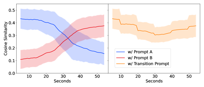
The image contains two line graphs comparing cosine similarity over time (in seconds) for three different prompts: Prompt A (blue), Prompt B (red), and Transition Prompt (orange). The left graph shows overlapping trends for Prompt A and B, while the right graph isolates the Transition Prompt's performance. Shaded regions around each line indicate variability or confidence intervals.
---
### Components/Axes
- **Left Graph**:
- **X-axis**: "Seconds" (0–50), linear scale.
- **Y-axis**: "Cosine Similarity" (0.0–0.5), linear scale.
- **Legend**: Located at the bottom-right corner, labels:
- Blue line: "w/ Prompt A"
- Red line: "w/ Prompt B"
- **Shaded Areas**: Gray regions around each line (likely representing standard deviation or confidence intervals).
- **Right Graph**:
- **X-axis**: "Seconds" (0–50), linear scale.
- **Y-axis**: "Cosine Similarity" (0.0–0.5), linear scale.
- **Legend**: Located at the bottom-right corner, label:
- Orange line: "w/ Transition Prompt"
- **Shaded Area**: Light orange region around the line.
---
### Detailed Analysis
#### Left Graph (Prompt A vs. Prompt B)
1. **Prompt A (Blue Line)**:
- Starts at ~0.45 at 0 seconds.
- Decreases steadily to ~0.35 at 50 seconds.
- Shaded area widens slightly between 20–40 seconds, indicating increased variability.
2. **Prompt B (Red Line)**:
- Starts at ~0.1 at 0 seconds.
- Increases steadily to ~0.35 at 50 seconds.
- Shaded area remains narrow throughout, suggesting stable performance.
3. **Intersection**:
- The blue and red lines cross near **30 seconds**, where both reach ~0.35 cosine similarity.
#### Right Graph (Transition Prompt)
1. **Transition Prompt (Orange Line)**:
- Starts at ~0.4 at 0 seconds.
- Dips to ~0.35 at ~20 seconds.
- Rises to ~0.4 by 50 seconds.
- Shaded area is narrowest at the dip (20–30 seconds) and widens slightly at the start/end.
---
### Key Observations
1. **Prompt A vs. Prompt B**:
- Prompt A shows a consistent decline in cosine similarity over time.
- Prompt B demonstrates a steady improvement, surpassing Prompt A after ~30 seconds.
- The intersection at 30 seconds suggests a critical point where Prompt B becomes more effective.
2. **Transition Prompt**:
- Exhibits a temporary dip in performance (~20–30 seconds) before stabilizing.
- The shaded area indicates lower variability during the dip, possibly due to a controlled transition phase.
3. **Shaded Regions**:
- Prompt A’s wider shaded area (20–40s) implies greater uncertainty in its performance during this interval.
- Transition Prompt’s narrowest shaded region aligns with its lowest cosine similarity, suggesting reduced variability during the dip.
---
### Interpretation
- **Prompt Effectiveness**: Prompt B outperforms Prompt A over time, with a clear crossover at 30 seconds. This may indicate that Prompt B is better suited for longer-term tasks or scenarios requiring sustained similarity.
- **Transition Prompt Behavior**: The dip in cosine similarity could represent a calibration or adjustment phase, after which performance stabilizes. The narrow shaded area during the dip suggests this phase is predictable or controlled.
- **Variability**: Prompt A’s wider confidence intervals (20–40s) highlight instability, whereas Prompt B and Transition Prompt show tighter variability, implying more reliable outcomes.
This analysis suggests that prompt design significantly impacts performance metrics over time, with Prompt B and Transition Prompt offering more stable or adaptive results depending on the task phase.