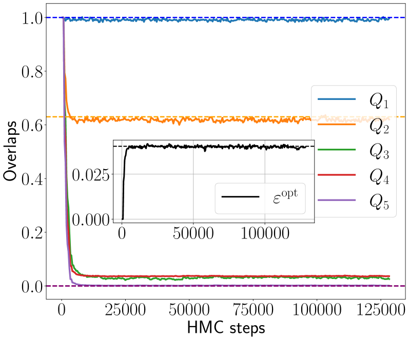
## Line Chart: Overlaps vs. HMC Steps
### Overview
This image presents a line chart illustrating the relationship between "HMC steps" (Hamiltonian Monte Carlo steps) on the x-axis and "Overlaps" on the y-axis. Five different lines, labeled Q1 through Q5, represent different data series. A smaller inset chart displays a line representing "εopt" (epsilon optimal) against HMC steps. The chart appears to be tracking the convergence of some sampling process.
### Components/Axes
* **X-axis:** "HMC steps" ranging from 0 to approximately 125,000.
* **Y-axis:** "Overlaps" ranging from 0.0 to 1.0.
* **Lines:**
* Q1 (Blue)
* Q2 (Orange)
* Q3 (Green)
* Q4 (Red)
* Q5 (Purple)
* **Inset Chart:**
* **X-axis:** "HMC steps" ranging from 0 to approximately 50,000.
* **Y-axis:** Values ranging from 0.000 to 0.025.
* **Line:** εopt (Black)
* **Legend:** Located in the top-right corner, associating colors with the Q1-Q5 labels.
### Detailed Analysis
**Main Chart:**
* **Q1 (Blue):** The line starts at approximately 0.98 and remains relatively stable around 0.95-1.0 throughout the entire range of HMC steps. It shows minimal fluctuation.
* **Q2 (Orange):** The line begins at approximately 0.65 and exhibits some initial fluctuation, stabilizing around 0.62-0.68 after approximately 25,000 HMC steps.
* **Q3 (Green):** The line starts at approximately 0.1 and rapidly decreases to near 0 within the first 10,000 HMC steps, remaining close to 0 for the rest of the chart.
* **Q4 (Red):** The line begins at approximately 0.8 and rapidly decreases to approximately 0.1 within the first 10,000 HMC steps. It then plateaus around 0.05-0.1 for the remainder of the chart.
* **Q5 (Purple):** The line starts at approximately 0.02 and remains relatively stable around 0.02-0.03 throughout the entire range of HMC steps.
**Inset Chart:**
* **εopt (Black):** The line shows a rapid increase from approximately 0.005 at 0 HMC steps to a peak of approximately 0.023 at around 10,000 HMC steps. After this peak, it fluctuates around 0.018-0.022 for the rest of the chart.
### Key Observations
* Q1 exhibits high and stable overlap values, suggesting strong convergence or a consistently high acceptance rate.
* Q3 and Q5 have very low overlap values, indicating they are not contributing significantly to the sampling process after the initial steps.
* Q4 shows a rapid decrease in overlap, suggesting it initially contributes but then stabilizes at a low value.
* The εopt line in the inset chart shows an initial increase, indicating optimization of a parameter, followed by stabilization.
* The rapid initial decrease in Q3 and Q4 suggests a quick burn-in period where these parameters are adjusted.
### Interpretation
The chart likely represents the convergence behavior of a Markov Chain Monte Carlo (MCMC) sampling process, specifically using Hamiltonian Monte Carlo (HMC). The "Overlaps" metric likely represents the acceptance rate of proposed samples.
* **Q1's** consistently high overlap suggests it's a well-behaved parameter that is readily accepted during sampling.
* **Q3 and Q5's** low overlaps indicate they may be poorly scaled or have other issues preventing efficient sampling.
* **Q4's** initial high overlap followed by a rapid decrease suggests it initially contributes to the sampling but then becomes less effective.
* The **εopt** line represents the optimal step size parameter for the HMC algorithm. The initial increase and subsequent stabilization suggest the algorithm is finding a good step size and maintaining it.
The overall trend suggests that the sampling process is converging, as indicated by the stabilization of most lines. However, the low overlap values for Q3 and Q5 suggest that these parameters may require further tuning or investigation. The inset chart provides insight into the optimization of the HMC algorithm's step size parameter. The rapid initial changes in Q3 and Q4 suggest a burn-in period where the algorithm adjusts to the parameter space.