# Technical Document Extraction: Feedback Collection Training Set
## Chart Overview
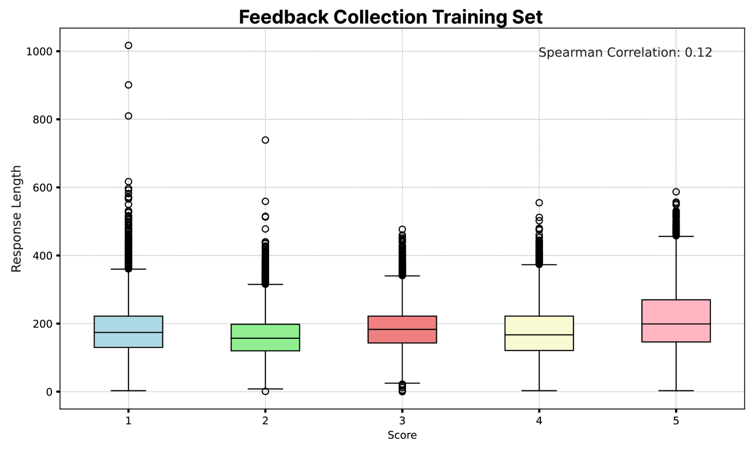
The image presents a **box plot** titled **"Feedback Collection Training Set"** with a **Spearman Correlation** value of **0.12** (weak positive relationship). The chart visualizes the distribution of **Response Length** across five **Score** categories (1–5).
---
### Key Components
1. **Axes**:
- **X-axis**: Labeled **"Score"**, with discrete categories **1, 2, 3, 4, 5**.
- **Y-axis**: Labeled **"Response Length"**, scaled from **0 to 1000** in increments of 200.
2. **Legend**:
- Located at **[x: 0.8, y: 0.95]** (top-right corner).
- Maps colors to **Score** categories:
- **Blue**: Score 1
- **Green**: Score 2
- **Red**: Score 3
- **Yellow**: Score 4
- **Pink**: Score 5
3. **Data Representation**:
- Each **Score** category has a corresponding **box plot** (IQR, median, whiskers) and **outliers** (marked with open circles).
- Outliers are defined as points outside the whiskers (1.5×IQR).
---
### Data Trends and Observations
1. **Score 1 (Blue)**:
- **Median**: ~180
- **IQR**: ~150–220
- **Outliers**: 1000, 900, 800, 600, 500, 400, 300
- **Trend**: High variability with extreme outliers.
2. **Score 2 (Green)**:
- **Median**: ~160
- **IQR**: ~120–180
- **Outliers**: 500, 400, 300
- **Trend**: Moderate spread with fewer outliers.
3. **Score 3 (Red)**:
- **Median**: ~180
- **IQR**: ~140–220
- **Outliers**: 500, 400
- **Trend**: Similar median to Score 1 but tighter distribution.
4. **Score 4 (Yellow)**:
- **Median**: ~160
- **IQR**: ~120–180
- **Outliers**: 500, 400
- **Trend**: Consistent with Score 2 but slightly higher median.
5. **Score 5 (Pink)**:
- **Median**: ~220
- **IQR**: ~180–260
- **Outliers**: 600, 500, 400
- **Trend**: Highest median and moderate outliers.
---
### Spatial Grounding and Validation
- **Legend Colors**: Confirmed to match box plot colors (e.g., blue for Score 1, pink for Score 5).
- **Outlier Placement**: Outliers are consistently marked above/below whiskers across all categories.
- **Spearman Correlation**: Value **0.12** suggests a weak positive trend between **Score** and **Response Length**.
---
### Missing Elements
- No **data table** is present in the image.
- No textual annotations beyond axis labels, title, and legend.
---
### Conclusion
The chart highlights variability in **Response Length** across **Score** categories, with **Score 1** exhibiting the highest outliers and **Score 5** the highest median. The weak positive correlation (0.12) indicates a minimal relationship between these variables.