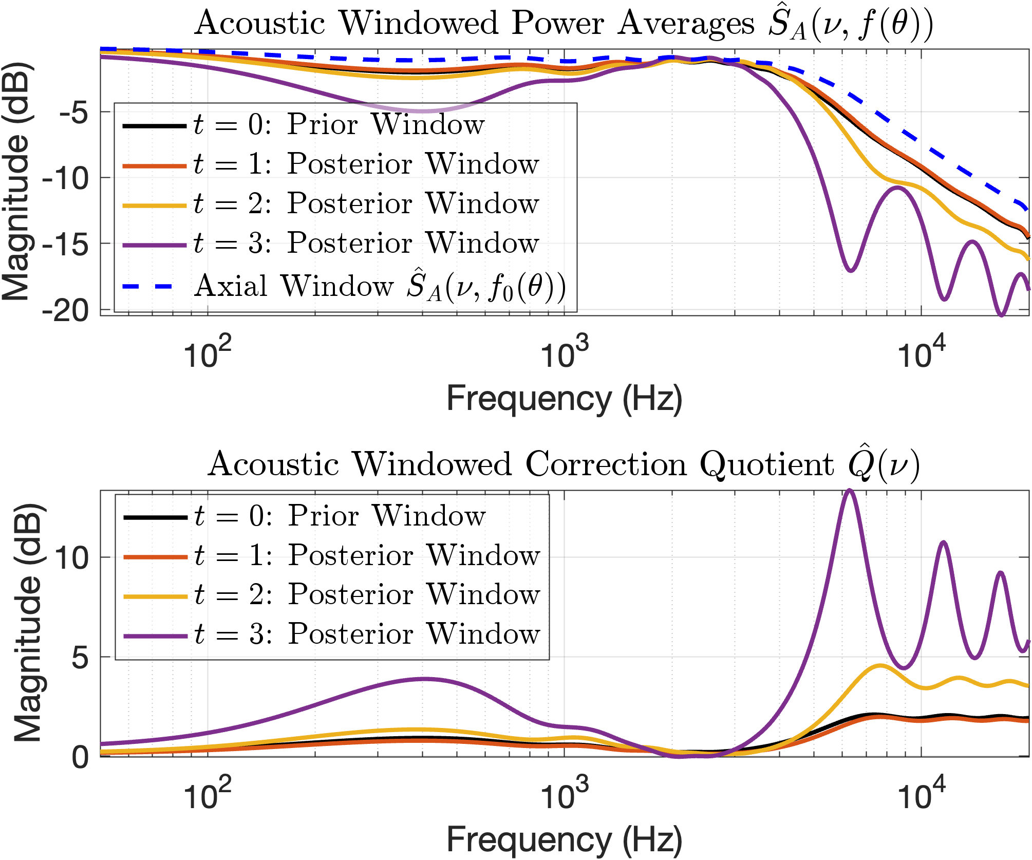
## Charts: Acoustic Windowed Power and Correction Quotient
### Overview
The image contains two charts. The top chart displays "Acoustic Windowed Power Averages" as a function of frequency, showing multiple lines representing different time steps (t = 0, 1, 2, 3) and an axial window. The bottom chart shows the "Acoustic Windowed Correction Quotient" also as a function of frequency, again with lines for different time steps. Both charts use a logarithmic frequency scale and a magnitude scale in decibels (dB).
### Components/Axes
**Top Chart:**
* **Title:** Acoustic Windowed Power Averages Ŝ<sub>A</sub>(ν, f(θ))
* **X-axis:** Frequency (Hz), logarithmic scale from 10<sup>2</sup> to 10<sup>5</sup>.
* **Y-axis:** Magnitude (dB), scale from -20 to -5.
* **Legend:**
* t = 0: Prior Window (Black)
* t = 1: Posterior Window (Purple)
* t = 2: Posterior Window (Orange)
* t = 3: Posterior Window (Brown)
* Axial Window Ŝ<sub>A</sub>(ν, f<sub>0</sub>(θ)) (Blue Dashed)
**Bottom Chart:**
* **Title:** Acoustic Windowed Correction Quotient Q̂(ν)
* **X-axis:** Frequency (Hz), logarithmic scale from 10<sup>2</sup> to 10<sup>5</sup>.
* **Y-axis:** Magnitude (dB), scale from 0 to 15.
* **Legend:**
* t = 0: Prior Window (Black)
* t = 1: Posterior Window (Purple)
* t = 2: Posterior Window (Orange)
* t = 3: Posterior Window (Brown)
### Detailed Analysis or Content Details
**Top Chart - Acoustic Windowed Power Averages:**
* **t = 0 (Black):** The line is relatively flat around -10dB from 10<sup>2</sup> Hz to approximately 10<sup>3</sup> Hz, then decreases to approximately -18dB at 10<sup>4</sup> Hz, with oscillations.
* **t = 1 (Purple):** The line starts at approximately -6dB at 10<sup>2</sup> Hz, rises to a peak of approximately -3dB around 10<sup>3</sup> Hz, then rapidly decreases to approximately -20dB at 10<sup>4</sup> Hz, with oscillations.
* **t = 2 (Orange):** The line starts at approximately -7dB at 10<sup>2</sup> Hz, rises to a peak of approximately -4dB around 10<sup>3</sup> Hz, then rapidly decreases to approximately -19dB at 10<sup>4</sup> Hz, with oscillations.
* **t = 3 (Brown):** The line starts at approximately -7dB at 10<sup>2</sup> Hz, rises to a peak of approximately -4dB around 10<sup>3</sup> Hz, then rapidly decreases to approximately -19dB at 10<sup>4</sup> Hz, with oscillations.
* **Axial Window (Blue Dashed):** The line starts at approximately -8dB at 10<sup>2</sup> Hz, rises to a peak of approximately -5dB around 10<sup>3</sup> Hz, then decreases to approximately -16dB at 10<sup>4</sup> Hz, with oscillations.
**Bottom Chart - Acoustic Windowed Correction Quotient:**
* **t = 0 (Black):** The line is relatively flat around -2dB from 10<sup>2</sup> Hz to approximately 10<sup>4</sup> Hz, then rises to approximately 12dB at 10<sup>4</sup> Hz, with oscillations.
* **t = 1 (Purple):** The line starts at approximately 0dB at 10<sup>2</sup> Hz, rises to a peak of approximately 14dB around 10<sup>4</sup> Hz, with oscillations.
* **t = 2 (Orange):** The line starts at approximately -1dB at 10<sup>2</sup> Hz, rises to a peak of approximately 13dB around 10<sup>4</sup> Hz, with oscillations.
* **t = 3 (Brown):** The line starts at approximately -1dB at 10<sup>2</sup> Hz, rises to a peak of approximately 13dB around 10<sup>4</sup> Hz, with oscillations.
### Key Observations
* In the top chart, the "Prior Window" (t=0) has a lower magnitude than the "Posterior Windows" (t=1, 2, 3) at lower frequencies, but the differences diminish at higher frequencies.
* The "Posterior Windows" (t=1, 2, 3) are very similar to each other.
* In the bottom chart, the "Prior Window" (t=0) has a lower magnitude than the "Posterior Windows" (t=1, 2, 3) across the entire frequency range.
* The "Posterior Windows" (t=1, 2, 3) are very similar to each other.
* Both charts exhibit oscillatory behavior at higher frequencies (around 10<sup>4</sup> Hz).
### Interpretation
The charts likely represent the effect of applying a time-varying window function to acoustic data. The "Prior Window" (t=0) represents the initial state, while the "Posterior Windows" (t=1, 2, 3) represent the data after applying the window function for increasing time steps.
The top chart shows how the windowing affects the power spectrum of the acoustic signal. The increase in magnitude at lower frequencies for the posterior windows suggests that the windowing process is enhancing the lower frequency components. The decrease in magnitude at higher frequencies suggests that the windowing process is attenuating the higher frequency components.
The bottom chart shows the correction quotient, which likely represents the ratio of the windowed power spectrum to the original power spectrum. The positive values indicate that the windowing process is amplifying the signal in those frequency ranges. The similarity between the posterior windows suggests that the windowing process is converging over time.
The oscillatory behavior at higher frequencies could be due to the shape of the window function or the presence of noise in the data. The charts demonstrate how a windowing function can be used to modify the frequency content of an acoustic signal, potentially for noise reduction or signal enhancement. The consistent behavior of t=1, t=2, and t=3 suggests the windowing process reaches a stable state after the first time step.