## t-SNE Scatter Plot: Learned Embeddings Visualization
### Overview
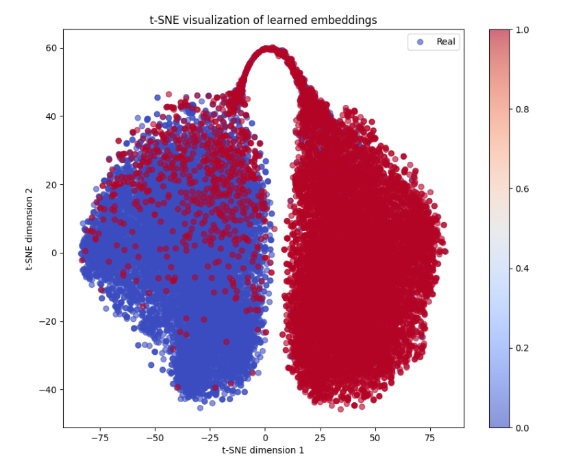
The image is a two-dimensional scatter plot generated using t-Distributed Stochastic Neighbor Embedding (t-SNE), a technique for visualizing high-dimensional data. It displays a large number of data points, each representing a "learned embedding," projected into a 2D space. The points form two primary, distinct clusters, colored according to a continuous variable represented by a color bar.
### Components/Axes
* **Title:** "t-SNE visualization of learned embeddings" (centered at the top).
* **X-Axis:** Labeled "t-SNE dimension 1". The scale runs from approximately -85 to +85, with major tick marks at -75, -50, -25, 0, 25, 50, and 75.
* **Y-Axis:** Labeled "t-SNE dimension 2". The scale runs from approximately -50 to +65, with major tick marks at -40, -20, 0, 20, 40, and 60.
* **Legend:** Located in the top-right corner of the plot area. It contains a single entry: a blue circle labeled "Real".
* **Color Bar:** Positioned vertically on the far right side of the image, outside the main plot axes. It displays a continuous gradient from blue at the bottom to red at the top. It is labeled with numerical values: 0.0 (bottom, blue), 0.2, 0.4, 0.6, 0.8, and 1.0 (top, red). This bar defines the color mapping for the data points.
### Detailed Analysis
The plot contains thousands of circular data points. Their color corresponds to the value on the color bar, ranging from blue (value ~0.0) to red (value ~1.0).
1. **Primary Clusters:**
* **Left Cluster (Blue-Dominant):** Centered roughly at coordinates (-40, -10) on the t-SNE axes. This cluster is densely packed and composed predominantly of blue points, indicating values near 0.0 on the color scale. It spans approximately from X: -80 to 0 and Y: -45 to +45.
* **Right Cluster (Red-Dominant):** Centered roughly at coordinates (+35, 0). This cluster is also very dense and composed almost entirely of deep red points, indicating values near 1.0. It spans approximately from X: 0 to +80 and Y: -45 to +45.
2. **Overlap and Transition Zone:**
* There is a narrow region of overlap and mixing between the two clusters, primarily along the vertical line where X ≈ 0. In this zone, points of intermediate colors (purples, pinks) are visible, suggesting a transition in the underlying variable from 0.0 to 1.0.
* A distinct, thinner "bridge" or "arch" of red points connects the top of the right cluster (around Y=+60) back towards the left side, creating a loop-like structure at the top of the visualization.
3. **Point Distribution and Density:**
* Both main clusters exhibit high density in their cores, with points becoming sparser towards their outer edges.
* The blue cluster appears slightly more diffuse at its lower-left periphery.
* The red cluster is very compact and uniform in its coloration, with almost no blue points within its main body.
### Key Observations
* **Clear Separation:** The most striking feature is the strong separation between the blue (value ~0) and red (value ~1) points into two distinct manifolds. This indicates the underlying high-dimensional embeddings for these two groups are very different.
* **Color-Value Correlation:** The color mapping is consistent and unambiguous. Points in the left cluster are blue (low value), and points in the right cluster are red (high value).
* **Anomalous Structure:** The arching bridge of red points at the top (Y ≈ +60) is a notable topological feature. It suggests that while the clusters are separate, there may be a subset of "high-value" (red) data points that share some similarity with the "low-value" (blue) group in the high-dimensional space, causing t-SNE to place them in this connecting structure.
* **Legend vs. Data:** The legend entry "Real" with a blue circle is potentially misleading if taken as the sole label for all blue points. The color bar is the definitive key, showing that color represents a continuous score from 0.0 to 1.0, not a discrete class label. The "Real" label may refer to the source of the data (e.g., real vs. synthetic samples), but the plot visualizes a continuous property of those samples.
### Interpretation
This t-SNE plot visualizes the latent space of a machine learning model. Each point is a data sample (e.g., an image, a text document) transformed into a dense vector embedding by the model. The t-SNE algorithm projects these high-dimensional vectors into 2D for visualization.
The clear separation into two clusters, perfectly correlated with the blue-to-red color scale (0.0 to 1.0), strongly suggests the model has learned to distinguish two fundamental categories or states within the data. The continuous color variable could represent:
1. **A model's confidence score or probability output** (e.g., probability of being "real" vs. "fake," or class A vs. class B).
2. **An intrinsic property of the data** (e.g., image brightness, sentiment score, age of a subject).
3. **A latent factor** discovered by the model during training.
The separation indicates the embeddings are highly discriminative for this property. The "bridge" structure is particularly interesting from an investigative standpoint. It may represent edge cases, outliers, or a subset of data where the model's learned representation is ambiguous, placing samples with a high output score (red) topologically closer to the low-score (blue) cluster. This could be a focus area for error analysis or data inspection. The visualization confirms the model's internal representations are not random but have organized the data according to a meaningful, continuous axis of variation.