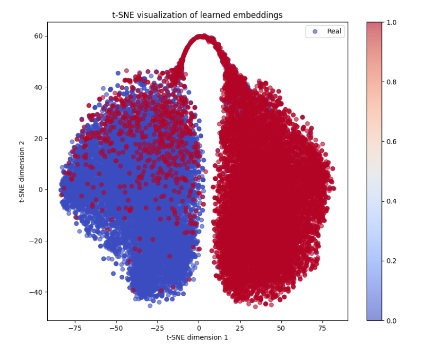
## Chart Type: Scatter Plot
### Overview
The image is a scatter plot titled "t-SNE visualization of learned embeddings." The plot displays data points colored according to a color gradient, with the x-axis labeled "t-SNE dimension 1" and the y-axis labeled "t-SNE dimension 2." The data points appear to cluster into two main groups, one predominantly blue and the other predominantly red, with a color gradient indicating a continuous transition between the two.
### Components/Axes
* **Title:** t-SNE visualization of learned embeddings
* **X-axis:** t-SNE dimension 1, with tick marks at approximately -75, -50, -25, 0, 25, 50, and 75.
* **Y-axis:** t-SNE dimension 2, with tick marks at approximately -40, -20, 0, 20, 40, and 60.
* **Legend:** Located in the top-right corner, labeled "Real" with a blue circle.
* **Colorbar:** Located on the right side of the plot, ranging from blue (0.0) to red (1.0), with tick marks at 0.0, 0.2, 0.4, 0.6, 0.8, and 1.0.
### Detailed Analysis
The scatter plot shows a distribution of data points in a two-dimensional space. The points are colored according to their value on a scale from 0.0 (blue) to 1.0 (red).
* **Left Cluster:** Predominantly blue, indicating values closer to 0.0. The cluster extends from approximately x = -75 to x = 0, and y = -40 to y = 40.
* **Right Cluster:** Predominantly red, indicating values closer to 1.0. The cluster extends from approximately x = 0 to x = 75, and y = -40 to y = 60.
* **Connecting Arc:** An arc of points connects the top of the left cluster to the top of the right cluster, with y values reaching approximately 60. The color transitions from blue to red along this arc.
### Key Observations
* The data points form two distinct clusters, suggesting two primary groups or categories within the data.
* The color gradient indicates a continuous transition or relationship between the two clusters.
* The arc connecting the clusters suggests a pathway or transformation between the two groups.
### Interpretation
The t-SNE visualization suggests that the learned embeddings can be separated into two main groups based on the t-SNE dimension 1 and dimension 2. The color gradient, representing "Real" values, indicates a continuous spectrum or relationship between these groups. The arc connecting the clusters might represent a transition or transformation process between the two states. The plot effectively reduces the dimensionality of the data while preserving the relationships between data points, allowing for visual identification of clusters and patterns.