\n
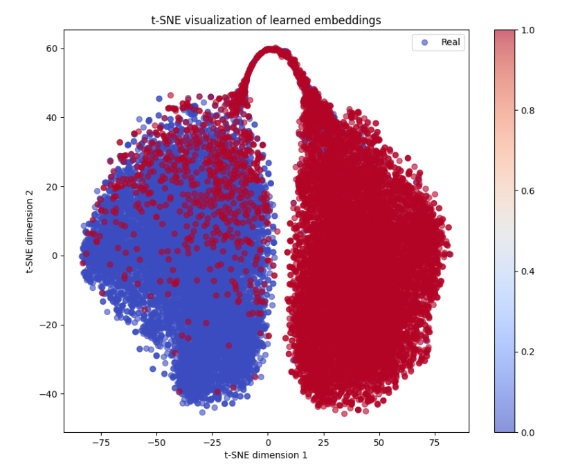
## Scatter Plot: t-SNE Visualization of Learned Embeddings
### Overview
The image presents a two-dimensional scatter plot generated using t-distributed Stochastic Neighbor Embedding (t-SNE). The plot visualizes learned embeddings, likely from a machine learning model, and color-codes the data points based on a "Real" label. The plot aims to show the separation or clustering of data points based on their embeddings.
### Components/Axes
* **Title:** "t-SNE visualization of learned embeddings" (top-center)
* **X-axis:** "t-SNE dimension 1" (bottom-center), ranging approximately from -75 to 75.
* **Y-axis:** "t-SNE dimension 2" (left-center), ranging approximately from -40 to 60.
* **Legend:** Located in the top-right corner.
* Label: "Real"
* Color: Blue
* **Colorbar:** Located on the right side of the plot.
* Scale: Ranges from 0.0 to 1.0.
* Color Gradient: From light blue (0.0) to dark red (1.0).
### Detailed Analysis
The scatter plot shows two distinct clusters of data points.
* **Blue Cluster:** Located on the left side of the plot, centered around x = -25 and y = 0. The points are densely packed, forming a roughly elliptical shape. The color of these points is consistently blue, indicating a "Real" label. The color intensity is relatively uniform across this cluster, with values generally between 0.0 and 0.2.
* **Red Cluster:** Located on the right side of the plot, centered around x = 50 and y = 20. This cluster also has a roughly elliptical shape, but it is more elongated vertically. The points are colored in shades of red, indicating a "Real" label. The color intensity is generally between 0.8 and 1.0.
* **Connecting Bridge:** A narrow connection or "bridge" of points exists between the two clusters around x = 0 and y = 20. These points exhibit a gradient of colors, transitioning from blue to red, suggesting intermediate values for the "Real" label.
There are approximately 500-700 points in the blue cluster and 500-700 points in the red cluster. The density of points appears higher in the central regions of each cluster.
### Key Observations
* The two clusters are well-separated, suggesting that the t-SNE embedding has effectively captured underlying differences in the data.
* The color gradient in the connecting bridge indicates that some data points may not clearly belong to either cluster.
* The "Real" label appears to be associated with both clusters, but the color intensity suggests different degrees of "Realness" or confidence.
### Interpretation
The t-SNE visualization suggests that the learned embeddings have successfully separated the data into two distinct groups based on the "Real" label. The separation indicates that the model has learned meaningful representations that capture the underlying structure of the data. The connecting bridge suggests that there may be some ambiguity or overlap between the two groups.
The color intensity associated with the "Real" label could represent a confidence score or probability. The red cluster, with higher color intensity, may represent data points that are more confidently classified as "Real" than those in the blue cluster.
The visualization is useful for understanding the relationships between data points and for identifying potential outliers or anomalies. It can also be used to evaluate the quality of the learned embeddings and to guide further model development. The fact that the data separates into two clusters suggests a binary classification problem or a dataset with two distinct modes.