## t-SNE Visualization of Learned Embeddings
### Overview
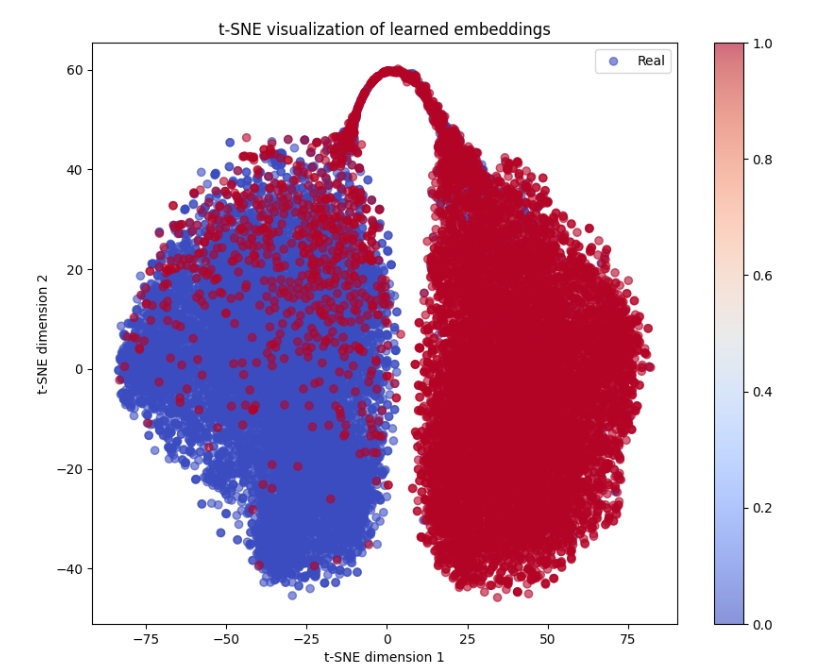
The image depicts a two-dimensional t-SNE (t-distributed Stochastic Neighbor Embedding) visualization of learned embeddings. It shows two distinct clusters of data points: a predominantly blue cluster on the left and a predominantly red cluster on the right, with a gradient of colors transitioning between them. The visualization includes axis labels, a legend, and a color bar.
### Components/Axes
- **Axes**:
- **X-axis**: "t-SNE dimension 1" (ranges approximately from -75 to 75).
- **Y-axis**: "t-SNE dimension 2" (ranges approximately from -40 to 60).
- **Legend**: Located in the top-right corner, labeled "Real" with a blue circle. No explicit label for red points.
- **Color Bar**: Positioned vertically on the right side of the plot, labeled with values from **0.0** (blue) to **1.0** (red), indicating a gradient scale.
### Detailed Analysis
- **Data Distribution**:
- **Blue Cluster**: Concentrated in the left half of the plot (x ≈ -75 to 0, y ≈ -40 to 40). Points are densely packed but show some spread.
- **Red Cluster**: Dominates the right half (x ≈ 0 to 75, y ≈ 0 to 60). Points are tightly clustered near the center-right.
- **Overlap Region**: A narrow band of mixed blue and red points exists between x ≈ -25 to 25, y ≈ 0 to 20, suggesting ambiguous or transitional embeddings.
- **Color Gradient**: The color bar implies a continuous scale from blue (0.0) to red (1.0). Points transition from blue to red as their x-coordinate increases, with the most intense reds near x ≈ 50–75.
### Key Observations
1. **Cluster Separation**: The blue and red clusters are spatially distinct, with minimal overlap except in the central region.
2. **Color Correlation**: The gradient from blue to red aligns with the x-axis progression, suggesting a relationship between the embedding's first dimension and the color-coded metric (likely confidence or probability).
3. **Ambiguity Zone**: The central overlap region contains points with intermediate colors (e.g., light red/pink), indicating uncertainty or hybrid characteristics.
### Interpretation
- **Data Meaning**: The visualization likely represents embeddings learned by a model (e.g., a classifier or generative model). The blue cluster ("Real") may correspond to genuine data samples, while the red cluster could represent synthetic or adversarial examples. The color gradient (0.0–1.0) might reflect the model's confidence in assigning labels (e.g., probability of being "real").
- **Model Performance**: The clear separation of clusters suggests the model effectively distinguishes between the two groups. However, the overlap region highlights cases where the model struggles to classify embeddings definitively.
- **Technical Insight**: t-SNE is used here to reduce high-dimensional embeddings to 2D for visualization. The x-axis (dimension 1) appears to drive the color gradient, implying it encodes critical information for differentiation.
### Uncertainties
- The exact meaning of the color bar (e.g., confidence, probability, or another metric) is not explicitly labeled in the image.
- The legend only labels "Real" for blue points; the red cluster's label (if any) is missing.
- The precise number of data points in each cluster is not discernible from the image.