\n
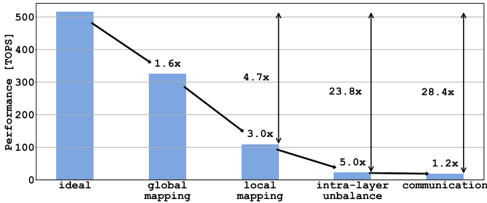
## Bar Chart: Performance Degradation Across Mapping and Communication Stages
### Overview
The image is a bar chart illustrating the degradation in computational performance, measured in Tera Operations Per Second (TOPS), across five sequential stages or conditions. The chart demonstrates a dramatic, multiplicative decline in performance from an "ideal" baseline to a final "communication" stage, with annotations highlighting the performance drop factors between stages.
### Components/Axes
* **Chart Type:** Vertical bar chart with annotated performance drop multipliers.
* **Y-Axis:**
* **Label:** `Performance [TOPS]`
* **Scale:** Linear scale from 0 to 500, with major gridlines at intervals of 100 (0, 100, 200, 300, 400, 500).
* **X-Axis (Categories):** Five distinct categories, listed from left to right:
1. `ideal`
2. `global mapping`
3. `local mapping`
4. `intra-layer unbalance`
5. `communication`
* **Data Series:** A single series represented by five solid blue bars.
* **Annotations:** Black arrows connect the tops of adjacent bars, with text labels indicating the multiplicative performance drop factor between them. The arrows and labels are positioned above the bars.
* **Language:** All text is in English.
### Detailed Analysis
**1. Bar Heights (Approximate Performance Values):**
* `ideal`: ~500 TOPS (bar reaches the 500 gridline).
* `global mapping`: ~320 TOPS (bar is slightly above the 300 gridline).
* `local mapping`: ~105 TOPS (bar is just above the 100 gridline).
* `intra-layer unbalance`: ~21 TOPS (bar is very low, approximately one-fifth of the 100 gridline height).
* `communication`: ~18 TOPS (bar is marginally lower than the previous bar).
**2. Annotated Performance Drop Multipliers (Between Adjacent Stages):**
* From `ideal` to `global mapping`: **1.6x** drop (500 / 320 ≈ 1.56).
* From `global mapping` to `local mapping`: **3.0x** drop (320 / 105 ≈ 3.05).
* From `local mapping` to `intra-layer unbalance`: **5.0x** drop (105 / 21 = 5.0).
* From `intra-layer unbalance` to `communication`: **1.2x** drop (21 / 18 ≈ 1.17).
**3. Additional Annotated Multipliers (Cumulative or Non-Adjacent):**
* An arrow spans from the `ideal` bar to the `local mapping` bar, labeled **4.7x**. This represents the cumulative drop from ideal to local mapping (500 / 105 ≈ 4.76).
* An arrow spans from the `ideal` bar to the `intra-layer unbalance` bar, labeled **23.8x**. This represents the cumulative drop from ideal to intra-layer unbalance (500 / 21 ≈ 23.8).
* An arrow spans from the `ideal` bar to the `communication` bar, labeled **28.4x**. This represents the total cumulative performance drop from the ideal state to the final communication stage (500 / 18 ≈ 27.8).
### Key Observations
* **Steep, Multiplicative Decline:** Performance does not degrade linearly. Each stage introduces a significant multiplicative overhead, leading to an exponential-like decay.
* **Major Bottlenecks:** The most severe single-stage drops occur at `local mapping` (3.0x) and `intra-layer unbalance` (5.0x). The `intra-layer unbalance` stage reduces performance to less than 5% of the ideal.
* **Final Stage Impact:** While the final drop to `communication` (1.2x) is the smallest factor, it occurs on an already severely degraded baseline, resulting in a final performance that is only ~3.6% of the ideal (1/28.4).
* **Visual Emphasis:** The chart uses height and annotated arrows to powerfully visualize how small inefficiencies compound into a massive overall performance loss.
### Interpretation
This chart likely models the performance overhead in a distributed or parallel computing system, such as a neural network accelerator or a high-performance computing task. The stages represent common sources of inefficiency:
1. **Ideal:** Theoretical peak performance with perfect parallelization and zero overhead.
2. **Global Mapping:** Overhead from partitioning a task across multiple processing units (e.g., cores, nodes, chips). The 1.6x drop suggests moderate overhead from this initial distribution.
3. **Local Mapping:** Further overhead from managing data and computation within each local processing unit. The 3.0x drop indicates this is a major bottleneck, possibly due to memory hierarchy constraints, thread synchronization, or kernel launch overheads.
4. **Intra-layer Unbalance:** Performance loss due to uneven workload distribution *within* a computational layer or phase. Some processors finish early and idle while others are still working. The severe 5.0x drop highlights load imbalance as a critical issue.
5. **Communication:** The final overhead from data exchange between processing units after computation. The relatively small 1.2x factor suggests that in this specific model, the computation and load imbalance are far greater bottlenecks than the communication itself.
**The core message is that achieving real-world performance close to the theoretical "ideal" is extremely challenging.** The multiplicative nature of the overheads means that even seemingly small inefficiencies at each stage (1.6x, 3.0x, etc.) combine to reduce the final usable performance by over 96%. To improve system efficiency, engineers must focus on the largest multipliers—particularly `local mapping` and `intra-layer unbalance`—as optimizing these would yield the most significant overall gains. The chart serves as a diagnostic tool, pinpointing where optimization efforts should be concentrated.