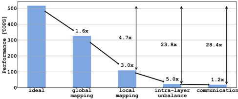
## Bar Chart: Performance Analysis
### Overview
The image is a bar chart comparing the performance (in TOPS) of different mapping and communication strategies. The chart shows a decreasing trend in performance from the "ideal" scenario to "communication," with annotations indicating the performance degradation factor at each stage.
### Components/Axes
* **Y-axis:** Performance [TOPS]. Scale ranges from 0 to 500, with implicit markers at 100, 200, 300, 400, and 500.
* **X-axis:** Categorical axis representing different scenarios: "ideal", "global mapping", "local mapping", "intra-layer unbalance", and "communication".
* **Bars:** Light blue bars represent the performance for each scenario.
* **Annotations:** Black arrows and text indicate the performance degradation factor between consecutive bars.
### Detailed Analysis
* **Ideal:** The first bar, representing the "ideal" scenario, has a performance of approximately 510 TOPS.
* **Global Mapping:** The second bar, "global mapping," has a performance of approximately 320 TOPS. The annotation "1.6x" indicates that the performance is 1.6 times lower than the "ideal" scenario.
* **Local Mapping:** The third bar, "local mapping," has a performance of approximately 110 TOPS. The annotation "3.0x" indicates that the performance is 3.0 times lower than the "global mapping" scenario.
* **Intra-layer Unbalance:** The fourth bar, "intra-layer unbalance," has a performance of approximately 20 TOPS. The annotation "5.0x" indicates that the performance is 5.0 times lower than the "local mapping" scenario.
* **Communication:** The fifth bar, "communication," has a performance of approximately 15 TOPS. The annotation "1.2x" indicates that the performance is 1.2 times lower than the "intra-layer unbalance" scenario.
* **Vertical Arrows:** Two vertical arrows point from the top of the "ideal" bar to the top of the "intra-layer unbalance" and "communication" bars, labeled "23.8x" and "28.4x" respectively. These indicate the overall performance degradation compared to the ideal scenario.
### Key Observations
* There is a significant drop in performance from the "ideal" scenario to "global mapping."
* The performance continues to decrease as we move from "global mapping" to "local mapping" and then to "intra-layer unbalance."
* The "communication" scenario has the lowest performance.
* The overall performance degradation from the "ideal" scenario to "intra-layer unbalance" is 23.8x, and to "communication" is 28.4x.
### Interpretation
The chart illustrates the impact of different factors on the overall performance. The "ideal" scenario represents the maximum achievable performance. The subsequent bars show how performance degrades due to global mapping, local mapping, intra-layer unbalance, and communication overhead. The annotations provide a quantitative measure of the performance degradation at each stage. The large performance degradation factors (23.8x and 28.4x) highlight the significant impact of intra-layer unbalance and communication on the overall performance compared to the ideal scenario. This suggests that optimizing these aspects is crucial for improving the overall system performance.