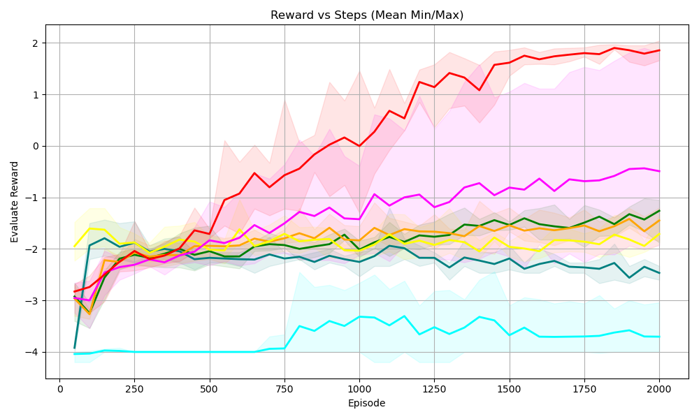
## Line Chart: Reward vs Steps (Mean Min/Max)
### Overview
The image is a line chart displaying the "Evaluate Reward" on the y-axis against "Episode" on the x-axis. The chart shows multiple data series, each represented by a different colored line, along with shaded regions indicating the min/max range for each series. The chart title is "Reward vs Steps (Mean Min/Max)".
### Components/Axes
* **Title:** Reward vs Steps (Mean Min/Max)
* **X-axis:** Episode, with tick marks at 0, 250, 500, 750, 1000, 1250, 1500, 1750, and 2000.
* **Y-axis:** Evaluate Reward, with tick marks at -4, -3, -2, -1, 0, 1, and 2.
* **Data Series:** There are multiple data series represented by different colored lines. Each line has a shaded region around it, representing the min/max range. The colors are red, magenta, orange, yellow, green, teal, and dark teal. There is no explicit legend.
### Detailed Analysis
* **Red Line:** This line starts at approximately -3 at Episode 0, increases rapidly to approximately -2 at Episode 250, then continues to increase, reaching approximately 0 at Episode 750, and continues to increase to approximately 1.5 at Episode 1250, and then plateaus around 1.8-2.0 from Episode 1500 to 2000. The shaded region around this line is pink, indicating the min/max range.
* **Magenta Line:** This line starts at approximately -2.5 at Episode 0, increases to approximately -2 at Episode 250, and then fluctuates between -1 and -0.5 from Episode 750 to 2000.
* **Orange Line:** This line starts at approximately -2.5 at Episode 0, increases to approximately -2 at Episode 250, and then fluctuates around -1.5 from Episode 500 to 2000.
* **Yellow Line:** This line starts at approximately -3 at Episode 0, increases to approximately -2 at Episode 250, and then fluctuates around -2 from Episode 500 to 2000.
* **Green Line:** This line starts at approximately -2 at Episode 0, decreases slightly to approximately -2.2 at Episode 250, and then fluctuates around -2 from Episode 500 to 2000.
* **Teal Line:** This line starts at approximately -2 at Episode 0, decreases slightly to approximately -2.5 at Episode 250, and then fluctuates around -2.5 from Episode 500 to 2000.
* **Dark Teal Line:** This line starts at approximately -4 at Episode 0, increases to approximately -4 at Episode 750, then increases to approximately -3.5 at Episode 1000, and then fluctuates around -3.5 from Episode 1000 to 2000.
### Key Observations
* The red line shows the most significant improvement in "Evaluate Reward" as the number of episodes increases.
* The dark teal line shows the least improvement in "Evaluate Reward" as the number of episodes increases.
* The other lines (magenta, orange, yellow, green, and teal) show some improvement initially, but then plateau and fluctuate around a relatively constant "Evaluate Reward".
* The shaded regions indicate the variability in the "Evaluate Reward" for each series. The red line has the largest variability, especially in the early episodes.
### Interpretation
The chart compares the performance of different algorithms or configurations (represented by the different colored lines) in terms of "Evaluate Reward" over a series of episodes. The red line represents the most successful algorithm, as it achieves the highest "Evaluate Reward" and shows the most significant improvement over time. The dark teal line represents the least successful algorithm, as it achieves the lowest "Evaluate Reward" and shows little improvement over time. The other algorithms show intermediate performance. The shaded regions indicate the stability or variability of each algorithm's performance. The red line's large variability in the early episodes suggests that it may be more sensitive to initial conditions or random fluctuations, but it eventually converges to a high-performing state.