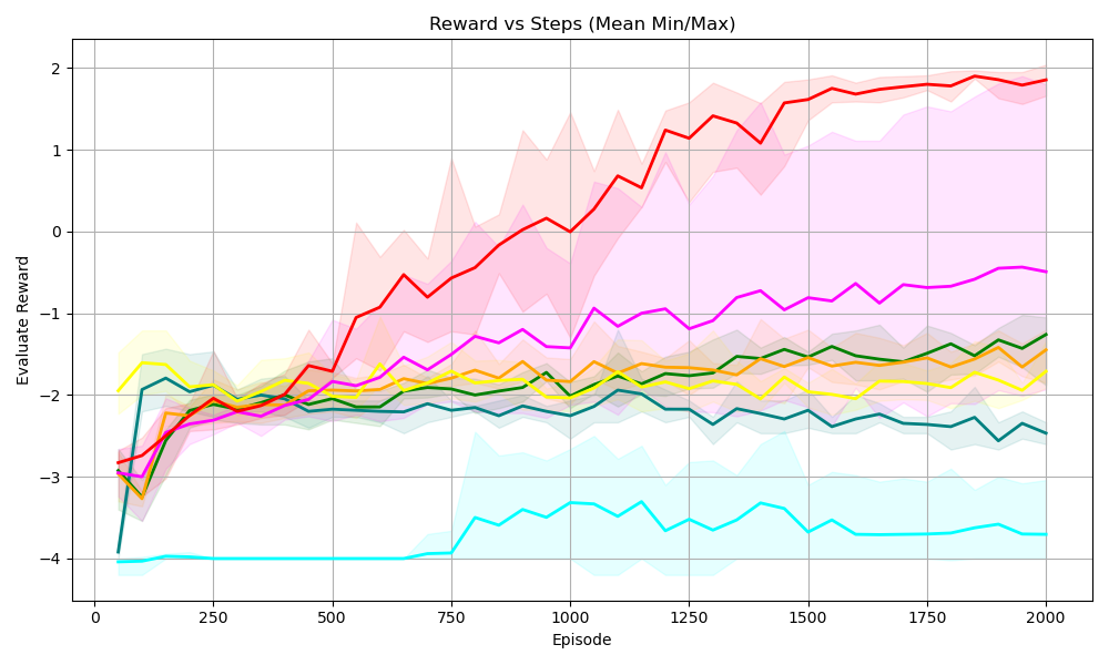
## Line Chart: Reward vs Steps (Mean Min/Max)
### Overview
This is a line chart titled "Reward vs Steps (Mean Min/Max)". It plots the "Evaluate Reward" on the y-axis against the number of "Episode" on the x-axis for six distinct data series. Each series is represented by a solid colored line (the mean) surrounded by a semi-transparent shaded area of the same color, indicating the minimum and maximum reward range for that episode. The chart includes a background grid.
### Components/Axes
* **Chart Title:** "Reward vs Steps (Mean Min/Max)" (Top center).
* **X-Axis:**
* **Label:** "Episode" (Bottom center).
* **Scale:** Linear, ranging from 0 to 2000.
* **Major Tick Marks:** 0, 250, 500, 750, 1000, 1250, 1500, 1750, 2000.
* **Y-Axis:**
* **Label:** "Evaluate Reward" (Left center, rotated vertically).
* **Scale:** Linear, ranging from -4 to 2.
* **Major Tick Marks:** -4, -3, -2, -1, 0, 1, 2.
* **Data Series (Identified by line color):**
1. **Red Line**
2. **Magenta (Pink) Line**
3. **Green Line**
4. **Yellow Line**
5. **Dark Teal Line**
6. **Cyan (Light Blue) Line**
* **Legend:** No explicit legend is present within the chart area. Series are distinguished solely by color.
### Detailed Analysis
**Trend Verification & Data Point Extraction (Approximate Values):**
1. **Red Line:**
* **Trend:** Shows a strong, consistent upward trend from start to finish.
* **Key Points:** Starts at ~ -2.9 (Episode 0). Crosses 0 reward around Episode 900. Ends at its peak of ~ 1.9 (Episode 2000). The shaded min/max range is very wide, especially between Episodes 750-1500, spanning nearly 3 reward units at its widest.
2. **Magenta Line:**
* **Trend:** Shows a steady, moderate upward trend.
* **Key Points:** Starts at ~ -3.0 (Episode 0). Crosses -1 reward around Episode 1100. Ends at ~ -0.5 (Episode 2000). Its shaded range is also wide, often overlapping with the red series' range.
3. **Green Line:**
* **Trend:** Shows a gradual, slight upward trend with minor fluctuations.
* **Key Points:** Starts at ~ -3.0 (Episode 0). Hovers between -2 and -1.5 for most of the chart. Ends at ~ -1.2 (Episode 2000). The shaded range is moderate.
4. **Yellow Line:**
* **Trend:** Relatively flat with minor fluctuations, showing no strong upward or downward trend.
* **Key Points:** Starts at ~ -2.0 (Episode 0). Fluctuates primarily between -2.2 and -1.8. Ends at ~ -1.8 (Episode 2000). The shaded range is relatively narrow.
5. **Dark Teal Line:**
* **Trend:** Shows a slight initial increase, followed by a very gradual downward trend in the latter half.
* **Key Points:** Starts at ~ -3.0 (Episode 0). Peaks around -1.8 near Episode 500. Declines slowly to end at ~ -2.5 (Episode 2000). The shaded range is moderate.
6. **Cyan Line:**
* **Trend:** Distinct two-phase trend: perfectly flat, then a step increase followed by noisy fluctuation.
* **Key Points:** Starts at -4.0 and remains flat until ~ Episode 750. Jumps to ~ -3.5 and then fluctuates between -3.7 and -3.3 for the remainder. Ends at ~ -3.7 (Episode 2000). The shaded range becomes very wide after the step increase.
**Spatial Grounding:** All data series originate from the left side (Episode 0) and progress to the right (Episode 2000). The red and magenta lines occupy the upper portion of the chart by the end, while the cyan line remains at the bottom. The shaded areas create significant overlap in the middle reward range (-3 to -1).
### Key Observations
* **Performance Hierarchy:** A clear performance hierarchy is established by the end of the episodes: Red > Magenta > Green > Yellow > Dark Teal > Cyan.
* **Variability:** The top-performing series (Red, Magenta) exhibit the highest variability (widest shaded areas), suggesting their mean performance comes with less consistency. The lowest-performing series (Cyan) also shows high variability after its phase change.
* **Anomaly:** The Cyan series is an outlier in behavior, showing a perfect flatline at the minimum reward (-4) for the first ~750 episodes before any learning or change occurs.
* **Convergence:** The Green, Yellow, and Dark Teal series converge into a similar performance band (between -2.5 and -1) from Episode 500 onward, making them difficult to distinguish without color.
### Interpretation
This chart likely visualizes the training performance of six different reinforcement learning agents or algorithmic variants over 2000 episodes. The "Evaluate Reward" is the performance metric.
* **What the data suggests:** The Red agent is the most successful, achieving the highest final reward and showing consistent improvement. The Magenta agent is the second-best learner. The Green, Yellow, and Dark Teal agents show modest, stable learning but plateau at a sub-optimal reward level. The Cyan agent fails to learn initially and, after a delayed start, only achieves a poor, unstable reward.
* **Relationship between elements:** The upward trends indicate learning. The width of the shaded min/max regions reflects the stability or volatility of each agent's policy during evaluation. The overlapping ranges, especially in the middle, indicate that on any given episode, the performance of different agents could be similar despite different mean trends.
* **Notable implications:** The high variability in top performers might be a concern for reliability. The delayed start of the Cyan agent points to a potential issue in its initialization or early training dynamics. The chart effectively compares not just final performance, but the learning trajectory and stability of each method.