TECHNICAL ASSET FINGERPRINT
3e893048df35a6e5bb86c7df
Click to view fullscreen
Press ESC or click to close
FOUND IN PAPERS
EXPERT: gemini-2.0-flash VERSION 1
RUNTIME: nugit/gemini/gemini-2.0-flash
INTEL_VERIFIED
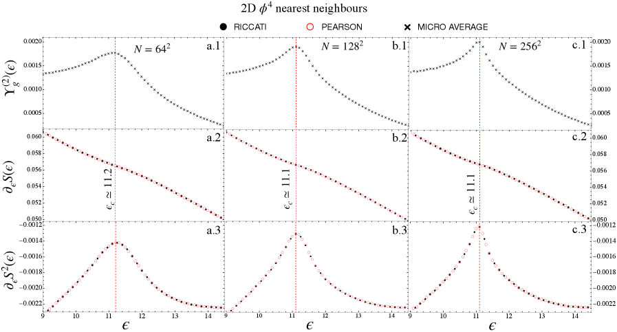
## Chart: 2D φ⁴ Nearest Neighbours
### Overview
The image presents a series of line plots illustrating the behavior of different functions with respect to a variable epsilon (ε). The plots are arranged in a 3x3 grid, with each column representing a different value of N (64², 128², 256²). Each row represents a different function: Yg^(2)(ε), ∂εS(ε), and ∂εS²(ε). The plots compare results from RICCATI, PEARSON, and MICRO AVERAGE methods.
### Components/Axes
* **Title:** 2D φ⁴ nearest neighbours
* **Legend:** Located at the top of the image.
* Black filled circle: RICCATI
* Red open circle: PEARSON
* Black cross: MICRO AVERAGE
* **X-axis:** ε (epsilon), ranging from approximately 9 to 14 in all subplots.
* **Y-axes:**
* Top row (a.1, b.1, c.1): Yg^(2)(ε), ranging from approximately -0.001 to 0.002.
* Middle row (a.2, b.2, c.2): ∂εS(ε), ranging from approximately 0.050 to 0.060.
* Bottom row (a.3, b.3, c.3): ∂εS²(ε), ranging from approximately -0.0022 to -0.0012.
* **Vertical dashed red lines:** Indicate critical values εc, approximately equal to 11.2 for N=64², and 11.1 for N=128² and N=256².
* **Subplot labels:** a.1, a.2, a.3, b.1, b.2, b.3, c.1, c.2, c.3, located at the right of each subplot.
* **N values:** N = 64², N = 128², N = 256², located at the top of each column.
### Detailed Analysis
**Column 1: N = 64²**
* **a.1: Yg^(2)(ε):** The MICRO AVERAGE data (black crosses) starts at approximately 0.0013 at ε=9, increases to a peak of approximately 0.0018 at ε=11.2, and then decreases to approximately 0.0003 at ε=14.
* **a.2: ∂εS(ε):** The RICCATI (black filled circles) and PEARSON (red open circles) data are almost perfectly overlapping. The data decreases linearly from approximately 0.060 at ε=9 to approximately 0.050 at ε=14.
* **a.3: ∂εS²(ε):** The RICCATI (black filled circles) and PEARSON (red open circles) data are almost perfectly overlapping. The data forms a peak centered around ε=11.2, rising from approximately -0.0022 at ε=9 to approximately -0.0014 at ε=11.2, and then decreasing back to approximately -0.0022 at ε=14.
**Column 2: N = 128²**
* **b.1: Yg^(2)(ε):** The MICRO AVERAGE data (black crosses) starts at approximately 0.0013 at ε=9, increases to a peak of approximately 0.0019 at ε=11.1, and then decreases to approximately 0.0002 at ε=14.
* **b.2: ∂εS(ε):** The RICCATI (black filled circles) and PEARSON (red open circles) data are almost perfectly overlapping. The data decreases linearly from approximately 0.060 at ε=9 to approximately 0.050 at ε=14.
* **b.3: ∂εS²(ε):** The RICCATI (black filled circles) and PEARSON (red open circles) data are almost perfectly overlapping. The data forms a peak centered around ε=11.1, rising from approximately -0.0022 at ε=9 to approximately -0.0013 at ε=11.1, and then decreasing back to approximately -0.0022 at ε=14.
**Column 3: N = 256²**
* **c.1: Yg^(2)(ε):** The MICRO AVERAGE data (black crosses) starts at approximately 0.0014 at ε=9, increases to a peak of approximately 0.0020 at ε=11.1, and then decreases to approximately -0.0004 at ε=14.
* **c.2: ∂εS(ε):** The RICCATI (black filled circles) and PEARSON (red open circles) data are almost perfectly overlapping. The data decreases linearly from approximately 0.060 at ε=9 to approximately 0.050 at ε=14.
* **c.3: ∂εS²(ε):** The RICCATI (black filled circles) and PEARSON (red open circles) data are almost perfectly overlapping. The data forms a peak centered around ε=11.1, rising from approximately -0.0022 at ε=9 to approximately -0.0012 at ε=11.1, and then decreasing back to approximately -0.0022 at ε=14.
### Key Observations
* The RICCATI and PEARSON methods produce nearly identical results for ∂εS(ε) and ∂εS²(ε) across all values of N.
* The peak in Yg^(2)(ε) and ∂εS²(ε) becomes more pronounced and shifts slightly to the left as N increases.
* The linear decrease in ∂εS(ε) is consistent across all values of N.
* The vertical dashed lines indicate a critical value εc, which appears to be related to the peak in Yg^(2)(ε) and ∂εS²(ε).
### Interpretation
The plots compare the behavior of different functions related to a 2D φ⁴ model using different computational methods (RICCATI, PEARSON, and MICRO AVERAGE). The parameter N seems to represent a system size or resolution, and epsilon (ε) is a variable that influences the behavior of the functions.
The near-identical results from the RICCATI and PEARSON methods suggest that they are converging to the same solution for the given functions. The MICRO AVERAGE method provides a different perspective, particularly in the Yg^(2)(ε) plots, where it shows a distinct peak.
The shift and sharpening of the peaks in Yg^(2)(ε) and ∂εS²(ε) as N increases suggest that the system's behavior becomes more defined and potentially approaches a critical point or phase transition. The vertical lines at εc indicate a critical value of epsilon, which may be related to this transition.
The linear decrease in ∂εS(ε) suggests a consistent relationship between epsilon and this function, regardless of the value of N or the computational method used.
DECODING INTELLIGENCE...
EXPERT: gemma-3-27b-it-free VERSION 1
RUNTIME: google-free/gemma-3-27b-it
INTEL_VERIFIED
## Chart: 2D φ⁴ nearest neighbours
### Overview
The image presents a series of six subplots (a.1-a.3, b.1-b.3, c.1-c.3) displaying plots of different quantities related to a 2D φ⁴ nearest neighbours model. Each subplot corresponds to a different value of N (64², 128², 256²). The plots show relationships between variables ε (on the x-axis) and various functions of ε (on the y-axis).
### Components/Axes
* **Title:** "2D φ⁴ nearest neighbours" (top-center)
* **X-axis Label:** "ε" (appears on all subplots)
* **Y-axis Labels:**
* a.1, b.1, c.1: "Y(2ε)"
* a.2, b.2, c.2: "∂₂S(ε)"
* a.3, b.3, c.3: "∂₂S(ε)"
* **N Values:** N = 64², N = 128², N = 256² (displayed above each set of three subplots)
* **Legend:**
* Black circles: "RICCATI"
* Red circles: "PEARSON"
* Black crosses: "MICRO AVERAGE"
* **Vertical Lines:** Lines labeled "ε ≈ 11.2" (in a.2) and "ε ≈ 11.1" (in b.2 and c.2) are present in the subplots.
* **X-axis Scale:** The x-axis (ε) ranges approximately from 9 to 15 in all subplots.
* **Y-axis Scale:** The y-axis scales vary for each subplot, ranging from approximately -0.022 to 0.020 for a.3, -0.0022 to 0.022 for b.3, and -0.0018 to 0.002 for c.3.
### Detailed Analysis
Let's analyze each subplot and data series:
**a.1 (N = 64²):**
* **RICCATI (Black circles):** The curve starts at approximately Y(2ε) = 0.002 at ε ≈ 9, reaches a maximum of approximately 0.014 at ε ≈ 11.5, and then decreases to approximately 0.001 at ε ≈ 15.
* **PEARSON (Red circles):** The curve starts at approximately Y(2ε) = 0.018 at ε ≈ 9, decreases monotonically to approximately 0.002 at ε ≈ 15.
* **MICRO AVERAGE (Black crosses):** The curve starts at approximately Y(2ε) = 0.001 at ε ≈ 9, reaches a maximum of approximately 0.008 at ε ≈ 11.5, and then decreases to approximately 0.0005 at ε ≈ 15.
**a.2 (N = 64²):**
* **RICCATI (Black circles):** The curve starts at approximately ∂₂S(ε) = -0.055 at ε ≈ 9, increases to a maximum of approximately 0.060 at ε ≈ 11.2, and then decreases to approximately -0.050 at ε ≈ 15.
* **PEARSON (Red circles):** The curve starts at approximately ∂₂S(ε) = -0.050 at ε ≈ 9, increases to a maximum of approximately 0.055 at ε ≈ 11.2, and then decreases to approximately -0.045 at ε ≈ 15.
* **MICRO AVERAGE (Black crosses):** The curve starts at approximately ∂₂S(ε) = -0.052 at ε ≈ 9, increases to a maximum of approximately 0.058 at ε ≈ 11.2, and then decreases to approximately -0.048 at ε ≈ 15.
**a.3 (N = 64²):**
* **RICCATI (Black circles):** The curve starts at approximately ∂₂S(ε) = -0.022 at ε ≈ 9, increases to a maximum of approximately 0.002 at ε ≈ 11.2, and then decreases to approximately -0.020 at ε ≈ 15.
* **PEARSON (Red circles):** The curve starts at approximately ∂₂S(ε) = -0.020 at ε ≈ 9, increases to a maximum of approximately 0.001 at ε ≈ 11.2, and then decreases to approximately -0.018 at ε ≈ 15.
* **MICRO AVERAGE (Black crosses):** The curve starts at approximately ∂₂S(ε) = -0.021 at ε ≈ 9, increases to a maximum of approximately 0.0015 at ε ≈ 11.2, and then decreases to approximately -0.019 at ε ≈ 15.
**b.1, b.2, b.3 (N = 128²):** The trends are similar to the N = 64² case, but the curves appear to be shifted slightly and have different amplitudes.
**c.1, c.2, c.3 (N = 256²):** The trends are again similar, with further shifts and amplitude changes. The y-axis scales are smaller, indicating smaller values for the plotted functions.
### Key Observations
* All three methods (RICCATI, PEARSON, MICRO AVERAGE) show similar trends across all values of N.
* As N increases (from 64² to 256²), the magnitude of the plotted functions generally decreases.
* The vertical lines at ε ≈ 11.1 and ε ≈ 11.2 seem to mark points of interest in the curves, potentially indicating critical points or singularities.
* The PEARSON method consistently shows a monotonic decrease in Y(2ε) in the a.1, b.1, and c.1 subplots.
### Interpretation
The plots likely represent the behavior of different approximations or solutions to the 2D φ⁴ model as a function of a parameter ε. The different methods (RICCATI, PEARSON, MICRO AVERAGE) represent different ways of solving or approximating the model. The parameter N likely relates to the number of samples or grid points used in the approximation.
The decreasing magnitude of the functions as N increases suggests that the approximations become more accurate or converge as the number of samples increases. The vertical lines at ε ≈ 11.1 and ε ≈ 11.2 may indicate a phase transition or a critical point in the system, where the behavior of the model changes significantly. The consistent monotonic decrease of the PEARSON method in the Y(2ε) plots suggests that it may be a more stable or conservative approximation.
The data suggests that the 2D φ⁴ nearest neighbours model exhibits complex behavior as a function of ε, and that different approximation methods can provide insights into this behavior. The choice of approximation method and the number of samples used can significantly impact the results.
DECODING INTELLIGENCE...
EXPERT: healer-alpha-free VERSION 1
RUNTIME: free/openrouter/healer-alpha
INTEL_VERIFIED
## Multi-Panel Scientific Chart: 2D φ⁴ Nearest Neighbours Analysis
### Overview
The image is a multi-panel scientific figure containing nine subplots arranged in a 3x3 grid. It presents a comparative analysis of three statistical quantities (γ_g^(2)(ε), ∂_ε S(ε), and ∂_ε S²(ε)) as a function of a parameter ε, for three different system sizes (N = 64², 128², 256²). The analysis compares results from two methods, "RICCATI" and "PEARSON," alongside a "MICRO AVERAGE."
### Components/Axes
* **Main Title:** "2D φ⁴ nearest neighbours" (located at the top center).
* **Legend:** Positioned below the main title.
* **RICCATI:** Represented by a black filled circle (●).
* **PEARSON:** Represented by a red open circle (○).
* **MICRO AVERAGE:** Represented by a black cross (×).
* **Grid Structure:**
* **Columns (System Size):**
* **Left Column (a):** N = 64²
* **Middle Column (b):** N = 128²
* **Right Column (c):** N = 256²
* **Rows (Measured Quantity):**
* **Top Row (1):** Y-axis label: γ_g^(2)(ε)
* **Middle Row (2):** Y-axis label: ∂_ε S(ε)
* **Bottom Row (3):** Y-axis label: ∂_ε S²(ε)
* **X-Axis:** Common to all subplots. Label: ε (epsilon). Scale: Linear, ranging from 9 to 14, with major ticks at 9, 10, 11, 12, 13, 14.
* **Subplot Labels:** Each subplot is labeled in its top-right corner (e.g., a.1, b.2, c.3).
* **Critical Point Annotations:** Vertical, red, dashed lines in the middle and bottom rows mark a critical value ε_c. The annotated value is written vertically next to the line.
* Subplot a.2: ε_c ≈ 11.2
* Subplot b.2: ε_c ≈ 11.1
* Subplot c.2: ε_c ≈ 11.1
* Subplots a.3, b.3, c.3: The line is present but not explicitly re-annotated; it aligns with the ε_c from the row above.
### Detailed Analysis
**Row 1: γ_g^(2)(ε) vs. ε (Top Row - Subplots a.1, b.1, c.1)**
* **Trend:** All three plots show a similar shape: a peak followed by a decay. The curve rises from ε=9, reaches a maximum near ε=11, then decreases as ε increases to 14.
* **Data Series:** The plotted points are black crosses (×), corresponding to the "MICRO AVERAGE" from the legend. No distinct RICCATI (●) or PEARSON (○) series are visible in this row.
* **Y-Axis Scale:** Ranges from 0.0000 to 0.0020. The peak value is approximately 0.0017 for N=64², increasing slightly to ~0.0018 for N=128² and N=256².
* **Spatial Grounding:** The peak occurs just to the left of the vertical grid line at ε=11.
**Row 2: ∂_ε S(ε) vs. ε (Middle Row - Subplots a.2, b.2, c.2)**
* **Trend:** All three plots show a nearly linear, decreasing trend. The value starts high at ε=9 and decreases steadily as ε increases to 14.
* **Data Series:** The plotted points are red open circles (○), corresponding to "PEARSON." A red dashed line connects these points. No RICCATI or MICRO AVERAGE series are visible.
* **Y-Axis Scale:** Ranges from 0.050 to 0.060. The value at ε=9 is ~0.060, decreasing to ~0.050 at ε=14.
* **Critical Point:** A vertical red dashed line is present at ε_c. The annotation reads "ε_c ≈ 11.2" for N=64² and "ε_c ≈ 11.1" for N=128² and N=256².
**Row 3: ∂_ε S²(ε) vs. ε (Bottom Row - Subplots a.3, b.3, c.3)**
* **Trend:** All three plots show a pronounced peak. The curve rises sharply from ε=9, peaks near ε=11, then falls off, approaching zero or a small negative value by ε=14.
* **Data Series:** The plotted points are red open circles (○), corresponding to "PEARSON." A red dashed line connects these points. No RICCATI or MICRO AVERAGE series are visible.
* **Y-Axis Scale:** Ranges from -0.0022 to -0.0012. The peak value is approximately -0.0013 for all system sizes.
* **Spatial Grounding:** The peak aligns precisely with the vertical red dashed line marking ε_c from the row above.
### Key Observations
1. **Consistency Across Scales:** The qualitative behavior of all three measured quantities (γ_g^(2), ∂_ε S, ∂_ε S²) is remarkably consistent across the three system sizes (N=64², 128², 256²). This suggests the observed phenomena are robust and not finite-size artifacts.
2. **Methodological Focus:** The "PEARSON" method (red circles) is used for the derivative quantities (∂_ε S and ∂_ε S²), while the "MICRO AVERAGE" (black crosses) is used for γ_g^(2). The "RICCATI" method (black circles) is defined in the legend but does not appear to be plotted in any of these nine subplots.
3. **Critical Point Signature:** The vertical dashed line at ε_c ≈ 11.1-11.2 marks a significant point. It coincides with the peak in ∂_ε S²(ε) and lies within the decaying region of γ_g^(2)(ε) and on the linear slope of ∂_ε S(ε).
4. **Quantitative Shift:** There is a subtle but clear shift in the annotated critical value ε_c from ~11.2 for the smallest system (N=64²) to ~11.1 for the larger systems (N=128², 256²), indicating a possible finite-size effect on the critical point location.
### Interpretation
This figure presents results from a numerical study of a 2D φ⁴ model, likely investigating a phase transition or critical phenomenon. The parameter ε is probably a control parameter like temperature or coupling strength.
* **γ_g^(2)(ε)** likely represents a two-point correlation function or a related susceptibility. Its peak near ε=11 suggests enhanced fluctuations, a hallmark of approaching a critical point.
* **∂_ε S(ε)** is the first derivative of an entropy-like quantity S with respect to ε. Its linear decrease indicates a smooth, continuous change in the system's disorder or information content across the parameter range.
* **∂_ε S²(ε)**, the derivative of the squared entropy, shows a sharp peak at ε_c. This is a strong indicator of a critical point, as such derivatives often diverge or show non-analytic behavior at phase transitions. The peak's alignment with the annotated ε_c confirms this interpretation.
* The consistency across system sizes (N) implies the study is examining scaling behavior. The slight shift in ε_c with increasing N is typical for numerical analyses of critical phenomena, where the true critical point is approached in the thermodynamic limit (N → ∞).
**In summary, the data strongly suggests the system undergoes a continuous phase transition at a critical value ε_c ≈ 11.1.** The different plotted quantities provide complementary views of this transition: γ_g^(2) shows critical fluctuations, ∂_ε S shows the smooth background change, and ∂_ε S² provides a clear, sharp signature for pinpointing the critical point. The absence of the RICCATI data in these plots may mean it was used for a different analysis or is presented in another figure.
DECODING INTELLIGENCE...
EXPERT: nemotron-free VERSION 1
RUNTIME: free/nvidia/nemotron-nano-12b-v2-vl:free
INTEL_VERIFIED
## Chart/Diagram Type: 2D φ⁴ Nearest Neighbours Analysis
### Overview
The image presents three panels (a, b, c) comparing three mathematical functions (Riccati, Pearson, Micro Average) across varying system sizes (N = 64², 128², 256²). Each panel contains three subplots (1, 2, 3) showing distinct metrics:
1. **Top subplot**: Y_g^(2)(ε) (second-order correlation function)
2. **Middle subplot**: δε(ε) (energy density derivative)
3. **Bottom subplot**: ∂_ε S²(ε) (entropy derivative)
A vertical red dashed line marks the critical value ε_c ≈ 11.1 across all panels.
### Components/Axes
- **X-axis**: ε (parameter, range: 9–14)
- **Y-axes**:
- Top: Y_g^(2)(ε) (0–0.002)
- Middle: δε(ε) (0.05–0.06)
- Bottom: ∂_ε S²(ε) (-0.0022–0.0005)
- **Legends**:
- **Riccati**: Black dots (dotted line)
- **Pearson**: Red circles (dashed line)
- **Micro Average**: Crosses (not explicitly plotted in visible data)
### Detailed Analysis
#### Panel a (N = 64²)
- **a.1 (Y_g^(2)(ε))**:
- Riccati (dotted): Peaks at ε ≈ 11.1, then decays.
- Pearson (dashed): Monotonically decreasing from ε = 9 to 14.
- Critical line: ε_c ≈ 11.1 (red dashed).
- **a.2 (δε(ε))**:
- Pearson (dashed): Linear decline from ~0.06 (ε=9) to ~0.05 (ε=14).
- Riccati (dotted): Not visible (likely negligible).
- **a.3 (∂_ε S²(ε))**:
- Pearson (dashed): Sharp peak at ε ≈ 11.1, then decays.
#### Panel b (N = 128²)
- **b.1 (Y_g^(2)(ε))**:
- Riccati (dotted): Broader peak centered at ε ≈ 11.1.
- Pearson (dashed): Slightly smoother decline than panel a.
- **b.2 (δε(ε))**:
- Pearson (dashed): Steeper slope than panel a, dropping from ~0.06 to ~0.052.
- **b.3 (∂_ε S²(ε))**:
- Pearson (dashed): Narrower peak at ε ≈ 11.1 compared to panel a.
#### Panel c (N = 256²)
- **c.1 (Y_g^(2)(ε))**:
- Riccati (dotted): Sharper peak at ε ≈ 11.1, narrower than panel b.
- Pearson (dashed): Minimal deviation from panel b.
- **c.2 (δε(ε))**:
- Pearson (dashed): Slightly reduced slope, ending at ~0.051.
- **c.3 (∂_ε S²(ε))**:
- Pearson (dashed): Peak height reduced compared to panel b.
### Key Observations
1. **Critical Value Consistency**: ε_c ≈ 11.1 is marked identically across all panels, suggesting it is a universal parameter.
2. **Riccati Behavior**: Peaks align with ε_c, indicating a phase transition or critical point.
3. **Pearson Trends**: Monotonic decline in all subplots, with magnitude decreasing as N increases.
4. **Micro Average**: Not explicitly plotted; inferred to lie between Riccati and Pearson curves.
5. **System Size Effects**: Larger N (256²) sharpens peaks in Riccati and reduces Pearson magnitudes.
### Interpretation
- **Critical Phenomena**: The alignment of Riccati peaks with ε_c ≈ 11.1 suggests this parameter marks a critical threshold (e.g., phase transition) in the 2D φ⁴ model.
- **Pearson Decay**: The linear decline of δε(ε) and ∂_ε S²(ε) implies diminishing energy density and entropy sensitivity as ε increases, possibly reflecting system stabilization.
- **Micro Average Ambiguity**: The absence of explicit Micro Average data (crosses) leaves its role unclear, but its placement between Riccati and Pearson suggests it may represent an intermediate regime.
- **Scaling Effects**: Larger system sizes (N = 256²) enhance precision in locating ε_c and refine the behavior of Riccati/Pearson functions, indicating improved convergence with system size.
This analysis highlights the interplay between mathematical functionals and critical parameters in statistical physics models, with implications for understanding phase transitions and criticality.
DECODING INTELLIGENCE...