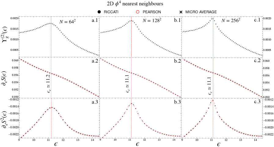
## Chart: 2D φ⁴ nearest neighbours
### Overview
The image presents a series of six subplots (a.1-a.3, b.1-b.3, c.1-c.3) displaying plots of different quantities related to a 2D φ⁴ nearest neighbours model. Each subplot corresponds to a different value of N (64², 128², 256²). The plots show relationships between variables ε (on the x-axis) and various functions of ε (on the y-axis).
### Components/Axes
* **Title:** "2D φ⁴ nearest neighbours" (top-center)
* **X-axis Label:** "ε" (appears on all subplots)
* **Y-axis Labels:**
* a.1, b.1, c.1: "Y(2ε)"
* a.2, b.2, c.2: "∂₂S(ε)"
* a.3, b.3, c.3: "∂₂S(ε)"
* **N Values:** N = 64², N = 128², N = 256² (displayed above each set of three subplots)
* **Legend:**
* Black circles: "RICCATI"
* Red circles: "PEARSON"
* Black crosses: "MICRO AVERAGE"
* **Vertical Lines:** Lines labeled "ε ≈ 11.2" (in a.2) and "ε ≈ 11.1" (in b.2 and c.2) are present in the subplots.
* **X-axis Scale:** The x-axis (ε) ranges approximately from 9 to 15 in all subplots.
* **Y-axis Scale:** The y-axis scales vary for each subplot, ranging from approximately -0.022 to 0.020 for a.3, -0.0022 to 0.022 for b.3, and -0.0018 to 0.002 for c.3.
### Detailed Analysis
Let's analyze each subplot and data series:
**a.1 (N = 64²):**
* **RICCATI (Black circles):** The curve starts at approximately Y(2ε) = 0.002 at ε ≈ 9, reaches a maximum of approximately 0.014 at ε ≈ 11.5, and then decreases to approximately 0.001 at ε ≈ 15.
* **PEARSON (Red circles):** The curve starts at approximately Y(2ε) = 0.018 at ε ≈ 9, decreases monotonically to approximately 0.002 at ε ≈ 15.
* **MICRO AVERAGE (Black crosses):** The curve starts at approximately Y(2ε) = 0.001 at ε ≈ 9, reaches a maximum of approximately 0.008 at ε ≈ 11.5, and then decreases to approximately 0.0005 at ε ≈ 15.
**a.2 (N = 64²):**
* **RICCATI (Black circles):** The curve starts at approximately ∂₂S(ε) = -0.055 at ε ≈ 9, increases to a maximum of approximately 0.060 at ε ≈ 11.2, and then decreases to approximately -0.050 at ε ≈ 15.
* **PEARSON (Red circles):** The curve starts at approximately ∂₂S(ε) = -0.050 at ε ≈ 9, increases to a maximum of approximately 0.055 at ε ≈ 11.2, and then decreases to approximately -0.045 at ε ≈ 15.
* **MICRO AVERAGE (Black crosses):** The curve starts at approximately ∂₂S(ε) = -0.052 at ε ≈ 9, increases to a maximum of approximately 0.058 at ε ≈ 11.2, and then decreases to approximately -0.048 at ε ≈ 15.
**a.3 (N = 64²):**
* **RICCATI (Black circles):** The curve starts at approximately ∂₂S(ε) = -0.022 at ε ≈ 9, increases to a maximum of approximately 0.002 at ε ≈ 11.2, and then decreases to approximately -0.020 at ε ≈ 15.
* **PEARSON (Red circles):** The curve starts at approximately ∂₂S(ε) = -0.020 at ε ≈ 9, increases to a maximum of approximately 0.001 at ε ≈ 11.2, and then decreases to approximately -0.018 at ε ≈ 15.
* **MICRO AVERAGE (Black crosses):** The curve starts at approximately ∂₂S(ε) = -0.021 at ε ≈ 9, increases to a maximum of approximately 0.0015 at ε ≈ 11.2, and then decreases to approximately -0.019 at ε ≈ 15.
**b.1, b.2, b.3 (N = 128²):** The trends are similar to the N = 64² case, but the curves appear to be shifted slightly and have different amplitudes.
**c.1, c.2, c.3 (N = 256²):** The trends are again similar, with further shifts and amplitude changes. The y-axis scales are smaller, indicating smaller values for the plotted functions.
### Key Observations
* All three methods (RICCATI, PEARSON, MICRO AVERAGE) show similar trends across all values of N.
* As N increases (from 64² to 256²), the magnitude of the plotted functions generally decreases.
* The vertical lines at ε ≈ 11.1 and ε ≈ 11.2 seem to mark points of interest in the curves, potentially indicating critical points or singularities.
* The PEARSON method consistently shows a monotonic decrease in Y(2ε) in the a.1, b.1, and c.1 subplots.
### Interpretation
The plots likely represent the behavior of different approximations or solutions to the 2D φ⁴ model as a function of a parameter ε. The different methods (RICCATI, PEARSON, MICRO AVERAGE) represent different ways of solving or approximating the model. The parameter N likely relates to the number of samples or grid points used in the approximation.
The decreasing magnitude of the functions as N increases suggests that the approximations become more accurate or converge as the number of samples increases. The vertical lines at ε ≈ 11.1 and ε ≈ 11.2 may indicate a phase transition or a critical point in the system, where the behavior of the model changes significantly. The consistent monotonic decrease of the PEARSON method in the Y(2ε) plots suggests that it may be a more stable or conservative approximation.
The data suggests that the 2D φ⁴ nearest neighbours model exhibits complex behavior as a function of ε, and that different approximation methods can provide insights into this behavior. The choice of approximation method and the number of samples used can significantly impact the results.