## Scatter Plot: Log Probability Ratio vs. Number of Layers
### Overview
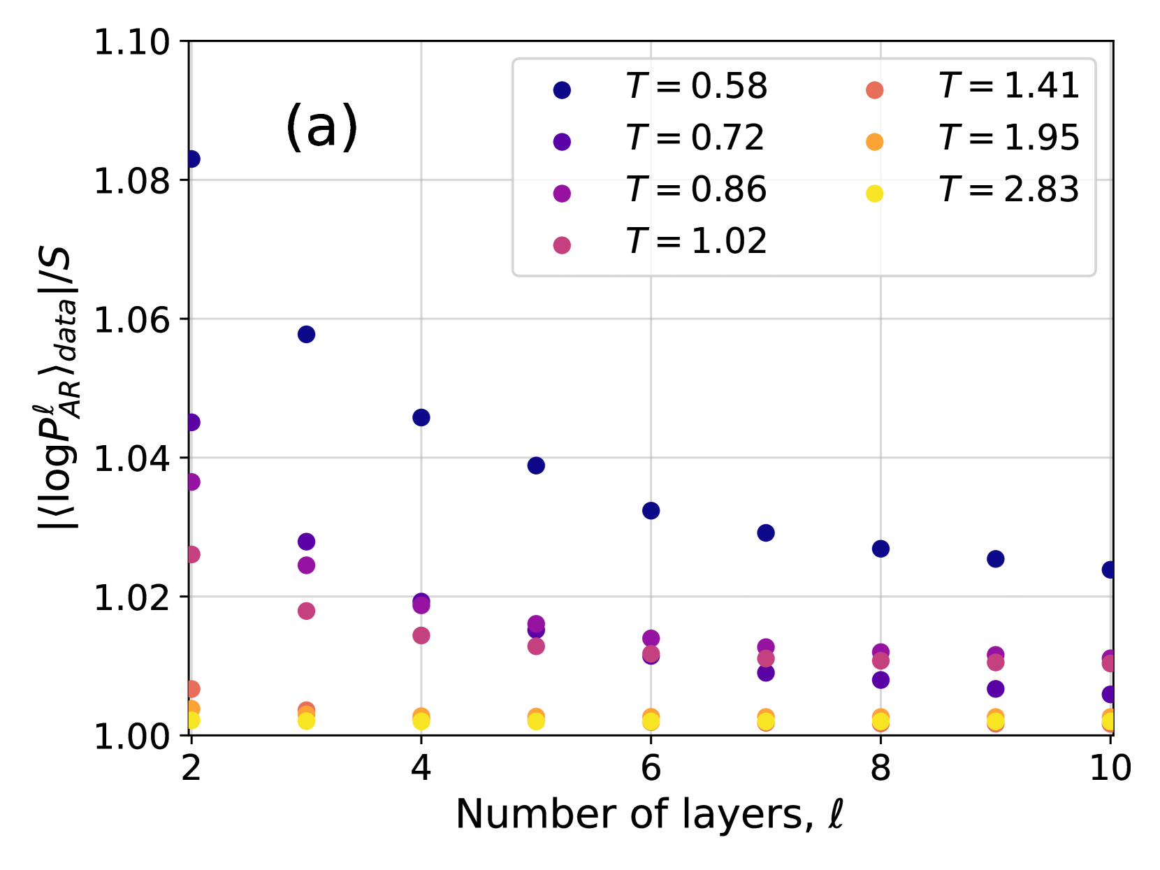
The image presents a scatter plot illustrating the relationship between the number of layers (denoted as 'l') and the log probability ratio (⟨log P<sup>l</sup><sub>AR</sub>⟩<sub>data</sub>/S) for different values of a parameter 'T'. The plot appears to be investigating how the log probability ratio changes as the number of layers increases, with different curves representing different temperature values.
### Components/Axes
* **X-axis:** Number of layers, 'l', ranging from approximately 2 to 10.
* **Y-axis:** ⟨log P<sup>l</sup><sub>AR</sub>⟩<sub>data</sub>/S, ranging from approximately 1.00 to 1.08.
* **Legend:** Located in the top-right corner, providing color-coded labels for different values of 'T':
* T = 0.58 (Dark Blue)
* T = 0.72 (Medium Blue)
* T = 0.86 (Purple)
* T = 1.02 (Magenta)
* T = 1.41 (Red)
* T = 1.95 (Orange)
* T = 2.83 (Yellow)
* **Title:** "(a)" in the top-left corner, likely indicating this is part of a larger figure.
### Detailed Analysis
The plot consists of several data series, each represented by a different color corresponding to a specific 'T' value.
* **T = 0.58 (Dark Blue):** The data points are scattered, generally around a value of 1.04-1.05, with a slight downward trend as the number of layers increases. Approximate data points: (2, 1.05), (3, 1.04), (4, 1.04), (6, 1.04), (8, 1.03), (10, 1.03).
* **T = 0.72 (Medium Blue):** Similar to T=0.58, the points are clustered around 1.03-1.04, with a slight downward trend. Approximate data points: (2, 1.04), (3, 1.04), (4, 1.03), (6, 1.03), (8, 1.02), (10, 1.02).
* **T = 0.86 (Purple):** The data points are around 1.02-1.03, showing a slight decrease with increasing layers. Approximate data points: (2, 1.03), (3, 1.02), (4, 1.02), (6, 1.01), (8, 1.01), (10, 1.01).
* **T = 1.02 (Magenta):** Points are clustered around 1.01-1.02, with a slight downward trend. Approximate data points: (3, 1.02), (4, 1.02), (6, 1.01), (8, 1.01), (10, 1.01).
* **T = 1.41 (Red):** The data points are consistently around 1.00-1.01, showing minimal variation with increasing layers. Approximate data points: (2, 1.01), (4, 1.00), (6, 1.00), (8, 1.00), (10, 1.00).
* **T = 1.95 (Orange):** The data points are consistently around 1.00, with minimal variation. Approximate data points: (2, 1.00), (4, 1.00), (6, 1.00), (8, 1.00), (10, 1.00).
* **T = 2.83 (Yellow):** The data points are consistently around 1.00, with minimal variation. Approximate data points: (2, 1.00), (4, 1.00), (6, 1.00), (8, 1.00), (10, 1.00).
### Key Observations
* The log probability ratio generally decreases slightly as the number of layers increases for lower values of 'T' (0.58, 0.72, 0.86, 1.02).
* For higher values of 'T' (1.41, 1.95, 2.83), the log probability ratio remains relatively constant around 1.00, regardless of the number of layers.
* There is a clear separation between the data series for lower and higher 'T' values.
### Interpretation
The plot suggests that the relationship between the number of layers and the log probability ratio is dependent on the value of 'T'. At lower 'T' values, increasing the number of layers leads to a slight decrease in the log probability ratio, potentially indicating diminishing returns or a saturation effect. However, at higher 'T' values, the log probability ratio remains constant, suggesting that adding more layers does not significantly impact the probability ratio in these cases.
The parameter 'T' likely represents a temperature or a similar scaling factor that influences the system's behavior. The observed trend could be related to the system reaching an equilibrium state or a point of diminishing sensitivity to additional layers as 'T' increases. The consistent value of 1.00 for higher 'T' values might indicate a stable or saturated state. The "(a)" label suggests this is part of a larger study, and comparing this plot to others in the figure could provide further insights into the overall system behavior.