\n
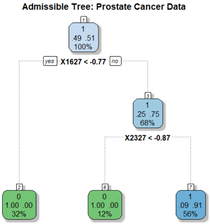
## Diagram: Admissible Tree - Prostate Cancer Data
### Overview
The image depicts a decision tree diagram, likely used in a medical context for diagnosing or classifying prostate cancer. The tree branches based on the results of two tests: "X1627 < -0.77" and "X2327 < -0.87". Each node in the tree represents a decision point or a final classification, and is labeled with numerical data.
### Components/Axes
The diagram consists of rectangular nodes connected by lines representing decision branches. Each node contains three numbers, and a percentage. The branches are labeled with the conditions for following that branch ("yes" or "no", and the test condition). The title of the diagram is "Admissible Tree: Prostate Cancer Data".
### Detailed Analysis or Content Details
The tree starts with node 1, positioned at the top-center.
* **Node 1:** Contains the values 0.49, 0.51, and 1, with a percentage of 100%. It branches based on the condition "X1627 < -0.77".
* **"yes" branch:** Leads to node 2, positioned on the left.
* **Node 2:** Contains the values 0, 1.00, and 0.00, with a percentage of 32%.
* **"no" branch:** Leads to node 3, positioned towards the bottom-center.
* **Node 3:** Contains the values 0.25, 0.75, and 1, with a percentage of 68%. It branches based on the condition "X2327 < -0.87".
* **"yes" branch:** Leads to node 6, positioned on the bottom-left.
* **Node 6:** Contains the values 1.00, 0.00, and 0, with a percentage of 12%.
* **"no" branch:** Leads to node 7, positioned on the bottom-right.
* **Node 7:** Contains the values 0.09, 0.91, and 1, with a percentage of 56%.
### Key Observations
The tree structure suggests a sequential decision-making process. The percentage values likely represent the proportion of cases that follow each branch or end up in each terminal node. Node 1 represents the initial population, and subsequent nodes represent increasingly refined classifications based on the test results. The percentages decrease as the tree branches, indicating that each test narrows down the population.
### Interpretation
This diagram represents a simplified model for classifying prostate cancer based on two biomarker tests (X1627 and X2327). The tree structure allows for a clear visualization of the decision-making process. The values within each node likely represent probabilities or proportions related to the presence or absence of the disease, or specific characteristics of the cancer.
The initial split at X1627 < -0.77 divides the population into two groups. Those with values below this threshold (32% of the initial population) are classified by Node 2. Those with values above this threshold (68% of the initial population) are further classified based on X2327 < -0.87.
The final nodes (2, 6, and 7) represent the ultimate classifications. The percentages associated with these nodes indicate the prevalence of each classification within the overall population. For example, 32% of the initial population falls into the classification represented by Node 2.
The diagram suggests that the combination of these two tests can effectively stratify patients into different risk groups or disease subtypes. The specific meaning of the numerical values within each node would require additional context about the data and the model.