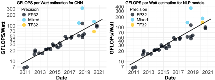
## Scatter Plot Charts: GFLOPS per Watt Estimation for CNN and NLP Models
### Overview
The image displays two side-by-side scatter plots with logarithmic y-axes. Both charts plot "GFLOPS/Watt" (a measure of computational efficiency) against "Date" (year) from 2011 to 2021. Each chart contains data points for different precision formats, overlaid with a black trend line. The left chart is specific to Convolutional Neural Networks (CNN), and the right chart is for Natural Language Processing (NLP) models.
### Components/Axes
**Common Elements (Both Charts):**
* **X-Axis:** Labeled "Date". Major tick marks are at 2-year intervals: 2011, 2013, 2015, 2017, 2019, 2021.
* **Y-Axis:** Labeled "GFLOPS/Watt". It is a logarithmic scale. Major labeled ticks are at 7, 10, 20, 30, 50, 70, 100, 200, 300, 400.
* **Legend:** Positioned in the top-left corner of each plot area. It defines four data series:
* **Precision** (Dark Gray circle)
* **FP32** (Light Blue circle)
* **Mixed** (Yellow circle)
* **TF32** (Orange circle)
* **Trend Line:** A solid black line showing the general upward trend of the data over time.
**Left Chart Specifics:**
* **Title:** "GFLOPS per Watt estimation for CNN"
**Right Chart Specifics:**
* **Title:** "GFLOPS per Watt estimation for NLP models"
### Detailed Analysis
**Left Chart (CNN):**
* **Trend:** The black trend line shows a clear, consistent upward slope from bottom-left to top-right, indicating a strong positive correlation between time and efficiency.
* **Data Series & Approximate Points:**
* **Precision (Dark Gray):** Forms the core cluster along the trend line. Points start near (2011, ~8) and progress to approximately (2021, ~100). The density of points increases from 2013 onward.
* **FP32 (Light Blue):** Points are generally above the main cluster and trend line. Notable points include one near (2019, ~150) and a significant outlier near (2019, ~380).
* **Mixed (Yellow):** A single visible point near (2021, ~70).
* **TF32 (Orange):** A single visible point near (2021, ~150).
**Right Chart (NLP):**
* **Trend:** The black trend line also shows a strong, consistent upward slope, similar to the CNN chart.
* **Data Series & Approximate Points:**
* **Precision (Dark Gray):** Again forms the core cluster along the trend line. Points start near (2011, ~8) and progress to approximately (2021, ~100). The distribution appears slightly more scattered in the mid-range (2015-2019) compared to the CNN chart.
* **FP32 (Light Blue):** Points are above the main cluster. Notable points include one near (2019, ~150) and a significant outlier near (2019, ~380), mirroring the CNN chart's outlier.
* **Mixed (Yellow):** A single visible point near (2021, ~150).
* **TF32 (Orange):** A single visible point near (2021, ~150), appearing very close to or overlapping the Mixed point.
### Key Observations
1. **Parallel Progress:** Both CNN and NLP model efficiencies have improved at a remarkably similar rate over the decade, as shown by the nearly identical trend lines.
2. **Precision Hierarchy:** In both domains, the "Precision" (likely representing standard or lower-precision training) data points form the baseline trend. "FP32" (32-bit floating point) consistently achieves higher efficiency values than the baseline cluster for the same time period.
3. **Recent Innovations:** The "Mixed" (mixed precision) and "TF32" (TensorFloat-32) data points only appear in the most recent years (2019-2021), indicating these are newer techniques. Their placement suggests they offer efficiency comparable to or exceeding the higher-end FP32 results.
4. **Significant Outlier:** Both charts feature a prominent FP32 data point around 2019 with an exceptionally high efficiency of ~380 GFLOPS/Watt, far above the trend line. This likely represents a specific, highly optimized model or hardware configuration.
5. **Logarithmic Growth:** The use of a log scale on the y-axis and the linear trend line on this scale implies that GFLOPS/Watt has been growing exponentially over time for both model types.
### Interpretation
The data demonstrates a clear and consistent exponential improvement in the computational efficiency (performance per watt) of both CNN and NLP models from 2011 to 2021. This trend is driven by advancements in both hardware (specialized AI accelerators) and software (training techniques, precision formats).
The parallel trajectories suggest that the underlying drivers of efficiency gains—such as Moore's Law for hardware, algorithmic improvements, and the adoption of lower-precision arithmetic—are being applied broadly across different AI domains. The appearance of Mixed Precision and TF32 points at the high end of recent years highlights the industry's shift towards utilizing reduced precision to maximize throughput and efficiency without significantly sacrificing model accuracy.
The outlier near 2019 serves as a benchmark, showing the peak efficiency achievable at that time and pulling the overall trend upward. The clustering of "Precision" points along the trend line represents the mainstream evolution of technology, while the points above it (FP32, Mixed, TF32) represent the leading edge of optimization. The charts collectively tell a story of rapid, sustained progress in making AI computation more powerful and energy-efficient.