\n
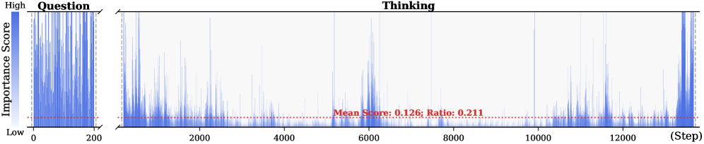
## Line Chart: Importance Score over Steps
### Overview
The image presents a line chart illustrating the "Importance Score" over "Step" number. The chart appears to represent the evolution of importance during a process divided into "Question" and "Thinking" phases. The Importance Score is plotted on the y-axis, ranging from "Low" to "High", while the Step number is plotted on the x-axis, ranging from 0 to approximately 12,500. A horizontal dashed line indicates the mean importance score.
### Components/Axes
* **X-axis:** "Step" - ranging from 0 to approximately 12,500.
* **Y-axis:** "Importance Score" - labeled with "Low" at the bottom and "High" at the top. The scale is not explicitly numerical, but represents a relative importance level.
* **Data Series:** A single blue line representing the Importance Score over time.
* **Annotations:**
* "Question" - Label above the initial portion of the chart (Steps 0-200 approximately).
* "Thinking" - Label above the remaining portion of the chart (Steps 200-12,500 approximately).
* "Mean Score: 0.126; Ratio: 0.211" - Text annotation positioned near the center of the chart.
* **Horizontal Line:** A dashed red line representing the mean Importance Score.
### Detailed Analysis
The blue line representing the Importance Score exhibits high variability.
* **Question Phase (Steps 0-200):** The line starts at a low Importance Score and rapidly increases to a high level within the first 200 steps. The line fluctuates significantly within this range.
* **Thinking Phase (Steps 200-12,500):** After the initial peak, the Importance Score generally decreases to a lower level, but continues to fluctuate considerably. There are several peaks and troughs throughout this phase. The line generally remains closer to the mean score than in the Question phase.
* **Mean Score:** The horizontal dashed red line indicates a mean Importance Score of approximately 0.126.
* **Ratio:** The ratio is given as 0.211, but its meaning is not explicitly defined in the image.
The data points are too dense to extract precise values, but the following observations can be made:
* Around Step 5000, there is a prominent peak in the Importance Score.
* Around Step 6500, there is another significant peak.
* The Importance Score generally remains below the mean score for the majority of the "Thinking" phase, but with frequent excursions above it.
### Key Observations
* The Importance Score is significantly higher during the "Question" phase compared to the "Thinking" phase.
* The "Thinking" phase is characterized by a more stable, but still fluctuating, Importance Score.
* The ratio of 0.211 may represent the proportion of time the Importance Score is above the mean.
### Interpretation
The chart suggests a process that begins with a focused "Question" phase where the Importance Score is high, indicating a strong signal or relevance. This is followed by a "Thinking" phase where the Importance Score is generally lower and more variable, suggesting a period of exploration and refinement. The fluctuations in the "Thinking" phase likely represent different ideas or considerations being evaluated. The mean Importance Score provides a baseline for assessing the overall relevance of the process. The ratio of 0.211 could indicate that 21.1% of the time during the process, the importance score is above the mean.
The sharp transition between the "Question" and "Thinking" phases suggests a distinct shift in the nature of the process. The high variability in the "Thinking" phase indicates a complex and dynamic process where the importance of different factors changes over time. The chart could be used to evaluate the effectiveness of the process by analyzing the distribution of Importance Scores and identifying areas where the signal is consistently strong or weak.