## Inductive Planning Diagram
### Overview
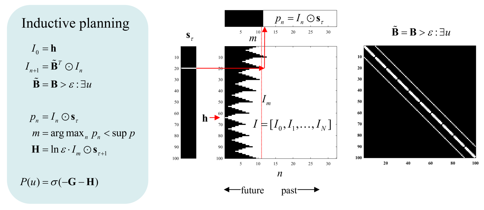
The image presents a diagram illustrating the concept of inductive planning. It includes mathematical formulas, two plots representing state transitions, and a heatmap-like representation of a matrix. The diagram aims to visually explain the process of inductive planning using mathematical notation and graphical representations.
### Components/Axes
* **Title:** Inductive planning (top-left)
* **Mathematical Formulas:**
* `I₀ = h`
* `Iₙ₊₁ = B̃ᵀ ⊙ Iₙ`
* `B̃ = B > ε : ∃u`
* `pₙ = Iₙ ⊙ sτ`
* `m = arg maxₙ pₙ < sup p`
* `H = ln ε ⋅ Iₘ ⊙ sτ₊₁`
* `P(u) = σ(-G - H)`
* **Left Plot:**
* Y-axis: Labeled `sτ`, with tick marks from 10 to 100 in increments of 10.
* The plot shows a black bar with a small white segment around the 20 mark.
* A red arrow points from the white segment to the right.
* A red arrow points to the black bar at the 60 mark, labeled `h`.
* **Middle Plot:**
* X-axis: Labeled `n`, with tick marks from 5 to 30 in increments of 5. An arrow below the axis indicates "future" to the left and "past" to the right.
* Y-axis: Tick marks from 10 to 100 in increments of 10.
* The plot shows a series of black and white horizontal bars, with the white portions forming a jagged pattern.
* A red dotted vertical line is present at approximately the 11 mark on the x-axis, labeled `m`.
* The expression `pₙ = Iₙ ⊙ sτ` is above the plot.
* The expression `I = [I₀, I₁, ..., Iₙ]` is to the right of the plot.
* The label `Iₘ` is to the left of the red dotted line.
* **Right Plot:**
* X and Y axes: Tick marks from 20 to 100 in increments of 20.
* The plot shows a black square with three diagonal white lines.
* The expression `B̃ = B > ε : ∃u` is above the plot.
### Detailed Analysis or Content Details
* **Mathematical Formulas:** The formulas describe the inductive planning process, involving state transitions, reward functions, and policy updates.
* **Left Plot (sτ):** The plot represents the state `sτ` at different time steps. The white segment at approximately 20 indicates a specific state value.
* **Middle Plot (n):** The plot represents the evolution of the state over time (`n`). The jagged pattern indicates changes in the state. The red dotted line `m` marks a specific time step.
* **Right Plot (B̃):** The plot represents the matrix `B̃`, which likely encodes transition probabilities or relationships between states. The diagonal lines suggest a strong correlation between neighboring states.
### Key Observations
* The diagram combines mathematical notation with visual representations to explain inductive planning.
* The plots provide a visual understanding of state transitions and relationships.
* The mathematical formulas formalize the planning process.
### Interpretation
The diagram illustrates the core concepts of inductive planning. The formulas define the mathematical framework, while the plots provide a visual representation of the planning process. The left plot `sτ` shows the state at different time steps, the middle plot `n` shows the evolution of the state over time, and the right plot `B̃` represents the transition matrix. The red arrows and dotted line highlight specific aspects of the planning process. The diagram suggests that inductive planning involves iteratively updating the state based on the transition matrix and reward function. The goal is to find an optimal policy that maximizes the cumulative reward.