## Diagram: Inductive Planning Visualization
### Overview
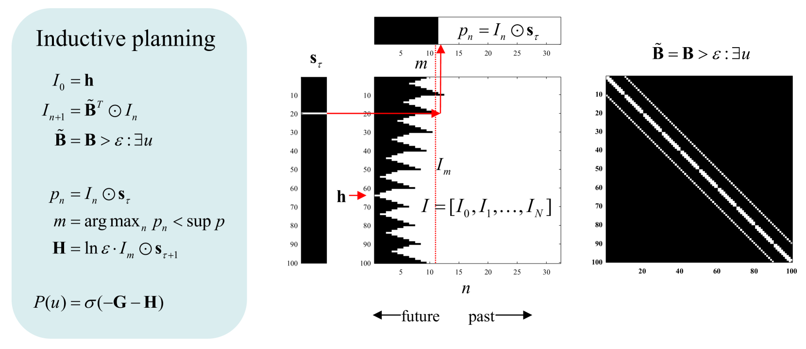
The image presents a diagram illustrating a concept called "Inductive Planning". It consists of mathematical equations on the left and three grayscale plots on the right, visually representing the relationships defined by the equations. The plots appear to depict a state space or a similar representation of a planning process, with the leftmost plot being the most detailed and the rightmost being a simplified representation.
### Components/Axes
The diagram is divided into two main sections:
1. **Equations (Left):** A series of mathematical equations defining the inductive planning process.
2. **Plots (Right):** Three grayscale plots, each with labeled axes.
**Axes Labels:**
* **Plot 1 (Center-Left):**
* X-axis: `n` (ranging approximately from 0 to 35) - labeled as "future" to "past"
* Y-axis: `sτ` (ranging approximately from 0 to 100)
* **Plot 2 (Center-Right):**
* X-axis: `n` (ranging approximately from 0 to 100)
* Y-axis: `sτ` (ranging approximately from 0 to 100)
* **Plot 3 (Right):**
* X-axis: `n` (ranging approximately from 0 to 100)
* Y-axis: `sτ` (ranging approximately from 0 to 100)
**Equations:**
* `I₀ = h`
* `Iₙ₊₁ = B̃ᵀOIₙ`
* `B̃ = B > ε:∃u`
* `Pₙ = IₙOSτ`
* `m = arg maxₙ Pₙ < sup p`
* `H = lnε:IOSτₙ₊₁`
* `P(u) = σ(-G - H)`
**Annotations within Plots:**
* Plot 1: `I = [I₀, I₁, ..., Iₙ]`
* Plot 1: `m` (indicated by a red arrow)
* Plot 1: `h` (indicated by a red arrow)
### Detailed Analysis or Content Details
**Plot 1 (Center-Left):**
This plot shows a grayscale representation where darker shades indicate higher values. A diagonal line extends from the bottom-left corner (approximately (0,0)) to the top-right corner (approximately (35,100)). This line represents the values of `Iₙ`. A red arrow points to the starting point of the line, labeled `h`. Another red arrow points to a point on the line, labeled `m`. The grayscale values appear to increase as `n` increases, suggesting a positive correlation.
**Plot 2 (Center-Right):**
This plot is similar to Plot 1, but extends to `n = 100`. It also shows a diagonal line, but the grayscale values are less distinct. The line starts at approximately (0,0) and extends to (100,100).
**Plot 3 (Right):**
This plot shows a completely dark triangle. The lower-left corner is at approximately (0,0), and the upper-right corner is at approximately (100,100). This suggests that all values in this region are at their maximum grayscale value.
**Equations Breakdown:**
* `I₀ = h`: Initial state `I₀` is equal to `h`.
* `Iₙ₊₁ = B̃ᵀOIₙ`: The next state `Iₙ₊₁` is calculated based on the previous state `Iₙ`, a transformation matrix `B̃`, and a function `O`.
* `B̃ = B > ε:∃u`: The transformation matrix `B̃` is defined based on a matrix `B` and a threshold `ε`.
* `Pₙ = IₙOSτ`: The probability `Pₙ` is calculated based on the state `Iₙ`, a function `O`, and a state `sτ`.
* `m = arg maxₙ Pₙ < sup p`: `m` is the value of `n` that maximizes the probability `Pₙ`, but is less than a supremum `p`.
* `H = lnε:IOSτₙ₊₁`: `H` is calculated based on the logarithm of `ε`, a function `O`, and the next state `Iₙ₊₁`.
* `P(u) = σ(-G - H)`: The probability of `u` is calculated using a sigmoid function `σ` and parameters `G` and `H`.
### Key Observations
* The plots demonstrate a progression from a detailed representation (Plot 1) to a simplified one (Plot 3).
* The diagonal lines in Plots 1 and 2 suggest a linear relationship between `n` and `sτ`.
* The dark triangle in Plot 3 indicates a saturation or maximum value being reached.
* The equations define a recursive process for updating the state `Iₙ` and calculating probabilities.
### Interpretation
The diagram illustrates an inductive planning process where an initial state `h` is iteratively updated based on a transformation matrix `B̃`. The probability of reaching a state `sτ` is calculated at each step, and the optimal step `m` is determined. The final probability `P(u)` is then calculated based on parameters `G` and `H`.
The plots visually represent this process. Plot 1 shows the initial stages of the planning process, where the state `Iₙ` is evolving. Plot 2 shows the process continuing to a larger scale. Plot 3 represents a scenario where the planning process has reached a saturation point, and further steps do not significantly improve the probability of success.
The equations and plots together suggest a framework for learning and adapting a plan based on observed outcomes. The use of probabilities and optimization techniques indicates a focus on finding the most likely path to a desired goal. The diagram is a conceptual representation of an algorithm, rather than a presentation of specific data.