## Scatter Plot: SWE Dataset Quality vs. Size
### Overview
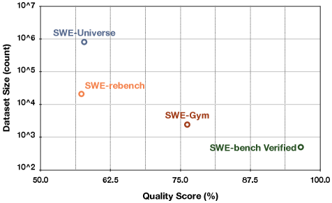
The image is a scatter plot comparing four different Software Engineering (SWE) datasets. It plots "Dataset Size (count)" on a logarithmic y-axis against "Quality Score (%)" on a linear x-axis. The chart visually demonstrates a trade-off: datasets with higher quality scores tend to be significantly smaller in size.
### Components/Axes
* **Chart Type:** Scatter plot.
* **X-Axis:**
* **Label:** `Quality Score (%)`
* **Scale:** Linear, from 50.0 to 100.0.
* **Major Ticks:** 50.0, 62.5, 75.0, 87.5, 100.0.
* **Y-Axis:**
* **Label:** `Dataset Size (count)`
* **Scale:** Logarithmic (base 10).
* **Major Ticks:** 10^2, 10^3, 10^4, 10^5, 10^6, 10^7.
* **Data Series (Labeled Points):** Four distinct data points, each labeled directly on the chart. The legend is integrated as text labels adjacent to each point.
1. **SWE-Universe** (Blue circle)
2. **SWE-rebench** (Orange circle)
3. **SWE-Gym** (Red circle)
4. **SWE-bench Verified** (Green circle)
### Detailed Analysis
**Data Point Extraction (Approximate Values):**
The following table reconstructs the data based on visual estimation from the chart's grid lines.
| Dataset Label | Color | Approx. Quality Score (%) | Approx. Dataset Size (count) | Spatial Position (Relative to Plot Area) |
| :--- | :--- | :--- | :--- | :--- |
| **SWE-Universe** | Blue | ~57% | ~8 x 10^5 (800,000) | Top-Left quadrant. Highest size, lowest quality. |
| **SWE-rebench** | Orange | ~58% | ~2 x 10^4 (20,000) | Center-Left. Slightly higher quality than SWE-Universe but ~40x smaller. |
| **SWE-Gym** | Red | ~76% | ~2 x 10^3 (2,000) | Center. Noticeably higher quality and ~10x smaller than SWE-rebench. |
| **SWE-bench Verified** | Green | ~96% | ~1 x 10^2 (100) | Bottom-Right quadrant. Highest quality, smallest size by a large margin. |
**Trend Verification:**
The visual trend is a clear, inverse relationship. As one moves from left to right along the x-axis (increasing Quality Score), the data points descend sharply along the logarithmic y-axis (decreasing Dataset Size). The line connecting these points conceptually would slope steeply downward.
### Key Observations
1. **Inverse Correlation:** There is a strong negative correlation between dataset size and quality score among these four benchmarks.
2. **Magnitude of Difference:** The range is vast. The largest dataset (SWE-Universe) is approximately **8,000 times larger** than the smallest (SWE-bench Verified), while the smallest has a quality score nearly **40 percentage points higher**.
3. **Clustering:** SWE-Universe and SWE-rebench are clustered in the lower-quality, larger-size region. SWE-Gym occupies a middle ground. SWE-bench Verified is an outlier in the high-quality, small-size region.
### Interpretation
This chart illustrates a fundamental tension in dataset curation for software engineering tasks: **scale versus precision**.
* **What the data suggests:** Achieving a very high "Quality Score" (likely involving rigorous verification, human annotation, or filtering for correctness) appears to require a drastic reduction in dataset size. Conversely, scaling up to massive sizes (like SWE-Universe) seems to come at the cost of lower average quality.
* **How elements relate:** The logarithmic y-axis is crucial. It emphasizes that the size differences are not linear but exponential. A small gain in quality score (e.g., from SWE-rebench to SWE-Gym) is associated with an order-of-magnitude reduction in size.
* **Notable implications:** The position of **SWE-bench Verified** is particularly significant. It represents a "gold standard" approach where immense effort is invested in verifying a small set of high-quality examples. This is contrasted with **SWE-Universe**, which likely prioritizes breadth and volume, possibly through automated collection, accepting lower average quality as a trade-off. The choice between these datasets would depend entirely on the downstream task: training a large model might benefit from scale, while evaluating a model's precise reasoning might require the verified set. The chart provides a clear visual framework for understanding this strategic choice in dataset development.