TECHNICAL ASSET FINGERPRINT
3f5c408cfc72cfdbe3fad275
Click to view fullscreen
Press ESC or click to close
FOUND IN PAPERS
EXPERT: gemini-2.0-flash VERSION 1
RUNTIME: nugit/gemini/gemini-2.0-flash
INTEL_VERIFIED
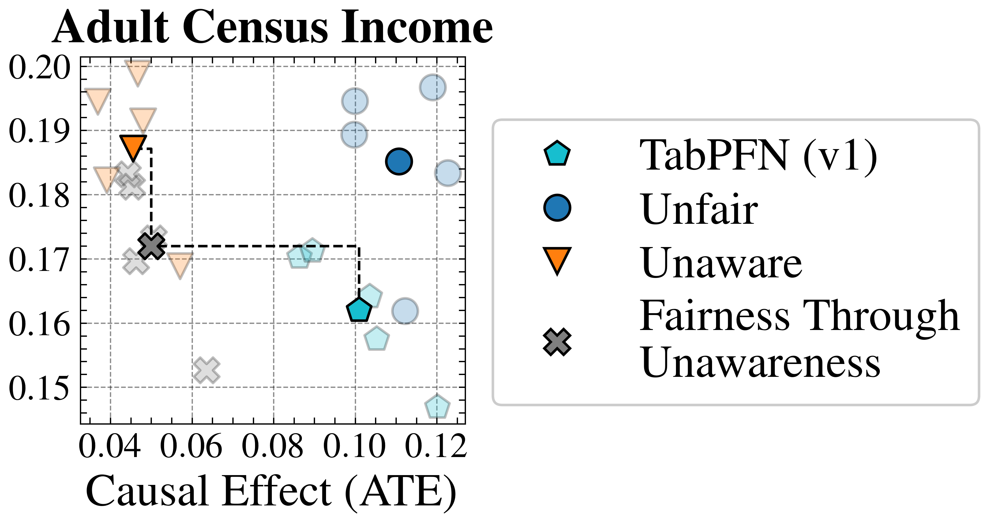
## Scatter Plot: Adult Census Income
### Overview
The image is a scatter plot titled "Adult Census Income". It visualizes the relationship between "Causal Effect (ATE)" on the x-axis and an unspecified metric on the y-axis, ranging from 0.15 to 0.20. The plot compares four different methods: TabPFN (v1), Unfair, Unaware, and Fairness Through Unawareness. A dashed line connects two data points, representing a specific transition or comparison.
### Components/Axes
* **Title:** Adult Census Income
* **X-axis:** Causal Effect (ATE), with tick marks at 0.04, 0.06, 0.08, 0.10, and 0.12.
* **Y-axis:** Values range from 0.15 to 0.20, with tick marks at 0.15, 0.16, 0.17, 0.18, 0.19, and 0.20.
* **Grid:** The plot has a grid of dashed gray lines.
* **Legend:** Located on the right side of the plot.
* **TabPFN (v1):** Represented by a cyan pentagon.
* **Unfair:** Represented by a blue circle.
* **Unaware:** Represented by an orange triangle pointing downwards.
* **Fairness Through Unawareness:** Represented by a gray "X" mark.
* **Dashed Line:** A black dashed line connects the "Fairness Through Unawareness" point at approximately (0.04, 0.17) to the "TabPFN (v1)" point at approximately (0.10, 0.17).
### Detailed Analysis
* **TabPFN (v1):**
* There are multiple cyan pentagons, some more transparent than others.
* One is located at approximately (0.10, 0.16).
* Another is located at approximately (0.10, 0.17).
* Other points are scattered around (0.11, 0.19) and (0.12, 0.15).
* **Unfair:**
* There are multiple blue circles, some more transparent than others.
* One is located at approximately (0.11, 0.185).
* Other points are scattered around (0.12, 0.20) and (0.12, 0.19).
* **Unaware:**
* There are multiple orange triangles pointing downwards, some more transparent than others.
* One is located at approximately (0.04, 0.188).
* Another is located at approximately (0.04, 0.195).
* Other points are scattered around (0.04, 0.18) and (0.06, 0.17).
* **Fairness Through Unawareness:**
* There are multiple gray "X" marks, some more transparent than others.
* One is located at approximately (0.04, 0.172).
* Other points are scattered around (0.05, 0.18) and (0.06, 0.15).
### Key Observations
* The "Unaware" method has the lowest Causal Effect (ATE) values, clustered around 0.04-0.06.
* The "Unfair" method has the highest Causal Effect (ATE) values, clustered around 0.11-0.12.
* The "TabPFN (v1)" method has Causal Effect (ATE) values between 0.10 and 0.12.
* The "Fairness Through Unawareness" method has the lowest Causal Effect (ATE) values, clustered around 0.04-0.06.
* The dashed line connects "Fairness Through Unawareness" to "TabPFN (v1)", suggesting a potential transition or comparison between these two methods.
### Interpretation
The scatter plot compares the performance of four different methods related to fairness and causal effect in the context of adult census income prediction. The x-axis, "Causal Effect (ATE)", likely represents the average treatment effect, indicating the causal impact of a certain intervention or variable. The y-axis represents an unspecified metric, possibly related to accuracy or fairness.
The plot suggests that the "Unaware" and "Fairness Through Unawareness" methods have lower causal effects compared to "Unfair" and "TabPFN (v1)". The dashed line connecting "Fairness Through Unawareness" to "TabPFN (v1)" might indicate an improvement or a trade-off between these two methods. The scattering of points for each method could represent different experimental runs or variations of the method.
The data suggests a trade-off between causal effect and whatever the y-axis represents. The "Unfair" method achieves the highest causal effect, but potentially at the cost of fairness or another performance metric. The "Fairness Through Unawareness" method prioritizes fairness, but sacrifices causal effect. "TabPFN (v1)" appears to be a compromise between the two.
DECODING INTELLIGENCE...
EXPERT: gemma-3-27b-it-free VERSION 1
RUNTIME: google-free/gemma-3-27b-it
INTEL_VERIFIED
## Scatter Plot: Adult Census Income
### Overview
This image presents a scatter plot visualizing data related to "Adult Census Income," likely representing the performance of different fairness-aware machine learning models. The plot compares "Causal Effect (ATE)" against an unspecified y-axis value, with data points distinguished by shape and color according to the model they represent. A dashed rectangle highlights a region of interest.
### Components/Axes
* **Title:** "Adult Census Income" (top-center)
* **X-axis Label:** "Causal Effect (ATE)" (bottom-center)
* **Y-axis:** The y-axis is not explicitly labeled, but ranges from approximately 0.15 to 0.20.
* **Legend:** Located in the top-right corner, containing the following entries:
* Light Blue Diamond: TabPFN (v1)
* Dark Blue Circle: Unfair
* Orange Downward-Pointing Triangle: Unaware
* Gray Cross: Fairness Through Unawareness
* **Dashed Rectangle:** A dashed rectangle is drawn on the plot, spanning approximately from x=0.04 to x=0.10 and y=0.16 to 0.19.
### Detailed Analysis
The plot contains several data points, each representing a model's performance.
* **TabPFN (v1) - Light Blue Diamonds:**
* Point 1: Approximately (0.04, 0.175)
* Point 2: Approximately (0.08, 0.16)
* Point 3: Approximately (0.10, 0.165)
* Point 4: Approximately (0.12, 0.155)
* Trend: The points generally show a slight upward trend, but with considerable variance.
* **Unfair - Dark Blue Circles:**
* Point 1: Approximately (0.06, 0.185)
* Point 2: Approximately (0.08, 0.19)
* Point 3: Approximately (0.10, 0.18)
* Point 4: Approximately (0.12, 0.18)
* Trend: The points show a relatively flat trend, with values clustered around 0.18-0.19.
* **Unaware - Orange Downward-Pointing Triangles:**
* Point 1: Approximately (0.05, 0.19)
* Point 2: Approximately (0.06, 0.17)
* Trend: The points show a downward trend.
* **Fairness Through Unawareness - Gray Crosses:**
* Point 1: Approximately (0.05, 0.17)
* Point 2: Approximately (0.08, 0.165)
* Trend: The points show a relatively flat trend.
### Key Observations
* The "Unfair" model consistently exhibits higher values on the y-axis compared to other models, particularly within the range of x-values from 0.06 to 0.12.
* The "Unaware" model shows a decreasing trend as the "Causal Effect (ATE)" increases.
* The dashed rectangle appears to highlight a region where the "TabPFN (v1)" and "Fairness Through Unawareness" models perform similarly.
* There is significant overlap in the y-axis values across different models, suggesting that the performance differences are not always substantial.
### Interpretation
The scatter plot likely aims to compare the trade-off between fairness and accuracy (as represented by the "Causal Effect (ATE)") for different machine learning models applied to the Adult Census Income dataset. The "Unfair" model, despite its name, appears to achieve the highest values on the y-axis, potentially indicating better performance on some metric (e.g., accuracy) but at the cost of fairness. The "Unaware" model, which doesn't explicitly account for fairness, shows a negative correlation between "Causal Effect (ATE)" and the y-axis value, suggesting that increasing the causal effect might lead to a decrease in performance. The "TabPFN (v1)" and "Fairness Through Unawareness" models represent attempts to balance fairness and accuracy, and their performance falls within a narrower range. The dashed rectangle highlights a region where these models exhibit comparable performance. The lack of explicit y-axis labeling makes it difficult to draw definitive conclusions, but the plot suggests that achieving fairness may involve a trade-off with other performance metrics.
DECODING INTELLIGENCE...
EXPERT: healer-alpha-free VERSION 1
RUNTIME: free/openrouter/healer-alpha
INTEL_VERIFIED
\n
## Scatter Plot: Adult Census Income - Causal Effect vs. Unlabeled Metric
### Overview
This is a scatter plot titled "Adult Census Income." It compares four different methods or models based on two metrics: "Causal Effect (ATE)" on the x-axis and an unnamed performance or error metric on the y-axis (ranging from 0.15 to 0.20). The plot visualizes the trade-off between the causal effect of a sensitive attribute and the model's performance.
### Components/Axes
* **Title:** "Adult Census Income" (top-left, above the plot area).
* **X-Axis:**
* **Label:** "Causal Effect (ATE)" (centered below the axis).
* **Scale:** Linear, ranging from approximately 0.04 to 0.12.
* **Major Ticks:** 0.04, 0.06, 0.08, 0.10, 0.12.
* **Y-Axis:**
* **Label:** **Not explicitly labeled.** The axis displays numerical values only.
* **Scale:** Linear, ranging from 0.15 to 0.20.
* **Major Ticks:** 0.15, 0.16, 0.17, 0.18, 0.19, 0.20.
* **Legend:** Positioned to the right of the plot area. It defines four data series by shape and color:
1. **TabPFN (v1):** Cyan (light blue) pentagon.
2. **Unfair:** Blue circle.
3. **Unaware:** Orange inverted triangle.
4. **Fairness Through Unawareness:** Gray 'X' (cross).
* **Grid:** A light gray dashed grid is present for both axes.
### Detailed Analysis
The plot contains multiple data points for each series, showing their distribution across the two metrics.
**1. TabPFN (v1) - Cyan Pentagons:**
* **Trend:** Points are clustered in the lower-right quadrant, indicating higher Causal Effect (ATE) and lower values on the y-axis metric.
* **Approximate Data Points (x, y):**
* (0.10, 0.162)
* (0.105, 0.158)
* (0.09, 0.170)
* (0.092, 0.170)
* (0.12, 0.148) - This is the lowest y-value on the entire plot.
**2. Unfair - Blue Circles:**
* **Trend:** Points are clustered in the upper-right quadrant, indicating both higher Causal Effect (ATE) and higher values on the y-axis metric.
* **Approximate Data Points (x, y):**
* (0.10, 0.195)
* (0.10, 0.190)
* (0.11, 0.185)
* (0.12, 0.197)
* (0.12, 0.183)
* (0.11, 0.162) - An outlier for this group, lower on the y-axis.
**3. Unaware - Orange Inverted Triangles:**
* **Trend:** Points are clustered in the upper-left quadrant, indicating lower Causal Effect (ATE) but higher values on the y-axis metric.
* **Approximate Data Points (x, y):**
* (0.04, 0.195)
* (0.05, 0.200)
* (0.05, 0.192)
* (0.04, 0.183)
* (0.05, 0.188) - This point is connected by a dashed line to a gray 'X'.
* (0.06, 0.170)
**4. Fairness Through Unawareness - Gray 'X's:**
* **Trend:** Points are more scattered, primarily in the left and central regions of the plot.
* **Approximate Data Points (x, y):**
* (0.05, 0.182)
* (0.05, 0.172) - This point is connected by dashed lines to an orange triangle and a cyan pentagon.
* (0.05, 0.170)
* (0.06, 0.153)
**Notable Visual Element:**
* A set of black dashed lines connects three specific points, forming a right angle:
1. An **Unaware** (orange triangle) point at approximately (0.05, 0.188).
2. A **Fairness Through Unawareness** (gray 'X') point at approximately (0.05, 0.172).
3. A **TabPFN (v1)** (cyan pentagon) point at approximately (0.10, 0.162).
* This likely highlights a direct comparison or a specific trade-off path between these three methods.
### Key Observations
1. **Clear Clustering by Method:** Each method occupies a distinct region of the plot, suggesting strong, consistent characteristics.
2. **Performance-Fairness Trade-off:** There appears to be an inverse relationship between the y-axis metric (likely a measure of error or loss, where lower is better) and the Causal Effect (ATE). Methods with lower ATE (Unaware) have higher y-values, while methods with higher ATE (TabPFN v1, Unfair) have lower y-values.
3. **"Unfair" vs. "TabPFN (v1)":** Both have high ATE, but "Unfair" has significantly higher y-values (worse performance), while "TabPFN (v1)" achieves the lowest y-values (best performance) on the chart.
4. **"Fairness Through Unawareness" Variability:** This method shows the widest spread, particularly in the y-axis direction, indicating less consistent performance compared to the others.
### Interpretation
This chart analyzes fairness in machine learning models trained on the Adult Census Income dataset, a common benchmark for fairness research. The **Causal Effect (ATE - Average Treatment Effect)** on the x-axis likely measures the direct influence of a sensitive attribute (e.g., race, gender) on the model's predictions. A higher ATE suggests the model's decisions are more causally influenced by that attribute, which is often considered unfair.
The **unlabeled y-axis** almost certainly represents a standard model performance metric like **log loss, error rate, or 1 - accuracy**, where a **lower value is better**.
The data demonstrates a fundamental tension:
* **Unaware** models (which are not designed to be fair) achieve low causal influence (low ATE) but have poor predictive performance (high y-value).
* **Unfair** models (likely standard models without any fairness constraints) achieve good performance (low y-value) but have high causal influence (high ATE), indicating potential bias.
* **TabPFN (v1)** appears to be a method that successfully achieves **both** high performance (very low y-value) **and** a high causal effect. This is a critical observation—it suggests this method may be optimizing for accuracy in a way that inadvertently amplifies the causal influence of the sensitive attribute.
* The **"Fairness Through Unawareness"** method and the dashed lines connecting it to the others illustrate a potential compromise or a specific intervention point. The path from "Unaware" down to "Fairness Through Unawareness" shows a gain in fairness (slight increase in ATE) at the cost of performance (drop in y-value). The horizontal line to "TabPFN (v1)" then shows a dramatic increase in ATE for a further gain in performance.
**Conclusion:** The plot suggests that on this dataset, achieving the highest predictive performance (TabPFN v1) comes with a high causal effect of the sensitive attribute. Traditional "unaware" modeling yields low causal effect but poor performance. The chart visualizes the search for methods that can navigate this trade-off, with the dashed lines potentially highlighting a specific analytical comparison between three key approaches. The missing y-axis label is a significant omission for full technical interpretation.
DECODING INTELLIGENCE...
EXPERT: nemotron-free VERSION 1
RUNTIME: free/nvidia/nemotron-nano-12b-v2-vl:free
INTEL_VERIFIED
## Scatter Plot: Adult Census Income
### Overview
The image is a scatter plot titled "Adult Census Income," visualizing the relationship between **Causal Effect (ATE)** (x-axis) and **Adult Census Income** (y-axis). Data points are categorized by fairness-related labels (e.g., "Unaware," "Unfair," "Fairness Through Unawareness") and represented by distinct symbols and colors. The plot includes a legend on the right, axis labels, and gridlines for reference.
---
### Components/Axes
- **X-axis (Causal Effect (ATE))**: Ranges from 0.04 to 0.12, with gridlines at 0.04, 0.06, 0.08, 0.10, and 0.12.
- **Y-axis (Adult Census Income)**: Ranges from 0.15 to 0.20, with gridlines at 0.15, 0.16, 0.17, 0.18, 0.19, and 0.20.
- **Legend**: Located on the right, with the following mappings:
- **Teal pentagon**: TabPFN (v1)
- **Dark blue circle**: Unfair
- **Orange triangle**: Unaware
- **Gray cross**: Fairness Through Unawareness
---
### Detailed Analysis
#### Data Points and Trends
1. **Orange Triangles (Unaware)**:
- Clustered around **x = 0.04–0.08** and **y = 0.18–0.19**.
- Example points: (0.06, 0.185), (0.07, 0.18), (0.05, 0.19).
- **Trend**: High income values with relatively low causal effects.
2. **Dark Blue Circles (Unfair)**:
- Spread across **x = 0.10–0.12** and **y = 0.18–0.19**.
- Example points: (0.11, 0.185), (0.12, 0.19), (0.10, 0.18).
- **Trend**: Higher causal effects and income values, suggesting a potential trade-off between fairness and performance.
3. **Teal Pentagons (TabPFN v1)**:
- Located near **x = 0.10** and **y = 0.16**.
- Example points: (0.10, 0.16), (0.09, 0.165).
- **Trend**: Moderate causal effects and lower income compared to other groups.
4. **Gray Crosses (Fairness Through Unawareness)**:
- Clustered around **x = 0.08–0.10** and **y = 0.17–0.18**.
- Example points: (0.08, 0.175), (0.10, 0.17).
- **Trend**: Balanced but lower income and causal effects compared to "Unaware" and "Unfair" groups.
---
### Key Observations
- **Outliers**:
- A single orange triangle (Unaware) at (0.09, 0.17) deviates from the cluster, suggesting variability in the "Unaware" group.
- A dark blue circle (Unfair) at (0.12, 0.19) is the highest point on the plot, indicating an extreme case.
- **Grouping Patterns**:
- "Unaware" and "Unfair" groups occupy distinct regions of the plot, with "Unaware" favoring higher income and "Unfair" favoring higher causal effects.
- "TabPFN v1" and "Fairness Through Unawareness" groups are intermediate, with "TabPFN v1" showing slightly lower income and "Fairness Through Unawareness" showing slightly lower causal effects.
---
### Interpretation
The plot highlights trade-offs between **causal effect (ATE)** and **income** across different fairness approaches:
1. **Unaware** (orange triangles): Prioritizes high income but achieves lower causal effects, possibly indicating a focus on outcomes over fairness.
2. **Unfair** (dark blue circles): Achieves higher causal effects but may compromise fairness, as suggested by the label.
3. **TabPFN v1** (teal pentagons): Balances moderate causal effects and income, potentially reflecting a more nuanced approach.
4. **Fairness Through Unawareness** (gray crosses): Sits in the middle, suggesting a compromise between fairness and performance.
The data implies that fairness strategies (e.g., "Unaware" vs. "Unfair") influence the relationship between causal effects and income, with no single approach dominating both metrics. The "Unaware" group’s high income but low causal effects may indicate a focus on optimizing outcomes at the expense of fairness, while the "Unfair" group’s high causal effects might reflect a focus on fairness metrics that inadvertently reduce income. The intermediate groups ("TabPFN v1" and "Fairness Through Unawareness") suggest potential middle-ground solutions.
This analysis underscores the complexity of balancing fairness and performance in algorithmic decision-making, as visualized through the Adult Census Income dataset.
DECODING INTELLIGENCE...