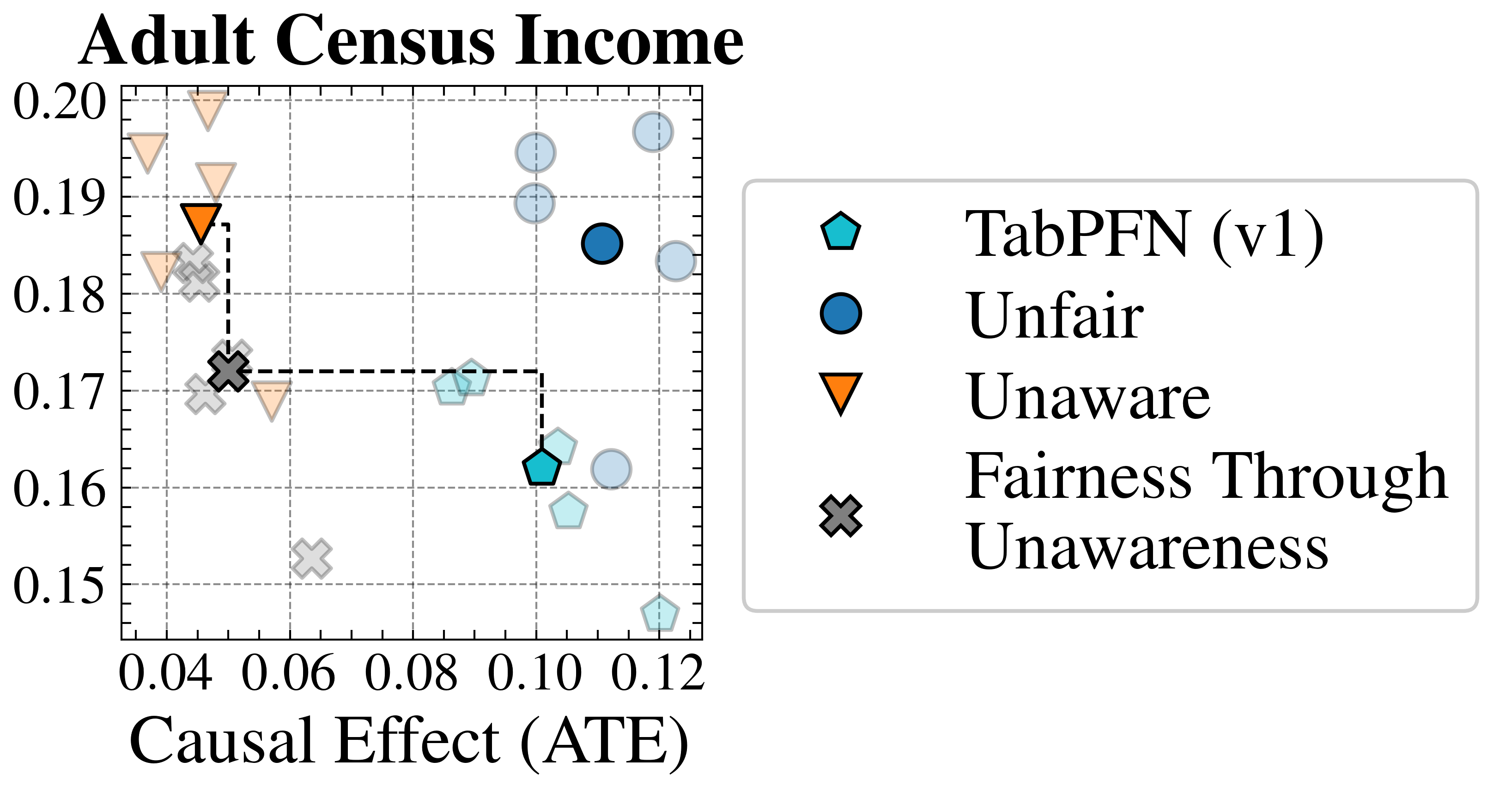
## Scatter Plot: Adult Census Income
### Overview
The image is a scatter plot titled "Adult Census Income," visualizing the relationship between **Causal Effect (ATE)** (x-axis) and **Adult Census Income** (y-axis). Data points are categorized by fairness-related labels (e.g., "Unaware," "Unfair," "Fairness Through Unawareness") and represented by distinct symbols and colors. The plot includes a legend on the right, axis labels, and gridlines for reference.
---
### Components/Axes
- **X-axis (Causal Effect (ATE))**: Ranges from 0.04 to 0.12, with gridlines at 0.04, 0.06, 0.08, 0.10, and 0.12.
- **Y-axis (Adult Census Income)**: Ranges from 0.15 to 0.20, with gridlines at 0.15, 0.16, 0.17, 0.18, 0.19, and 0.20.
- **Legend**: Located on the right, with the following mappings:
- **Teal pentagon**: TabPFN (v1)
- **Dark blue circle**: Unfair
- **Orange triangle**: Unaware
- **Gray cross**: Fairness Through Unawareness
---
### Detailed Analysis
#### Data Points and Trends
1. **Orange Triangles (Unaware)**:
- Clustered around **x = 0.04–0.08** and **y = 0.18–0.19**.
- Example points: (0.06, 0.185), (0.07, 0.18), (0.05, 0.19).
- **Trend**: High income values with relatively low causal effects.
2. **Dark Blue Circles (Unfair)**:
- Spread across **x = 0.10–0.12** and **y = 0.18–0.19**.
- Example points: (0.11, 0.185), (0.12, 0.19), (0.10, 0.18).
- **Trend**: Higher causal effects and income values, suggesting a potential trade-off between fairness and performance.
3. **Teal Pentagons (TabPFN v1)**:
- Located near **x = 0.10** and **y = 0.16**.
- Example points: (0.10, 0.16), (0.09, 0.165).
- **Trend**: Moderate causal effects and lower income compared to other groups.
4. **Gray Crosses (Fairness Through Unawareness)**:
- Clustered around **x = 0.08–0.10** and **y = 0.17–0.18**.
- Example points: (0.08, 0.175), (0.10, 0.17).
- **Trend**: Balanced but lower income and causal effects compared to "Unaware" and "Unfair" groups.
---
### Key Observations
- **Outliers**:
- A single orange triangle (Unaware) at (0.09, 0.17) deviates from the cluster, suggesting variability in the "Unaware" group.
- A dark blue circle (Unfair) at (0.12, 0.19) is the highest point on the plot, indicating an extreme case.
- **Grouping Patterns**:
- "Unaware" and "Unfair" groups occupy distinct regions of the plot, with "Unaware" favoring higher income and "Unfair" favoring higher causal effects.
- "TabPFN v1" and "Fairness Through Unawareness" groups are intermediate, with "TabPFN v1" showing slightly lower income and "Fairness Through Unawareness" showing slightly lower causal effects.
---
### Interpretation
The plot highlights trade-offs between **causal effect (ATE)** and **income** across different fairness approaches:
1. **Unaware** (orange triangles): Prioritizes high income but achieves lower causal effects, possibly indicating a focus on outcomes over fairness.
2. **Unfair** (dark blue circles): Achieves higher causal effects but may compromise fairness, as suggested by the label.
3. **TabPFN v1** (teal pentagons): Balances moderate causal effects and income, potentially reflecting a more nuanced approach.
4. **Fairness Through Unawareness** (gray crosses): Sits in the middle, suggesting a compromise between fairness and performance.
The data implies that fairness strategies (e.g., "Unaware" vs. "Unfair") influence the relationship between causal effects and income, with no single approach dominating both metrics. The "Unaware" group’s high income but low causal effects may indicate a focus on optimizing outcomes at the expense of fairness, while the "Unfair" group’s high causal effects might reflect a focus on fairness metrics that inadvertently reduce income. The intermediate groups ("TabPFN v1" and "Fairness Through Unawareness") suggest potential middle-ground solutions.
This analysis underscores the complexity of balancing fairness and performance in algorithmic decision-making, as visualized through the Adult Census Income dataset.