## Line Chart: Data Variation vs. Number of Layers
### Overview
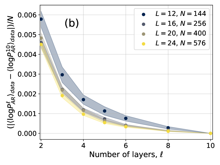
The image is a line chart displaying the relationship between the number of layers (l) and the variation in log probability data, normalized by N. Four different data series are plotted, each corresponding to a different value of L and N. The chart includes error bands around each line.
### Components/Axes
* **Title:** There is no explicit title.
* **X-axis:** "Number of layers, l". The axis ranges from 2 to 10, with tick marks at intervals of 2.
* **Y-axis:** "(|<log P^(l)_AR>_data - <log P^(10)_AR>_data|)/N". The axis ranges from 0.000 to 0.006, with tick marks at intervals of 0.001.
* **Legend:** Located in the top-right corner.
* Blue: L = 12, N = 144
* Gray: L = 16, N = 256
* Dark Yellow: L = 20, N = 400
* Yellow: L = 24, N = 576
* **Annotation:** "(b)" is present in the top-center of the chart.
### Detailed Analysis
The chart contains four data series, each represented by a line with error bands. All series show a decreasing trend as the number of layers increases.
* **L = 12, N = 144 (Blue):**
* At l = 2, the value is approximately 0.006.
* At l = 4, the value is approximately 0.003.
* At l = 6, the value is approximately 0.0008.
* At l = 8, the value is approximately 0.0002.
* At l = 10, the value is approximately 0.00005.
* The line slopes downward, decreasing rapidly between l = 2 and l = 4, then decreasing more gradually.
* **L = 16, N = 256 (Gray):**
* At l = 2, the value is approximately 0.0052.
* At l = 4, the value is approximately 0.0018.
* At l = 6, the value is approximately 0.0006.
* At l = 8, the value is approximately 0.0001.
* At l = 10, the value is approximately 0.00001.
* The line slopes downward, decreasing rapidly between l = 2 and l = 4, then decreasing more gradually.
* **L = 20, N = 400 (Dark Yellow):**
* At l = 2, the value is approximately 0.0048.
* At l = 4, the value is approximately 0.0015.
* At l = 6, the value is approximately 0.0005.
* At l = 8, the value is approximately 0.00008.
* At l = 10, the value is approximately 0.00001.
* The line slopes downward, decreasing rapidly between l = 2 and l = 4, then decreasing more gradually.
* **L = 24, N = 576 (Yellow):**
* At l = 2, the value is approximately 0.0045.
* At l = 4, the value is approximately 0.001.
* At l = 6, the value is approximately 0.0004.
* At l = 8, the value is approximately 0.00005.
* At l = 10, the value is approximately 0.00001.
* The line slopes downward, decreasing rapidly between l = 2 and l = 4, then decreasing more gradually.
### Key Observations
* All data series exhibit a similar decreasing trend.
* The error bands are wider at lower values of 'l' and narrow as 'l' increases.
* The data series with lower L and N values (blue) generally have higher values on the y-axis compared to those with higher L and N values (yellow).
### Interpretation
The chart suggests that as the number of layers (l) increases, the variation in log probability data, normalized by N, decreases. This indicates that with more layers, the model becomes more stable or consistent in its predictions. The different L and N values seem to influence the magnitude of this variation, with lower L and N resulting in higher initial variation. The decreasing error bands suggest that the uncertainty in the data also decreases as the number of layers increases. The annotation (b) likely refers to a specific experimental setup or condition under which the data was collected.