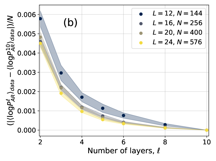
## Line Graph: Normalized Difference in Log Probabilities vs. Number of Layers
### Overview
The image is a line graph depicting the normalized difference between two logarithmic probability metrics (⟨logPℓ_AR⟩_data and ⟨logPℓ_AR⟩_data) divided by sample size (N) across varying numbers of layers (ℓ). Four distinct data series are plotted, each corresponding to different system sizes (L) and sample sizes (N). The graph shows a clear trend of decreasing values as the number of layers increases.
### Components/Axes
- **X-axis**: "Number of layers, ℓ" (integer values from 2 to 10)
- **Y-axis**: "(|⟨logPℓ_AR⟩_data − ⟨logPℓ_AR⟩_data|)/N" (normalized difference, ranging from 0.000 to 0.006)
- **Legend**: Located in the top-right corner, with four entries:
- Blue circles: L = 12, N = 144
- Gray circles: L = 16, N = 256
- Olive circles: L = 20, N = 400
- Yellow circles: L = 24, N = 576
- **Lines**: Four distinct lines with shaded gradient regions (likely confidence intervals or error margins).
### Detailed Analysis
1. **Blue Line (L=12, N=144)**:
- Starts at ~0.006 at ℓ=2.
- Gradually decreases to ~0.001 at ℓ=10.
- Shaded region widest at ℓ=2, narrowing as ℓ increases.
2. **Gray Line (L=16, N=256)**:
- Begins at ~0.005 at ℓ=2.
- Declines to ~0.0005 at ℓ=10.
- Shaded region narrower than blue but wider than olive/yellow.
3. **Olive Line (L=20, N=400)**:
- Starts at ~0.0045 at ℓ=2.
- Drops to ~0.0003 at ℓ=10.
- Shaded region narrower than gray, indicating tighter confidence intervals.
4. **Yellow Line (L=24, N=576)**:
- Begins at ~0.004 at ℓ=2.
- Declines sharply to ~0.0001 at ℓ=10.
- Shaded region narrowest, suggesting highest precision.
### Key Observations
- **Inverse Relationship**: All lines show a strong negative correlation between ℓ and the normalized difference, indicating that increasing layers reduces discrepancy.
- **L/N Dependency**: Higher L values (and corresponding N) exhibit steeper declines and lower starting points, suggesting larger systems/samples yield better agreement.
- **Shaded Regions**: Narrower for higher L values, implying reduced uncertainty in larger systems.
- **Convergence**: All lines approach zero as ℓ increases, with L=24 (yellow) reaching near-zero faster than others.
### Interpretation
The data demonstrates that increasing the number of layers (ℓ) improves alignment between the model's predicted log probabilities and empirical data. Systems with larger L (and N) show more pronounced improvements, likely due to enhanced model capacity or reduced noise in larger datasets. The narrowing shaded regions for higher L values suggest greater confidence in predictions as system size grows. This trend could be critical in applications like neural network design or statistical modeling, where balancing model complexity (layers) and data fit is essential. The rapid convergence for L=24 implies that very large systems may achieve near-optimal performance with fewer layers, warranting further investigation into efficiency trade-offs.