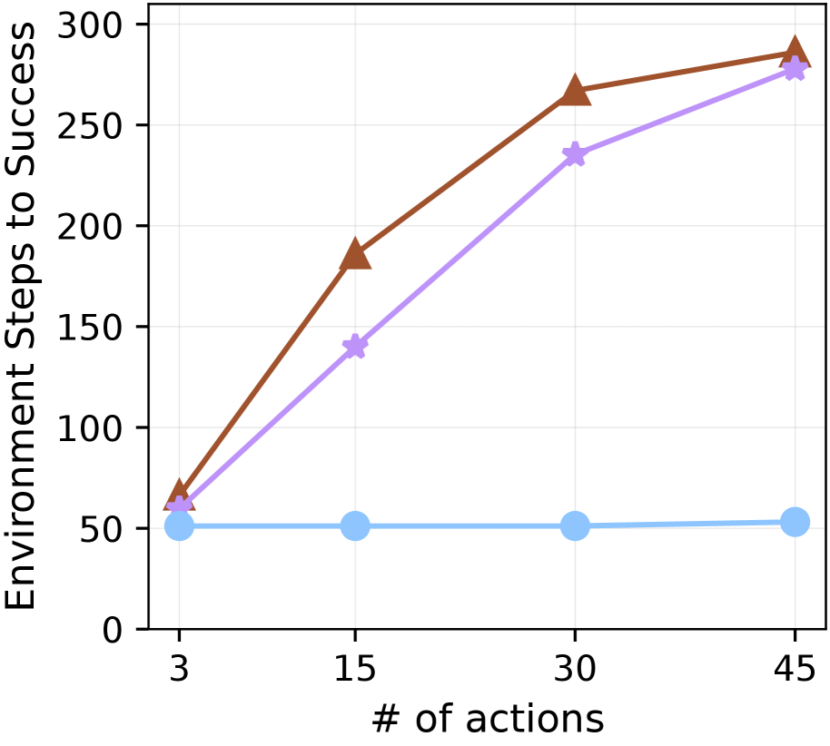
## Line Chart: Environment Steps to Success vs. Number of Actions
### Overview
The image is a line chart comparing the number of environment steps to success against the number of actions taken. There are three distinct data series represented by different colored lines: brown, light purple, and light blue. The x-axis represents the number of actions, and the y-axis represents the environment steps to success.
### Components/Axes
* **X-axis:** "# of actions" with markers at 3, 15, 30, and 45.
* **Y-axis:** "Environment Steps to Success" with markers at 0, 50, 100, 150, 200, 250, and 300.
* **Data Series:**
* Brown line with triangle markers.
* Light purple line with star markers.
* Light blue line with circle markers.
### Detailed Analysis
* **Brown Line (Triangle Markers):** This line shows an upward trend, indicating that as the number of actions increases, the environment steps to success also increase.
* At 3 actions, the value is approximately 65.
* At 15 actions, the value is approximately 185.
* At 30 actions, the value is approximately 265.
* At 45 actions, the value is approximately 285.
* **Light Purple Line (Star Markers):** This line also shows an upward trend, but it is less steep than the brown line.
* At 3 actions, the value is approximately 65.
* At 15 actions, the value is approximately 140.
* At 30 actions, the value is approximately 235.
* At 45 actions, the value is approximately 285.
* **Light Blue Line (Circle Markers):** This line remains relatively flat, indicating that the environment steps to success are nearly constant regardless of the number of actions.
* At 3 actions, the value is approximately 52.
* At 15 actions, the value is approximately 52.
* At 30 actions, the value is approximately 52.
* At 45 actions, the value is approximately 54.
### Key Observations
* The brown line consistently has the highest values for environment steps to success across all numbers of actions.
* The light blue line remains almost constant, suggesting a fixed number of steps regardless of the number of actions.
* The light purple line increases steadily, approaching the brown line at 45 actions.
### Interpretation
The chart suggests that different strategies or algorithms are being compared based on the number of environment steps required to achieve success as the number of actions varies. The brown line represents a scenario where more actions lead to a higher number of steps, possibly indicating a less efficient or more complex approach. The light purple line shows a more moderate increase in steps with actions, suggesting a more efficient strategy than the brown line. The light blue line represents a highly consistent strategy where the number of steps remains nearly constant, regardless of the number of actions, potentially indicating a very simple or direct approach. The convergence of the brown and light purple lines at 45 actions might indicate a performance ceiling or a point where the benefits of additional actions diminish.