\n
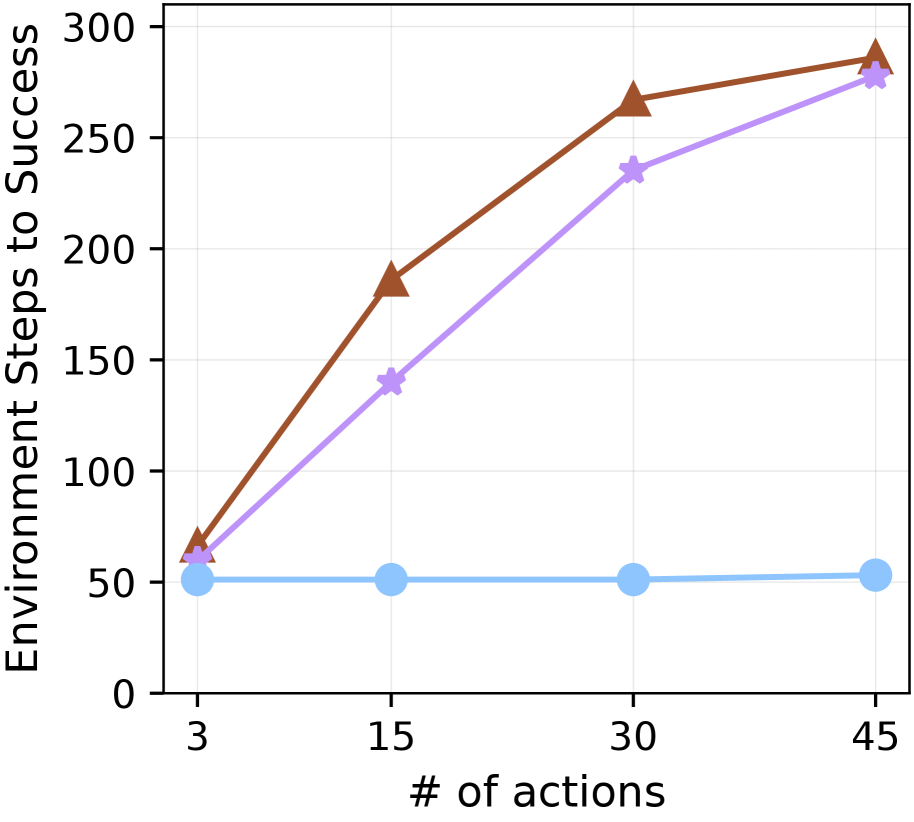
## Line Chart: Environment Steps to Success vs. Number of Actions
### Overview
This image presents a line chart illustrating the relationship between the number of actions taken and the environment steps required to achieve success. Three distinct lines represent different conditions or algorithms, showing how the number of steps to success changes as the number of actions increases.
### Components/Axes
* **X-axis:** "# of actions" with markers at 3, 15, 30, and 45.
* **Y-axis:** "Environment Steps to Success" with a scale ranging from 0 to 300, incrementing by 50.
* **Lines:** Three lines are present, each with a distinct color:
* Light Blue
* Purple
* Brown
* **Grid:** A light gray grid is overlaid on the chart to aid in reading values.
### Detailed Analysis
Let's analyze each line individually, noting trends and approximate data points.
* **Light Blue Line:** This line is relatively flat. It slopes slightly upward.
* At 3 actions: Approximately 60 Environment Steps to Success.
* At 15 actions: Approximately 50 Environment Steps to Success.
* At 30 actions: Approximately 50 Environment Steps to Success.
* At 45 actions: Approximately 60 Environment Steps to Success.
* **Purple Line:** This line exhibits a clear upward trend, becoming steeper as the number of actions increases.
* At 3 actions: Approximately 70 Environment Steps to Success.
* At 15 actions: Approximately 150 Environment Steps to Success.
* At 30 actions: Approximately 230 Environment Steps to Success.
* At 45 actions: Approximately 280 Environment Steps to Success.
* **Brown Line:** This line also shows an upward trend, but it is less steep than the purple line.
* At 3 actions: Approximately 60 Environment Steps to Success.
* At 15 actions: Approximately 200 Environment Steps to Success.
* At 30 actions: Approximately 270 Environment Steps to Success.
* At 45 actions: Approximately 290 Environment Steps to Success.
### Key Observations
* The light blue line remains relatively constant, suggesting that increasing the number of actions does not significantly impact the environment steps to success for this condition.
* Both the purple and brown lines demonstrate a positive correlation between the number of actions and the environment steps to success. The purple line shows a more pronounced increase.
* At 3 actions, the light blue and brown lines start at approximately the same value.
* The purple line consistently requires more environment steps to success than the other two lines, especially as the number of actions increases.
### Interpretation
The chart suggests that the effectiveness of increasing the number of actions varies depending on the condition or algorithm being used. The light blue line indicates a scenario where more actions do not necessarily lead to faster success. The purple line suggests that while more actions eventually lead to success, they also require a significantly larger number of environment steps. The brown line represents a middle ground, where increasing actions leads to increased steps, but not as dramatically as with the purple line.
This data could be related to reinforcement learning or optimization algorithms, where the number of actions represents the number of iterations or trials, and the environment steps represent the computational cost or time required to reach a successful state. The different lines could represent different algorithms or parameter settings. The fact that the purple line requires more steps despite increasing actions could indicate a less efficient algorithm or a more complex environment. Further investigation would be needed to understand the specific context and meaning of these results.