## Line Graph: Frequency vs. Contrast Analysis
### Overview
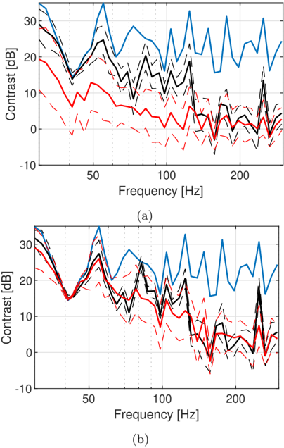
The image contains two line graphs labeled (a) and (b), each depicting contrast (in dB) as a function of frequency (in Hz). Both graphs feature three data series represented by distinct line styles and colors:
- **Signal A**: Solid blue line
- **Signal B**: Dashed black line
- **Signal C**: Dotted red line
Vertical dotted lines are drawn at 50 Hz, 100 Hz, and 200 Hz to highlight specific frequency intervals.
### Components/Axes
- **X-axis**: Frequency [Hz], ranging from 0 to 200 Hz.
- **Y-axis**: Contrast [dB], ranging from -10 to 30 dB.
- **Legend**: Positioned at the top-left of each graph, with labels:
- Signal A (blue)
- Signal B (black)
- Signal C (red)
- **Annotations**: Graphs labeled (a) and (b) at the bottom.
### Detailed Analysis
#### Graph (a):
- **Signal A (blue)**: Peaks at ~50 Hz (~28 dB), ~100 Hz (~25 dB), and ~150 Hz (~22 dB).
- **Signal B (black)**: Peaks at ~75 Hz (~22 dB), ~125 Hz (~18 dB), and ~175 Hz (~15 dB).
- **Signal C (red)**: Peaks at ~25 Hz (~12 dB), ~75 Hz (~10 dB), and ~125 Hz (~8 dB).
- **Trends**: Signal A exhibits the highest contrast, with sharp peaks at regular intervals. Signal B shows lower contrast with broader peaks. Signal C has the lowest contrast, with peaks spaced further apart.
#### Graph (b):
- **Signal A (blue)**: Peaks at ~50 Hz (~25 dB), ~100 Hz (~20 dB), and ~150 Hz (~18 dB).
- **Signal B (black)**: Peaks at ~75 Hz (~18 dB), ~125 Hz (~15 dB), and ~175 Hz (~12 dB).
- **Signal C (red)**: Peaks at ~25 Hz (~10 dB), ~75 Hz (~8 dB), and ~125 Hz (~6 dB).
- **Trends**: Similar to graph (a), but with slightly reduced peak amplitudes for all signals.
### Key Observations
1. **Signal A** consistently shows the highest contrast across both graphs, with peaks aligned at 50 Hz, 100 Hz, and 150 Hz.
2. **Signal B** exhibits lower contrast than Signal A but higher than Signal C, with peaks at 75 Hz, 125 Hz, and 175 Hz.
3. **Signal C** has the lowest contrast, with peaks at 25 Hz, 75 Hz, and 125 Hz.
4. Vertical lines at 50 Hz, 100 Hz, and 200 Hz may indicate critical frequency thresholds or measurement intervals.
5. Both graphs share similar patterns, suggesting consistent behavior across different conditions or datasets.
### Interpretation
The data suggests that Signal A dominates in terms of contrast, potentially indicating stronger or more dominant waveforms at specific frequencies. Signal B and C show progressively weaker responses, which could reflect differences in signal strength, filtering, or system response characteristics. The vertical lines at 50 Hz, 100 Hz, and 200 Hz may serve as reference points for analyzing harmonic relationships or system resonances. The consistency between graphs (a) and (b) implies that the observed trends are robust across the measured conditions.
### Uncertainties
- Contrast values are approximate due to the lack of gridlines or numerical annotations on the lines themselves.
- Peak positions are estimated based on visual alignment with the x-axis.
- The exact relationship between the signals (e.g., phase differences, amplitude ratios) cannot be determined without additional context.