# Technical Data Extraction: Performance and Ablation Analysis
This document contains a detailed extraction of data from two side-by-side charts analyzing model performance across different stages and ablation configurations.
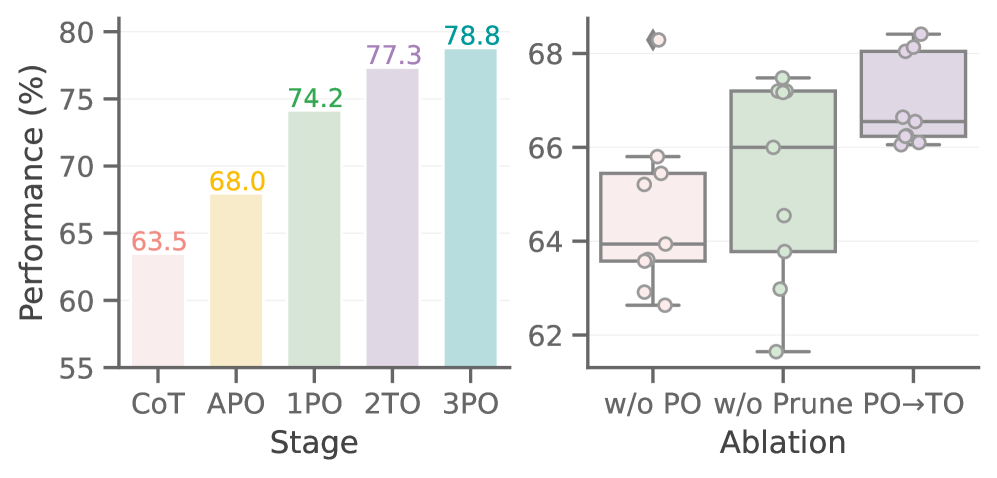
## 1. General Metadata
* **Primary Language:** English
* **Y-Axis Label (Shared):** Performance (%)
* **Y-Axis Scale:** 55 to 80 (Left Chart), 62 to 68 (Right Chart)
* **Visual Style:** Bar chart (Left) and Box-and-Whisker plot with overlaid data points (Right).
---
## 2. Left Chart: Performance by Stage
This chart illustrates a consistent upward trend in performance as the model progresses through various optimization stages.
### Component Isolation: Main Bar Chart
* **X-Axis Title:** Stage
* **X-Axis Categories:** CoT, APO, 1PO, 2TO, 3PO
* **Trend Observation:** The performance increases monotonically from left to right.
### Data Table (Extracted Values)
| Stage | Color | Performance Value (%) |
| :--- | :--- | :--- |
| **CoT** | Light Pink | 63.5 |
| **APO** | Light Yellow | 68.0 |
| **1PO** | Light Green | 74.2 |
| **2TO** | Light Purple | 77.3 |
| **3PO** | Light Teal | 78.8 |
---
## 3. Right Chart: Ablation Study
This chart uses box plots to show the distribution of performance across different ablation settings. Each box includes a median line, interquartile range (IQR), whiskers, and individual data points (jittered).
### Component Isolation: Ablation Box Plot
* **X-Axis Title:** Ablation
* **X-Axis Categories:** w/o PO, w/o Prune, PO $\rightarrow$ TO
* **Trend Observation:** Performance improves and variance generally decreases as the configuration moves from "w/o PO" to "PO $\rightarrow$ TO".
### Data Distribution Analysis
| Ablation Category | Color | Visual Summary |
| :--- | :--- | :--- |
| **w/o PO** | Pink | Lowest median (~64%). Contains one high outlier near 68.3%. High spread in individual points. |
| **w/o Prune** | Green | Higher median (~66%). Shows a wide vertical spread of data points ranging from ~61.8% to ~67.5%. |
| **PO $\rightarrow$ TO** | Purple | Highest median (~66.5%) and highest overall performance ceiling (~68.5%). Data points are more tightly clustered at the top of the range. |
---
## 4. Summary of Findings
1. **Incremental Improvement:** The left chart confirms that each successive stage (from CoT to 3PO) adds significant percentage points to the model's performance, totaling a 15.3% gain.
2. **Optimization Impact:** The right chart demonstrates that the "PO $\rightarrow$ TO" configuration is the most effective and stable, while removing "PO" (w/o PO) results in the lowest baseline performance.
3. **Consistency:** The color coding is consistent across both charts (e.g., purple and green hues represent similar stages/concepts in both the progression and the ablation).