## Scatter Plot with Threshold Line: Guess Timing Analysis
### Overview
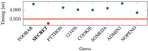
The image is a scatter plot chart comparing the timing (in milliseconds) of eight different "Guess" entries against a fixed threshold. The chart visually highlights one specific entry ("SECRET") that performs significantly better (lower timing) than the others and the established threshold.
### Components/Axes
* **Chart Type:** Scatter plot with a horizontal threshold line.
* **X-Axis:**
* **Label:** "Guess"
* **Categories (from left to right):** FOOBAR, SECRET, PYTHON, 123456, COOKIE, SOMEDA, ADMINI, NOPENO.
* **Note:** The category labels are rotated approximately 45 degrees for readability.
* **Y-Axis:**
* **Label:** "Timing [ms]"
* **Scale:** Linear scale from approximately 3,940 ms to 4,010 ms.
* **Major Tick Marks:** Labeled at 3,950 and 4,000.
* **Data Series:**
* **Blue Dots:** Represent the timing values for seven of the eight guesses.
* **Red Dot:** Represents the timing value for the "SECRET" guess.
* **Threshold Line:**
* A solid red horizontal line drawn at the **3,950 ms** mark on the y-axis.
* **Legend:** There is no explicit legend box. The color coding (blue vs. red) is used to distinguish the outlier ("SECRET") from the other data points.
### Detailed Analysis
**Data Point Extraction (Approximate Values):**
The following table lists each guess, its associated data point color, and its approximate timing value based on visual interpolation between the 3,950 ms and 4,000 ms axis markers.
| Guess (X-Axis) | Data Point Color | Approximate Timing (ms) | Position Relative to Threshold |
| :--- | :--- | :--- | :--- |
| FOOBAR | Blue | ~4,005 | Above |
| **SECRET** | **Red** | **~3,940** | **Below** |
| PYTHON | Blue | ~4,002 | Above |
| 123456 | Blue | ~3,998 | Above |
| COOKIE | Blue | ~3,998 | Above |
| SOMEDA | Blue | ~4,002 | Above |
| ADMINI | Blue | ~4,008 | Above |
| NOPENO | Blue | ~3,990 | Above |
**Trend Verification:**
* The seven blue data points form a relatively flat, high-timing cluster, all positioned above the red threshold line. Their values range approximately from 3,990 ms to 4,008 ms.
* The single red data point for "SECRET" is a clear outlier, positioned significantly lower on the y-axis and below the threshold line.
### Key Observations
1. **Significant Outlier:** The "SECRET" guess has a timing (~3,940 ms) that is approximately 50-70 ms faster than the next closest guess (NOPENO at ~3,990 ms) and is the only entry to perform below the 3,950 ms threshold.
2. **Clustered Performance:** The other seven guesses (FOOBAR, PYTHON, 123456, COOKIE, SOMEDA, ADMINI, NOPENO) show very similar performance, forming a tight cluster with a variance of less than 20 ms among them.
3. **Threshold Context:** The red line at 3,950 ms serves as a clear performance benchmark. "SECRET" is the only successful entry relative to this benchmark.
### Interpretation
This chart likely visualizes the results of a performance or security test, such as password cracking, algorithm benchmarking, or system response time analysis. The "Guess" labels suggest attempts to identify a correct input (e.g., a password, a key, or an optimized code path).
The data strongly suggests that "SECRET" is the correct or optimal solution. Its timing is not only the lowest but is also the only one to beat the predefined threshold (3,950 ms), indicating a fundamental difference in how that guess is processed. The tight clustering of the other, incorrect guesses implies they follow a similar, less efficient computational path or encounter similar system delays.
The visual design effectively uses color (red for both the threshold and the outlier) and spatial separation to draw immediate attention to the key finding: "SECRET" is the answer that matters. The chart answers the question, "Which guess performs differently?" with a clear, unambiguous visual signal.