\n
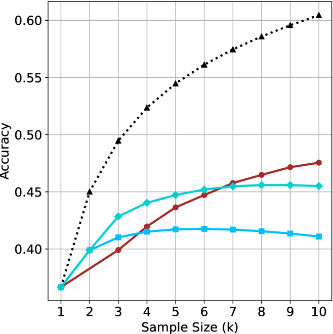
## Line Chart: Accuracy vs. Sample Size
### Overview
The image presents a line chart illustrating the relationship between sample size (in thousands) and accuracy. Four distinct data series are plotted, each represented by a different colored line. The chart appears to demonstrate how accuracy changes as the sample size increases for each series.
### Components/Axes
* **X-axis:** Labeled "Sample Size (k)", ranging from 1 to 10 (in thousands). The axis is linearly scaled.
* **Y-axis:** Labeled "Accuracy", ranging from 0.35 to 0.60, with a linear scale.
* **Data Series:** Four lines are present, each representing a different experimental condition or model.
* Black dotted line
* Red solid line
* Teal solid line
* Blue solid line
### Detailed Analysis
Let's analyze each line individually, noting trends and approximate data points.
* **Black Dotted Line:** This line exhibits the steepest upward trend. It starts at approximately 0.38 at a sample size of 1k and rapidly increases to approximately 0.50 at 3k, 0.55 at 5k, 0.58 at 7k, 0.59 at 9k, and reaches approximately 0.60 at 10k.
* **Red Solid Line:** This line shows a moderate upward trend, but plateaus towards the end. It begins at approximately 0.38 at 1k, increases to around 0.43 at 3k, 0.45 at 5k, 0.46 at 7k, 0.47 at 9k, and reaches approximately 0.47 at 10k.
* **Teal Solid Line:** This line shows a moderate upward trend, but plateaus towards the end. It begins at approximately 0.38 at 1k, increases to around 0.43 at 3k, 0.45 at 5k, 0.46 at 7k, 0.47 at 9k, and reaches approximately 0.47 at 10k.
* **Blue Solid Line:** This line initially increases, then plateaus and even slightly decreases. It starts at approximately 0.38 at 1k, increases to around 0.41 at 3k, 0.42 at 5k, and then remains relatively constant at approximately 0.41-0.42 from 5k to 10k.
### Key Observations
* The black dotted line consistently outperforms the other three lines across all sample sizes.
* The red and teal lines show similar performance, with accuracy plateauing after a sample size of 5k.
* The blue line shows the lowest and most stable accuracy, suggesting it may be reaching its performance limit.
* All lines start at the same accuracy level (approximately 0.38) at a sample size of 1k.
### Interpretation
The data suggests that increasing the sample size generally improves accuracy, but the rate of improvement varies significantly depending on the data series. The black dotted line indicates a method or model that benefits substantially from larger sample sizes, while the blue line suggests a method that is less sensitive to sample size. The red and teal lines show diminishing returns with increasing sample size, indicating that beyond a certain point, adding more data does not significantly improve accuracy.
The fact that all lines start at the same accuracy level suggests that the initial performance of all methods is comparable, but their ability to leverage larger datasets differs. This could be due to differences in model complexity, data quality, or the underlying algorithms used. The plateauing of the red, teal, and blue lines could indicate overfitting or the presence of inherent limitations in those methods. The consistent improvement of the black dotted line suggests a more robust and scalable approach.