## Line Chart: kNN Accuracy vs. Sample Size (k)
### Overview
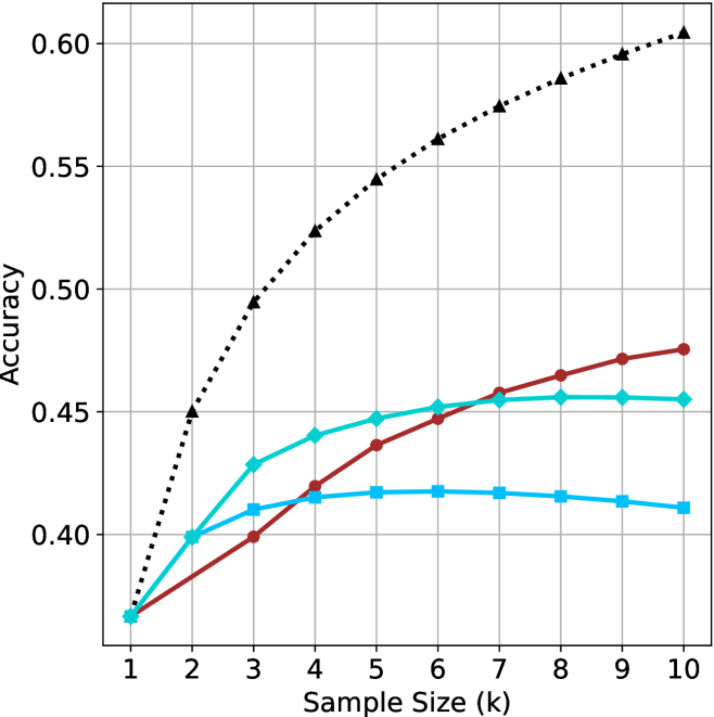
This is a line chart comparing the classification accuracy of a k-Nearest Neighbors (kNN) algorithm with different fixed `k` values (1, 3, 5, 7) as the sample size (number of neighbors considered, also denoted as `k` on the x-axis) increases. The chart demonstrates how the choice of the hyperparameter `k` affects the model's accuracy scaling with more data.
### Components/Axes
* **Chart Type:** Multi-line chart with markers.
* **X-Axis:**
* **Label:** "Sample Size (k)"
* **Scale:** Linear, ranging from 1 to 10 with integer increments.
* **Markers:** Major ticks at each integer value (1, 2, 3, ..., 10).
* **Y-Axis:**
* **Label:** "Accuracy"
* **Scale:** Linear, ranging from 0.40 to 0.60.
* **Markers:** Major ticks at 0.40, 0.45, 0.50, 0.55, 0.60.
* **Legend:**
* **Position:** Top-left corner of the plot area.
* **Entries (from top to bottom):**
1. **kNN (k=7):** Black, dotted line with upward-pointing triangle markers (▲).
2. **kNN (k=5):** Dark red, solid line with circle markers (●).
3. **kNN (k=3):** Cyan, solid line with diamond markers (◆).
4. **kNN (k=1):** Blue, solid line with square markers (■).
* **Grid:** Light gray grid lines are present for both major x and y ticks.
### Detailed Analysis
**Trend Verification & Data Point Extraction (Approximate Values):**
1. **kNN (k=7) - Black Dotted Line with Triangles:**
* **Trend:** Shows a strong, consistent, and nearly linear upward trend across the entire range. It is the highest-performing model for all sample sizes > 1.
* **Data Points:**
* k=1: ~0.37
* k=2: ~0.45
* k=3: ~0.495
* k=4: ~0.525
* k=5: ~0.545
* k=6: ~0.56
* k=7: ~0.575
* k=8: ~0.585
* k=9: ~0.595
* k=10: ~0.605
2. **kNN (k=5) - Dark Red Solid Line with Circles:**
* **Trend:** Shows a steady, moderate upward trend. It starts tied for lowest accuracy but surpasses the k=3 and k=1 models by k=6.
* **Data Points:**
* k=1: ~0.37
* k=2: ~0.40
* k=3: ~0.40
* k=4: ~0.42
* k=5: ~0.435
* k=6: ~0.445
* k=7: ~0.455
* k=8: ~0.465
* k=9: ~0.47
* k=10: ~0.475
3. **kNN (k=3) - Cyan Solid Line with Diamonds:**
* **Trend:** Increases rapidly from k=1 to k=4, then plateaus, showing very little improvement from k=6 onward.
* **Data Points:**
* k=1: ~0.37
* k=2: ~0.40
* k=3: ~0.43
* k=4: ~0.44
* k=5: ~0.445
* k=6: ~0.45
* k=7: ~0.455
* k=8: ~0.455
* k=9: ~0.455
* k=10: ~0.455
4. **kNN (k=1) - Blue Solid Line with Squares:**
* **Trend:** Increases slightly from k=1 to k=5, peaks around k=5 or k=6, and then shows a slight downward trend for larger sample sizes.
* **Data Points:**
* k=1: ~0.37
* k=2: ~0.40
* k=3: ~0.41
* k=4: ~0.415
* k=5: ~0.415
* k=6: ~0.415
* k=7: ~0.415
* k=8: ~0.415
* k=9: ~0.41
* k=10: ~0.41
### Key Observations
1. **Convergence at Origin:** All four models start at approximately the same accuracy (~0.37) when the sample size (k) is 1.
2. **Performance Hierarchy:** For any sample size greater than 1, a clear and consistent performance hierarchy is established: k=7 > k=5 > k=3 > k=1.
3. **Diminishing Returns:** The benefit of increasing sample size diminishes for lower `k` values. The k=3 line plateaus, and the k=1 line even declines slightly, suggesting overfitting or increased sensitivity to noise with more neighbors for a very local model.
4. **Linear Scaling for High k:** The k=7 model shows the most consistent and scalable improvement, suggesting that a less local (higher `k`) model benefits more predictably from additional data within this range.
### Interpretation
This chart illustrates a fundamental trade-off in k-Nearest Neighbors classification between **locality** (low `k`) and **generalization** (high `k`).
* **Low `k` (e.g., k=1):** Creates a highly flexible, complex decision boundary that is very sensitive to local patterns and noise in the training data. This leads to poor generalization, as seen by its low and eventually declining accuracy. It likely suffers from high variance.
* **High `k` (e.g., k=7):** Creates a smoother, simpler decision boundary by averaging over a larger neighborhood. This reduces variance and leads to better generalization, as evidenced by its steadily increasing accuracy. It likely has lower variance but higher bias.
* **The Trend:** The data suggests that for this specific (unspecified) dataset and problem, using a higher `k` value (7) yields a model that not only performs better overall but also scales more effectively with increased sample size. The plateauing of the k=3 line indicates that beyond a certain point (k≈6), adding more neighbors provides no additional discriminative power for that model configuration. The slight decline in the k=1 model is a classic sign of overfitting, where incorporating more neighbors (which should theoretically help) instead introduces noise that harms performance.
**In summary, the chart argues for using a higher `k` value (like 7) in this context, as it provides superior accuracy and more reliable improvement as the dataset grows.**