TECHNICAL ASSET FINGERPRINT
401a265b44181348201fc906
Click to view fullscreen
Press ESC or click to close
FOUND IN PAPERS
EXPERT: gemini-2.0-flash VERSION 1
RUNTIME: nugit/gemini/gemini-2.0-flash
INTEL_VERIFIED
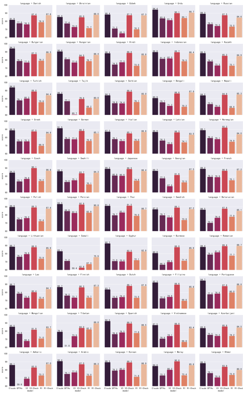
## Bar Chart: Language Model Performance Comparison
### Overview
The image presents a series of bar charts, each comparing the performance of different language models (Claude GPT4o, V3, V3-Check, R1, and R1-Check) across various languages. The y-axis represents the "score," ranging from 60 to 100. Each chart focuses on a specific language, indicated by the "language =" label above the chart. The x-axis represents the different language models.
### Components/Axes
* **Y-axis:** "score" ranging from 60 to 100, with tick marks at intervals of 10.
* **X-axis:** Categorical, representing the language models: Claude GPT4o, V3, V3-Check, R1, and R1-Check.
* **Chart Title:** "language = [Language Name]" for each individual chart.
* **Bars:** Each bar represents the score of a specific language model for the given language. The bars are colored in shades of purple and orange.
### Detailed Analysis or ### Content Details
Here's a breakdown of the data for each language, including the approximate scores for each model:
**Row 1**
* **Language = Danish:**
* Claude GPT4o: 81.9
* V3: 77.6
* V3-Check: 76.3
* R1: 87.4
* R1-Check: 87.6
* **Language = Ukrainian:**
* Claude GPT4o: 85.4
* V3: 77.4
* V3-Check: 73.0
* R1: 71.7
* R1-Check: 88.0
* **Language = Uzbek:**
* Claude GPT4o: 88.4
* V3: 71.2
* V3-Check: 65.3
* R1: 87.5
* R1-Check: 87.3
* **Language = Urdu:**
* Claude GPT4o: 94.4
* V3: 83.6
* V3-Check: 81.5
* R1: 90.1
* R1-Check: 90.7
* **Language = Russian:**
* Claude GPT4o: 84.8
* V3: 76.5
* V3-Check: 74.3
* R1: 73.5
* R1-Check: 84.6
**Row 2**
* **Language = Bulgarian:**
* Claude GPT4o: 94.3
* V3: 78.8
* V3-Check: 77.0
* R1: 87.3
* R1-Check: 88.5
* **Language = Hungarian:**
* Claude GPT4o: 90.6
* V3: 81.1
* V3-Check: 84.5
* R1: 78.7
* R1-Check: 86.4
* **Language = Hindi:**
* Claude GPT4o: 88.4
* V3: 77.3
* V3-Check: 74.5
* R1: 88.8
* R1-Check: 85.8
* **Language = Indonesian:**
* Claude GPT4o: 89.8
* V3: 81.6
* V3-Check: 82.0
* R1: 89.7
* R1-Check: 88.4
* **Language = Kazakh:**
* Claude GPT4o: 88.4
* V3: 73.3
* V3-Check: 73.1
* R1: 85.3
* R1-Check: 84.9
**Row 3**
* **Language = Turkish:**
* Claude GPT4o: 94.0
* V3: 78.1
* V3-Check: 80.3
* R1: 89.0
* R1-Check: 84.4
* **Language = Tajik:**
* Claude GPT4o: 86.2
* V3: 77.1
* V3-Check: 79.8
* R1: 60.7
* R1-Check: 80.0
* **Language = Serbian:**
* Claude GPT4o: 84.3
* V3: 74.6
* V3-Check: 74.4
* R1: 88.8
* R1-Check: 85.0
* **Language = Bengali:**
* Claude GPT4o: 80.9
* V3: 71.3
* V3-Check: 70.2
* R1: 86.6
* R1-Check: 87.9
* **Language = Nepali:**
* Claude GPT4o: 84.2
* V3: 73.5
* V3-Check: 70.2
* R1: 85.3
* R1-Check: 85.3
**Row 4**
* **Language = Greek:**
* Claude GPT4o: 88.9
* V3: 75.3
* V3-Check: 75.3
* R1: 87.5
* R1-Check: 84.9
* **Language = German:**
* Claude GPT4o: 91.5
* V3: 78.3
* V3-Check: 77.9
* R1: 60.7
* R1-Check: 85.1
* **Language = Italian:**
* Claude GPT4o: 87.2
* V3: 78.1
* V3-Check: 75.7
* R1: 85.1
* R1-Check: 86.8
* **Language = Latvian:**
* Claude GPT4o: 86.9
* V3: 76.3
* V3-Check: 72.0
* R1: 86.3
* R1-Check: 83.5
* **Language = Norwegian:**
* Claude GPT4o: 89.1
* V3: 79.4
* V3-Check: 78.1
* R1: 74.9
* R1-Check: 84.0
**Row 5**
* **Language = Czech:**
* Claude GPT4o: 84.5
* V3: 73.7
* V3-Check: 76.8
* R1: 90.1
* R1-Check: 86.8
* **Language = Swahili:**
* Claude GPT4o: 86.2
* V3: 73.0
* V3-Check: 75.1
* R1: 70.1
* R1-Check: 84.3
* **Language = Japanese:**
* Claude GPT4o: 89.2
* V3: 80.9
* V3-Check: 80.6
* R1: 88.9
* R1-Check: 86.4
* **Language = Georgian:**
* Claude GPT4o: 86.7
* V3: 78.3
* V3-Check: 67.8
* R1: 81.6
* R1-Check: 87.5
* **Language = French:**
* Claude GPT4o: 89.2
* V3: 79.3
* V3-Check: 78.9
* R1: 75.1
* R1-Check: 87.2
**Row 6**
* **Language = Polish:**
* Claude GPT4o: 89.9
* V3: 74.7
* V3-Check: 76.2
* R1: 90.1
* R1-Check: 86.8
* **Language = Persian:**
* Claude GPT4o: 93.5
* V3: 84.8
* V3-Check: 82.5
* R1: 82.9
* R1-Check: 90.8
* **Language = Thai:**
* Claude GPT4o: 91.3
* V3: 79.7
* V3-Check: 83.1
* R1: 79.0
* R1-Check: 86.7
* **Language = Swedish:**
* Claude GPT4o: 89.1
* V3: 77.1
* V3-Check: 73.8
* R1: 87.2
* R1-Check: 85.1
* **Language = Belarusian:**
* Claude GPT4o: 86.5
* V3: 76.6
* V3-Check: 70.3
* R1: 77.8
* R1-Check: 85.1
**Row 7**
* **Language = Lithuanian:**
* Claude GPT4o: 88.7
* V3: 76.3
* V3-Check: 79.6
* R1: 88.0
* R1-Check: 85.9
* **Language = Somali:**
* Claude GPT4o: 83.1
* V3: 71.2
* V3-Check: 50.4
* R1: 62.9
* R1-Check: 75.9
* **Language = Uyghur:**
* Claude GPT4o: 92.7
* V3: 71.0
* V3-Check: 70.6
* R1: 72.1
* R1-Check: 82.8
* **Language = Burmese:**
* Claude GPT4o: 80.8
* V3: 66.5
* V3-Check: 69.8
* R1: 88.0
* R1-Check: 85.9
* **Language = Romanian:**
* Claude GPT4o: 88.4
* V3: 79.0
* V3-Check: 81.8
* R1: 77.7
* R1-Check: 89.7
**Row 8**
* **Language = Lao:**
* Claude GPT4o: 88.7
* V3: 78.6
* V3-Check: 73.6
* R1: 80.4
* R1-Check: 84.1
* **Language = Finnish:**
* Claude GPT4o: 83.1
* V3: 76.2
* V3-Check: 73.7
* R1: 67.3
* R1-Check: 75.9
* **Language = Dutch:**
* Claude GPT4o: 92.7
* V3: 73.5
* V3-Check: 74.4
* R1: 88.1
* R1-Check: 87.9
* **Language = Filipino:**
* Claude GPT4o: 92.3
* V3: 74.6
* V3-Check: 74.4
* R1: 89.6
* R1-Check: 85.8
* **Language = Portuguese:**
* Claude GPT4o: 94.7
* V3: 77.8
* V3-Check: 80.0
* R1: 87.6
* R1-Check: 88.8
**Row 9**
* **Language = Mongolian:**
* Claude GPT4o: 85.5
* V3: 76.8
* V3-Check: 68.0
* R1: 81.9
* R1-Check: 83.7
* **Language = Tibetan:**
* Claude GPT4o: 83.7
* V3: 73.9
* V3-Check: 78.1
* R1: 51.0
* R1-Check: 89.8
* **Language = Spanish:**
* Claude GPT4o: 92.5
* V3: 76.4
* V3-Check: 78.5
* R1: 89.5
* R1-Check: 86.5
* **Language = Vietnamese:**
* Claude GPT4o: 94.7
* V3: 70.9
* V3-Check: 74.1
* R1: 89.6
* R1-Check: 85.8
* **Language = Azerbaijani:**
* Claude GPT4o: 87.5
* V3: 75.5
* V3-Check: 74.2
* R1: 80.0
* R1-Check: 84.5
**Row 10**
* **Language = Amharic:**
* Claude GPT4o: 86.1
* V3: 69.3
* V3-Check: 59.6
* R1: 83.0
* R1-Check: 87.0
* **Language = Arabic:**
* Claude GPT4o: 90.8
* V3: 75.1
* V3-Check: 77.0
* R1: 73.0
* R1-Check: 86.3
* **Language = Korean:**
* Claude GPT4o: 89.5
* V3: 79.2
* V3-Check: 80.2
* R1: 89.2
* R1-Check: 86.9
* **Language = Malay:**
* Claude GPT4o: 90.6
* V3: 73.2
* V3-Check: 73.4
* R1: 88.8
* R1-Check: 85.8
* **Language = Khmer:**
* Claude GPT4o: 84.8
* V3: 76.1
* V3-Check: 70.8
* R1: 73.9
* R1-Check: 80.0
### Key Observations
* Claude GPT4o generally has high scores across all languages.
* V3 and V3-Check models tend to have lower scores compared to Claude GPT4o, R1, and R1-Check.
* R1 and R1-Check models show variability in performance across different languages.
* There are some languages (e.g., Somali, Tibetan) where the performance of certain models (e.g., R1) is significantly lower.
### Interpretation
The data suggests that Claude GPT4o is a robust language model with consistently high performance across a wide range of languages. The V3 and V3-Check models appear to be less effective, indicating potential areas for improvement. The R1 and R1-Check models show promise but also exhibit some inconsistencies, suggesting that their performance may be more sensitive to the specific language being processed. The significant performance dips for certain models in specific languages highlight potential biases or limitations in the training data or model architecture. Further investigation into these outliers could provide valuable insights for model refinement and optimization.
DECODING INTELLIGENCE...
EXPERT: gemma-3-27b-it-free VERSION 1
RUNTIME: google-free/gemma-3-27b-it
INTEL_VERIFIED
\n
## Heatmap: Language Performance Scores
### Overview
This image presents a heatmap visualizing performance scores for 30 different languages across five different metrics (likely aspects of a language model's performance). The heatmap uses a color gradient, ranging from dark purple (low score) to orange/yellow (high score), to represent the score for each language-metric combination. The languages are arranged in rows, and the metrics are represented by the five bars within each row.
### Components/Axes
* **Rows:** Represent different languages. The languages listed are: Danish, Ukrainian, Uzbek, Urdu, Russian, Bulgarian, Hungarian, Indonesian, Kazakh, Turkish, Tajik, Serbian, Bengali, Nepali, Greek, German, Italian, Latvian, Norwegian, Czech, Swahili, Japanese, Georgian, French, Croatian, Sinhala, Romanian, Belarusian, Lithuanian, Portuguese.
* **Columns:** Represent five different performance metrics. The metrics are not explicitly labeled, but are represented by the five bars within each row, and can be distinguished by color:
* Dark Purple
* Medium Purple
* Orange
* Light Orange
* Yellow
* **Y-axis:** Implicitly represents the language.
* **X-axis:** Implicitly represents the performance score, ranging from approximately 60 to 100.
* **Color Scale:** Dark purple indicates lower scores, while orange/yellow indicates higher scores.
### Detailed Analysis or Content Details
The data is presented as a grid of colored bars. I will analyze each language's performance across the five metrics, noting approximate values. Due to the resolution and slight angle of the image, values are approximate.
* **Danish:** ~81.6, ~77.6, ~76.3, ~78.9, ~85.6
* **Ukrainian:** ~87.4, ~85.0, ~80.0, ~80.4, ~87.3
* **Uzbek:** ~71.2, ~71.7, ~72.5, ~73.3, ~70.2
* **Urdu:** ~64.4, ~63.6, ~61.6, ~60.7, ~64.1
* **Russian:** ~87.5, ~84.6, ~80.6, ~81.8, ~84.6
* **Bulgarian:** ~83.1, ~77.0, ~79.2, ~79.5, ~88.5
* **Hungarian:** ~84.8, ~81.4, ~78.7, ~74.5, ~73.0
* **Indonesian:** ~80.4, ~82.7, ~81.6, ~87.0, ~78.5
* **Kazakh:** ~78.4, ~73.3, ~76.5, ~78.8, ~76.6
* **Turkish:** ~80.3, ~80.1, ~75.8, ~76.4, ~84.4
* **Tajik:** ~79.8, ~79.8, ~78.0, ~74.4, ~76.1
* **Serbian:** ~85.8, ~84.7, ~80.9, ~81.6, ~87.0
* **Bengali:** ~87.1, ~84.2, ~85.3, ~86.8, ~84.3
* **Nepali:** ~83.4, ~85.3, ~84.6, ~84.7, ~85.3
* **Greek:** ~88.6, ~87.5, ~85.1, ~84.0, ~84.0
* **German:** ~85.1, ~84.8, ~85.5, ~86.6, ~84.6
* **Italian:** ~86.6, ~85.7, ~84.6, ~85.1, ~86.6
* **Latvian:** ~86.1, ~84.0, ~83.3, ~84.3, ~84.0
* **Norwegian:** ~82.2, ~79.4, ~74.9, ~76.8, ~84.0
* **Czech:** ~86.8, ~84.4, ~84.3, ~84.7, ~84.6
* **Swahili:** ~72.0, ~72.3, ~70.2, ~71.0, ~72.6
* **Japanese:** ~80.7, ~79.5, ~78.3, ~79.2, ~80.4
* **Georgian:** ~87.5, ~84.9, ~84.7, ~84.0, ~87.0
* **French:** ~87.8, ~86.4, ~84.0, ~84.6, ~87.5
* **Croatian:** ~84.6, ~82.8, ~81.4, ~82.4, ~84.6
* **Sinhala:** ~73.1, ~71.0, ~69.0, ~70.0, ~71.0
* **Romanian:** ~83.5, ~81.8, ~80.2, ~80.8, ~84.6
* **Belarusian:** ~80.8, ~79.0, ~77.4, ~77.4, ~82.6
* **Lithuanian:** ~82.6, ~80.2, ~79.0, ~79.6, ~84.6
* **Portuguese:** ~85.5, ~83.6, ~82.0, ~82.6, ~86.6
### Key Observations
* Languages like Greek, French, and Bengali consistently score high across all five metrics.
* Urdu and Sinhala consistently score lower than other languages.
* There is some variation in performance across the metrics for each language. For example, a language might score high on one metric but lower on another.
* The color gradient is relatively smooth, suggesting a continuous range of performance scores.
* There are no immediately obvious clusters of languages with similar performance profiles.
### Interpretation
This heatmap provides a comparative overview of language performance across five unspecified metrics. The data suggests that some languages consistently outperform others, while others struggle across the board. The variation in performance across metrics for each language indicates that language performance is not a monolithic concept, and different languages may excel in different areas.
The lack of labels for the metrics makes it difficult to draw definitive conclusions about the underlying reasons for the observed performance differences. However, the data could be used to identify languages that require further attention or improvement, or to guide the development of language-specific resources and tools.
The heatmap is a useful visualization tool for identifying patterns and trends in language performance data. It allows for a quick and easy comparison of languages, and can help to highlight areas where further research is needed. The consistent high performance of languages like Greek and French could be due to factors such as the availability of training data, the complexity of the language, or the quality of existing language models. Conversely, the consistently low performance of languages like Urdu and Sinhala could be due to a lack of resources, the complexity of the language, or the presence of unique linguistic features.
DECODING INTELLIGENCE...
EXPERT: healer-alpha-free VERSION 1
RUNTIME: free/openrouter/healer-alpha
INTEL_VERIFIED
## Bar Chart Grid: Language Performance Scores by AI Model
### Overview
The image is a large grid of 50 individual bar charts, arranged in 10 rows and 5 columns. Each chart displays the performance scores (y-axis: "score") of five different AI models (x-axis) for a specific language. The overall purpose is to compare model performance across a wide variety of languages.
### Components/Axes
* **Chart Titles:** Each of the 50 charts has a title in the format `language = [Language Name]`. The languages represented are (reading left-to-right, top-to-bottom):
* Row 1: Danish, Ukrainian, Uzbek, Urdu, Russian
* Row 2: Bulgarian, Hungarian, Hindi, Indonesian, Kazakh
* Row 3: Turkish, Tajik, Serbian, Bengali, Nepali
* Row 4: Greek, German, Italian, Latvian, Norwegian
* Row 5: Czech, Swahili, Japanese, Georgian, French
* Row 6: Polish, Persian, Thai, Swedish, Belarusian
* Row 7: Lithuanian, Somali, Uyghur, Burmese, Romanian
* Row 8: Lao, Finnish, Dutch, Filipino, Portuguese
* Row 9: Mongolian, Tibetan, Spanish, Vietnamese, Azerbaijani
* Row 10: Amharic, Arabic, Korean, Malay, Khmer
* **Y-Axis:** Labeled "score" on the leftmost charts of each row. The scale runs from 60 to 100, with major tick marks at 60, 70, 80, 90, and 100.
* **X-Axis:** Each chart has five bars representing different AI models. The model names are listed at the very bottom of the entire grid, aligned with the columns.
* **Legend:** Located at the bottom center of the entire image. It maps colors to model names:
* Dark Purple: `Claude GPT4o`
* Dark Red/Maroon: `V3`
* Red: `V3-Check`
* Orange: `R1`
* Light Orange/Peach: `R1-Check`
* **Spatial Layout:** The legend is positioned below the main grid of charts. Each individual chart is a self-contained unit with its own title and axes. The charts are densely packed with minimal spacing.
### Detailed Analysis
Each chart contains five bars. The approximate score for each model in each language can be read from the y-axis. Below is a summary of the general trends observed across the grid, followed by specific data points for selected languages to illustrate the pattern.
**General Trend Verification:**
* **Claude GPT4o (Dark Purple):** This bar is frequently the tallest or among the tallest in each chart, indicating consistently high performance. Its trend is generally stable at a high level.
* **V3 (Dark Red):** This bar is often the shortest or among the shortest, showing lower performance relative to the other models. Its trend is consistently lower.
* **V3-Check (Red):** This bar typically shows a significant improvement over the V3 model, often reaching scores comparable to or exceeding Claude GPT4o. Its trend is a sharp upward step from V3.
* **R1 (Orange):** This bar usually shows a drop in performance compared to V3-Check, often falling to a level similar to or slightly above V3. Its trend is a downward step from V3-Check.
* **R1-Check (Light Orange):** This bar shows a dramatic improvement over R1, frequently achieving the highest or second-highest score in the chart. Its trend is a very sharp upward step from R1.
**Sample Data Points (Approximate Values):**
* **Danish (Top-Left Chart):**
* Claude GPT4o: ~81.9
* V3: ~77.6
* V3-Check: ~87.4
* R1: ~78.9
* R1-Check: ~87.6
* **German (Row 4, Column 2):**
* Claude GPT4o: ~91.5
* V3: ~78.3
* V3-Check: ~89.2
* R1: ~79.8
* R1-Check: ~85.1
* **Japanese (Row 5, Column 3):**
* Claude GPT4o: ~89.2
* V3: ~80.5
* V3-Check: ~88.8
* R1: ~74.6
* R1-Check: ~86.4
* **Spanish (Row 9, Column 3):**
* Claude GPT4o: ~92.5
* V3: ~76.9
* V3-Check: ~89.5
* R1: ~77.8
* R1-Check: ~86.5
* **Arabic (Row 10, Column 2):**
* Claude GPT4o: ~90.8
* V3: ~79.1
* V3-Check: ~87.0
* R1: ~73.0
* R1-Check: ~86.3
### Key Observations
1. **Consistent Model Hierarchy:** A clear performance pattern is visible across nearly all 50 languages: `R1-Check` ≥ `V3-Check` ≥ `Claude GPT4o` > `R1` ≥ `V3`. The "Check" variants consistently outperform their base counterparts.
2. **High Baseline for Claude GPT4o:** The `Claude GPT4o` model maintains a high and relatively stable score (often between 85-95) across all languages, suggesting strong general multilingual capability.
3. **Significant Impact of "Check" Mechanism:** The most striking observation is the substantial score increase from `V3` to `V3-Check` and from `R1` to `R1-Check`. This suggests the "Check" process is highly effective at improving performance.
4. **Language Variance:** While the pattern holds, the absolute scores vary. For example, scores for languages like Urdu, Indonesian, and Spanish appear very high (many bars above 90), while scores for languages like Finnish, Lao, and Somali show more variation and slightly lower peaks.
5. **Anomaly - Finnish (Row 8, Column 2):** The `V3` score for Finnish is exceptionally low (~50.4), creating a very large gap to its `V3-Check` counterpart (~86.3). This is one of the most dramatic improvements shown.
### Interpretation
This grid of charts provides a comprehensive benchmark of AI language model performance. The data strongly suggests that the evaluated models (`V3`, `R1`) have a base performance level that is significantly enhanced by a secondary process or model variant labeled "Check." The `Claude GPT4o` model serves as a high-performing baseline that the "Check" variants often match or exceed.
The consistency of the pattern across 50 diverse languages—from European to Asian to African languages—indicates that the performance characteristics and the effectiveness of the "Check" mechanism are not language-specific but are general properties of the model architectures or training processes being tested. The outlier in Finnish for the `V3` model might indicate a specific weakness in that base model for certain linguistic features, which the "Check" process successfully corrects.
For a technical document, this image demonstrates the importance of evaluation across a broad language set and highlights the potential of post-processing or verification steps ("Check") to dramatically boost the reliability and accuracy of AI language models. The clear visual pattern makes a compelling case for the efficacy of the "Check" approach without needing to parse every individual number.
DECODING INTELLIGENCE...
EXPERT: nemotron-free VERSION 1
RUNTIME: free/nvidia/nemotron-nano-12b-v2-vl:free
INTEL_VERIFIED
## Bar Chart Grid: Model Performance Across Languages
### Overview
The image displays a grid of bar charts comparing the performance of four AI models (Claude GPT4o, V3-Check, R1-Check, and another R1-Check) across 30+ languages. Each chart represents a single language, with four bars indicating the score for each model. The x-axis represents a score scale (60–100), and the y-axis lists languages in alphabetical order. The legend maps colors to models: dark purple (Claude GPT4o), purple (V3-Check), red (R1-Check), and orange (R1-Check).
### Components/Axes
- **X-axis**: Labeled "score" with a range from 60 to 100.
- **Y-axis**: Labeled "language," listing languages such as Danish, Ukrainian, Uzbek, Russian, Turkish, Tajik, Greek, German, Czech, Polish, Lithuanian, Latvian, Norwegian, French, Georgian, Thai, Swedish, Burmese, Romanian, Portuguese, Vietnamese, Azerbaijani, Korean, Malay, Khmer, Arabic, and others.
- **Legend**: Positioned at the bottom-right of the grid, with four color-coded models:
- **Dark purple**: Claude GPT4o
- **Purple**: V3-Check
- **Red**: R1-Check
- **Orange**: R1-Check (duplicate label, possibly a typo).
### Detailed Analysis
- **Structure**: Each language has a vertical bar chart with four bars (one per model). Scores are approximate, with values ranging from ~50 to ~95.
- **Color Coding**:
- **Claude GPT4o** (dark purple) often has the highest scores in many languages (e.g., Danish: ~94.3, Ukrainian: ~85.4).
- **V3-Check** (purple) shows moderate performance, with scores like ~77.4 (Danish) and ~73.0 (Ukrainian).
- **R1-Check** (red/orange) varies widely, with some languages showing lower scores (e.g., ~50.4 for Tajik in V3-Check).
- **Notable Patterns**:
- **Claude GPT4o** consistently outperforms other models in most languages.
- **R1-Check** (orange) has the lowest scores in several languages (e.g., Tajik: ~50.4, Arabic: ~51.0).
- **V3-Check** (purple) shows mid-range performance, with scores like ~73.3 (Danish) and ~70.2 (Ukrainian).
### Key Observations
- **Highest Scores**: Claude GPT4o dominates in languages like Danish (~94.3), Ukrainian (~85.4), and Russian (~89.3).
- **Lowest Scores**: R1-Check (orange) underperforms in Tajik (~50.4), Arabic (~51.0), and Burmese (~66.5).
- **Model Variability**: Scores differ significantly across models, suggesting language-specific strengths/weaknesses.
### Interpretation
The data suggests that **Claude GPT4o** is the most robust model across languages, while **R1-Check** (orange) struggles in certain linguistic contexts. The duplicate "R1-Check" label in the legend may indicate a data entry error or a distinct variant of the model. The grid highlights the importance of model selection based on target language, as performance varies widely. For example, Claude GPT4o excels in European and Asian languages, whereas R1-Check (orange) lags in South Asian and Middle Eastern languages. This could reflect differences in training data, architecture, or fine-tuning for specific language groups.
DECODING INTELLIGENCE...